Method 1: Using Float Property
The CSS “float” property allows the developer to float the selected HTML element to align text on the same line.
Let us assume in the HTML file, three div are having a class of “left”, “center”, and “right” respectively. These “div” elements are wrapped inside the parent div having a class of “parentSpace”:
Now in the CSS portion, select each div class and apply the CSS properties. First, the “parentSpace” class is set to a width and display property of 100% to cover the full horizontal width of the screen:
width: 100%;
display: block;
color: white;
}
.left {
float: left;
width: 33.33%;
background-color: seagreen;
}
.right {
float: right;
width: 33.33%;
background-color: dodgerblue;
}
.center {
width: 33.33%;
display: inline-block;
background-color: dimgray;
}
In the above code,
- The “float” property is utilized to move the element toward the left and right sides, respectively.
- Then, the “width” is set to 33.33% which is the third percent of “100%” to occupy the same space from both sides.
- In the end, for better visual demonstration the “background-color” property is used:
After executing the above code, the webpage looks like this:
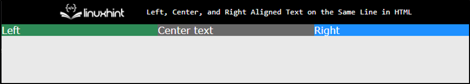
The above output displays that the three div are now left, right, and centre aligned
Method 2: Using Grid Layout Module
The Grid layout module is used to align the text in the left, right, and center positions. It is mostly used nowadays in case of providing responsive design:
display: grid;
grid-template-columns: 1fr 1fr 1fr;
}
.left {
grid-column: 1;
text-align: left;
padding: 5px;
}
.center {
grid-column: 2;
text-align: center;
padding: 5px;
}
.right {
grid-column: 3;
text-align: right;
padding: 5px;
}
In the above code,
- Initially, select the parent div element class “parentSpace” and use the “display” property to make a grid.
- Then, use “grid-template-column” and set it to “1fr 1fr 1fr” to make three columns of equal size in the grid.
- After that, select each child class and give them padding of “5px” and align the text to the left, center, and right using the “text-align” property.
- In the end, use the “grid-column” property to display the child in different columns.
The output looks like this.
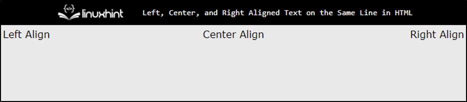
The output confirms that the text is aligned successfully.
Method 3: Using Flex Layout
The “flex” layout helps to make responsive websites. By using this layout, the div element can also be aligned in the left, right and center directions:
display: flex;
}
.left {
flex: 1;
padding: 5px;
text-align: left;
background-color: forestgreen;
}
.center {
flex: 1;
padding: 5px;
text-align: center;
background-color: darkgoldenrod;
}
.right {
flex: 1;
padding: 5px;
text-align: right;
background-color: cadetblue;
}
In this code,
- First, select the parent element class and set the “flex” value to the “display” property to create a flex layout.
- After that, select all child div element classes and set the “flex” property to “1”.
- In the end, assign “padding”, “color” and “text-align” properties for better visualization purposes.
After executing the above code snippet, the output looks like this:

The snapshot illustrates that the div along with the text is now left, right, and center aligned.
Bonus Tip: Using Table Tag
The alignment of the text can also be done via the “<table>” tag. This method can be very handy while creating the header for the web page.
Let us assume, the table is created having three table data in a single row:
Now add a couple of CSS properties by selecting the element selector of “table” and “td” tags:
width:100%; border-collapse: collapse;
}
td{
width: 33.33%;
border: 2px solid forestgreen;
padding: 5px;
}
In the above code,
- Set the width of the table to “100%” and “33%” for table data “<td>” elements.
- After that, apply some styles using the “border” and “padding” properties to enhance visibility.
After compilation, the webpage looks like this:
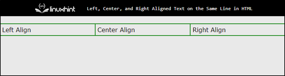
The output confirms that the same effect is generated using the “<table>” tag.
Conclusion
To left, center, and right-aligned text on the same line in HTML, the developer can use a “flex” layout, “grid” layout, and “float” property. For “flex” and “grid” layouts, set the “display” property. The alignment of the text can also be done with the help of the “<table>” tag. This guide demonstrates the alignment text on the same line in HTML.