How input attributes works in HTML
The functionality of the attributes depends upon the values carried by these attributes. The attributes and their supported values are described here.
Type attribute
Like the input element is the core part of HTML forms, the type attribute is the key ingredient of the input element. It defines the input type which has one of the following values.
- text: used to describe a text field
- number: used to create a field that accepts numeric values
- email: used to enter an email address
- color: define the color of an input field
- checkbox: to create a checkbox
- radio: to create a radio button
- tel: creates a field that accepts telephone numbers
- image: used to get the image file from the user
- hidden: a field that will not be displayed on the user’s screen
- date: creates a field that accepts date
- month: creates a field that contains month and year to be selected
- submit: a button that would submit the form data
- reset: this creates a button that resets all data of form
The above-mentioned are the most used values of the type attribute and the below-stated example makes use of few of them.
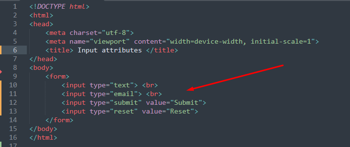
Example
The code written below executes a few values of the type attribute.
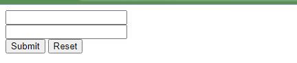
Four different input types are used in the above code that uses the values text, email, submit and reset.
Output
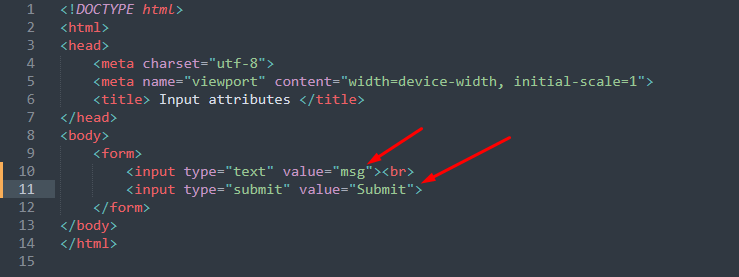
Value attribute
Whenever an HTML form is defined, it is recommended to assign an initial value to each for element. To do so, you have to use value attribute. The input type must be defined to use this attribute.
Example
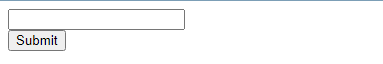
The code provided below practices value attribute on input type=text and input type=submit.
Output

Read-only attribute
This attribute would not allow writing inside the input field.
Example
The HTML code provided practices the readonly attribute on an input field.

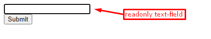
Output
The text-field shown in the output will neither allow you to write nor the mouse click would take any action.
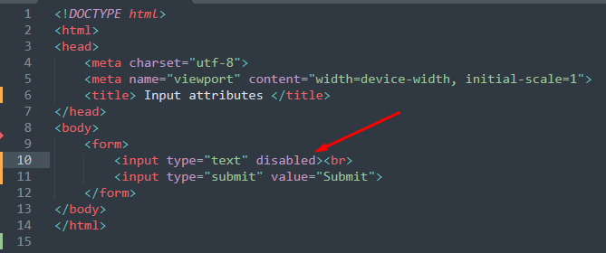
Disabled attribute
The input type that carries this attribute would display only the area covered by the input field. However, you cannot perform any action on that input element.
Example
The disabled attribute of input element is practiced in the following code
Output
Note: The read-only attribute is submitted with the form whereas the disabled attribute does permit the value for submission.
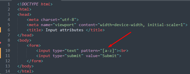
Pattern attribute
This attribute accepts regular expressions for which the value of that field will be checked. It is used with few input types such as text, email, tel, url, password, and date.
Example
In the following code, the pattern attribute is used on a text field that will accept only small alphabets.
Output
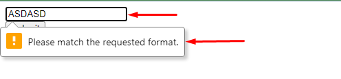
For verification of the pattern attribute, we tried to enter the capital alphabets. However, an error prompted asking to match the requested format.
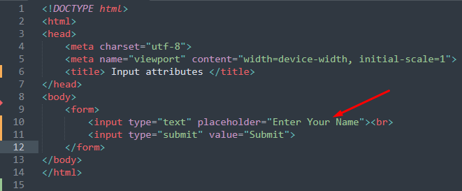
Placeholder attribute
This attribute adds dummy characters that assist the user in understating the purpose of that field.
Example
The code mentioned below applies the placeholder attribute field to describe that the text-field is meant to accept your name.
Output
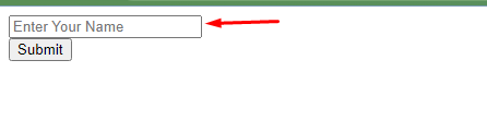
It is observed from the output that the text-field directs the user to enter their name.
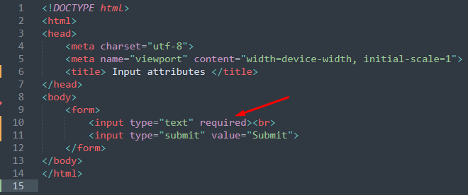
Required attribute
The input type’s that uses required attributes are mandatory to be filled.
Example
The code written below sets the required attribute for a text-field.
Output
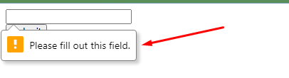
As the field is mandatory to be filled thus the submission will not be performed until some text is written inside the text-field.
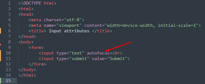
Autofocus attribute
If the web page is reloaded, the input field will be focused in which the autofocus attribute is used.
Example
The following code sets the autofocus attribute of input element.
Output
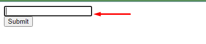
As we have used the autofocus attribute on a text field, thus whenever the page is loaded, the cursor will keep on ticking.
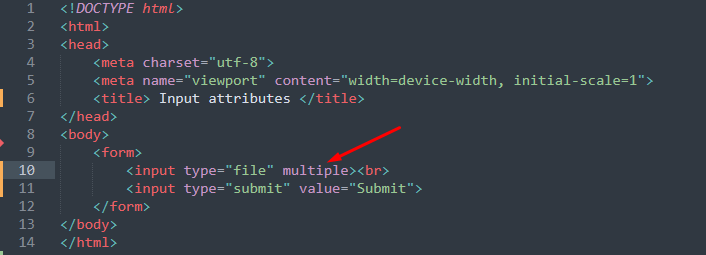
Multiple attribute
This attribute allows adding multiple values (attaching multiple files is the main use of this attribute).
Example
The code provided below takes the file as an input type and multiple attribute is applied on the input type.
Output
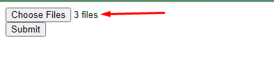
The output shows that three files are attached which describe the working of multiple attributes.
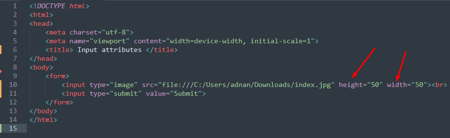
Height and width attribute
This attribute is used with image type and sets the height and width of the image.
Example
The input type is set to image and the height/width attributes are applied on it.
Output
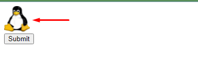
The image in the output would be adjusted according to the value of width and height.
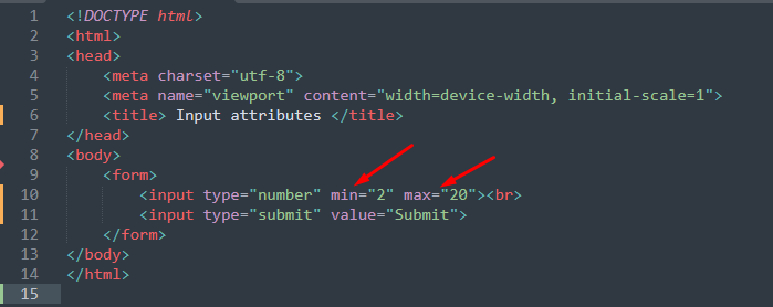
Min/Max attribute
The minimum/maximum values for various input types are specified by these attributes. The input types may include text, number, date, range, month, time, and week.
Example
The code provided below uses the min and max attribute where the input type is set to number.
Output
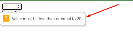
As shown in the output, the number field is not accepting 21 as the limit was set to 20.
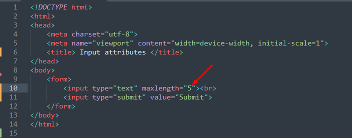
Maxlength attribute
The number of characters for an input type can be specified by using maxlength attribute.
Example
The following code limits the number of characters to 5 in a text field.
Output
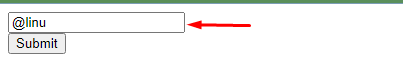
The output above contains 5 characters in the text field, the text-field will not allow the 6th character due to maxlength attribute.
Conclusion
The input element has an extensive list of attributes to create a featureful HTML form. This informative post lists down the attributes of the input element of HTML forms. The attributes supported by the input element are, type, value, disabled, read-only, autofocus, multiple, height and width, maxlength etc,. Moreover, each attribute is practiced using an example that will help in understating the functionality.