Shaping Images in Bootstrap 5
For the purpose of styling your images by providing them with some shape, there are multiple classes available in Bootstrap 5. These classes along with their demonstrations have been discussed in this section.
.rounded
In order to round the corners of the image use the .rounded class. For doing so you simply have to include this class in the <img> tag.
HTML
We know that Bootstrap works with wrapping elements inside a container, therefore, we have created a div container in the above code and nested an image inside it. The image has been assigned the rounded class along with some width and height.
Output
The output above shows an image with rounded corners.
.rounded-circle
As the name suggests, the class under discussion in this section makes an image a circle. Below we have shown its demonstration.
HTML
In order to make the image a circle we have assigned the rounded-circle class to the image.
Output
The image was made into a circle with success.
.img-thumbnail
Thumbnails play a vital role when designing a website that displays multiple images on a single web page. In Bootstrap 5, to convert images into a thumbnail the .img-thumbnail class is used.
HTML
In order to make our image appear as a thumbnail we have assigned it the .img-thumbnail class. This class basically makes a thumbnail with a border.
Output
A thumbnail was created successfully.
Aligning Images in Bootstrap 5
Apart from shaping images, aligning them in the right position is also very significant. This section discusses multiple classes that help you align images in Bootstrap 5.
.float-start
This class positions an image at the start of the container.
HTML
Here first of all we have created a container and placed an image inside it. In order to place that image at the start of the container, we are assigning it the .float-start class and some width and height.
Output
The image has been positioned at the start of the container.
.float-end
For the purpose of placing an image at the end of the container, this class is used.
HTML
In the above code, to position the image at the end of the container we have given the <img> tag the .float-end class.
Output
The image was placed successfully at the end of the container.
.mx-auto .d-block
These classes are used to center an image inside a container. The .mx-auto class adjusts the margin to auto and the .d-block class displays an image as a block. Here is how these classes are used.
HTML
For the purpose of centering an image the .mx-auto and .d-block classes were assigned to the image in the code snippet above.
Output
The image has been centered.
Responsive Images in Bootstrap 5
For the purpose of making images responsive that alter their behavior depending upon the device width use the below-mentioned class provided by Bootstrap 5.
.img-fluid
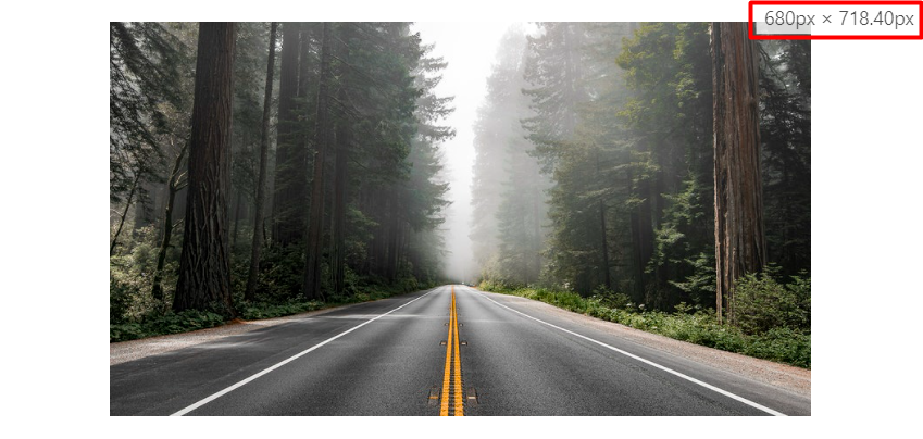
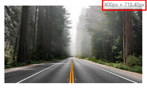
The .img-fluid class makes an image alter its size according to the screen size. Image using this class will change its size in correspondence to the parent element, moreover, this class adjusts the max-width of the image to 100% and height to auto.
HTML
In the above code, we are assigning the class img-fluid to the image. In order to see the effect of this class scale your browser window up and down.
Output
When the screen width is 680px and above.
At screen width 400px and below.
The image was successfully made responsive.
Conclusion
Image classes in Bootstrap 5 allow you to style the images appearing on your website. Using these classes you can give images a certain shape, alignment, or you can make them responsive as well. Some of the Bootstrap 5 image classes are .rounded, .img-fluid, .float-start, etc. These classes are discussed in detail, elaborating the purpose they serve.

