Web developers utilize the HTML “input” element with the type “tel” to create the input field for telephone numbers. This type of input field can be utilized by the users for submitting a phone number. Moreover, creating an input field for specifically entering the phone number can make your web page look professional and different from the competitors.
This article will explain the HTML input type=“tel” element.
How to Create an HTML input type=“tel” Element?
To create an HTML input type tel, follow the given steps.
Step 1: Create Input Field for Phone Number
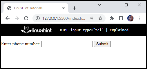
In the HTML file, first, create a div element with the name “main”. Inside this div element, add <form> and <label> elements. Within the label element, first, mention the caption and then add an input tag associated with type and name attributes. After that, include a <button> tag with the caption “Submit”:
<form>
<label>
Enter phone number:
<input type="tel" name="phone">
<button>Submit</button> <br>
</label>
</form>
</div>
Save the file and open it in your browser. At this moment, the web page will look like this:
Step 2: Apply Styles to Input field
Let’s apply styles to the input type tel with CSS properties.
Style “main” div
background-color: rgba(0, 0, 0, 0.159);
max-width: 600px;
margin: 15px auto;
height: 200px;
border-radius: 30px;
}
The “.main” is utilized to access the div element with class main, and the properties that are applied to it are described below:
- “background-color” property is utilized for the setting of the element’s background color.
- “max-width” property is utilized for the setting of the element’s maximum width.
- “margin” property with the value “15px” represents the space of 15px at the top-bottom, and the “auto” generates the equal space on the left-right side of the element.
- “height” property is utilized to set the element’s height to 200px.
- “border-radius” property is utilized for the setting of the element’s width to 30px.
Style “form-main” div
display: flex;
justify-content: center;
align-items: center;
height: 100%;
font-size: 24px;
}
The “.form-main” is utilized to access the div element with the class form-main. The description of the properties applied is mentioned below:
- “display” property with the value set as the “flex” will create a flexible layout for the elements.
- “justify-content” property is utilized to align the flexible items horizontally.
- “align-items” property is utilized to align the flexible items vertically.
- “height” property is utilized for the setting of the element’s height.
- “font-size” property is utilized for the setting of the element’s font size.
Style “input” of form-main div
border: 1px solid rgb(47, 63, 63);
padding: 10px;
font-size: 22px;
background-color: rgb(85, 104, 104);
color: #ffffff;
outline: none;
}
The form-main class is applied with CSS properties that are explained below:
- “border” property is applied with the value “1px solid rgb(47, 63, 63)”, where 1px represents the width of the border, solid line type, and rgb(47, 63, 63) represents the color.
- “padding” property is assigned with the value “10px”, where the first 10px represents the space on the top and bottom of the content, and the second refers to the 10px space on the left and right side of the element’s content.
- “font-size” property is utilized to set the font size.
- “background-color” property is utilized for the setting of the element’s background color.
- “color” property is utilized to set the font color.
- “outline” property with the value none will remove the outline of the input field when selected.
Style “placeholder” of input
color: #dadada;
}
We have only applied color to the input placeholder.
Style the “button” of the form-main
border: 1px solid rgb(47, 63, 63);
padding: 10px 20px;
font-size: 22px;
background-color: rgb(12, 33, 33);
color: #a3a3a3;
cursor: pointer;
margin-left: 5px;
transition: all 0.3s ease;
}
Here is the description of the given properties:
- “border” property is applied with the value “1px solid rgb(47, 63, 63)”, where 1px represents the width of the border, solid line type, and rgb(47, 63, 63) represents the color.
- “padding” property is assigned with the value “10px”, where 10px represents the space on the top and bottom of the content and 10px space on the left and right side of the content.
- “font-size” property is utilized to set the font size.
- “background-color” property is utilized for the setting of the element’s background color.
- “color” property is utilized to set the font color.
- “cursor” with the value set as the “pointer” will change the cursor to a pointing hand when placed on the button.
- “margin-left” property will set a space of 5px to the element’s left.
- “transition” property with the value set as all 0.3s ease allows the element to be moved gradually.
Style the “button” on the hover
transform: translateY(-5px);
}
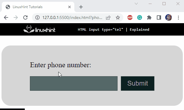
By providing the above-mentioned code, the output screen will generate the result as shown below:

Step 3: Add “required” Attribute to Input Field
It is often mandatory to add a specified pattern of the telephone number in our forms, which can be validated before form submission.
To do so, the “required” attribute is utilized in such a way that if a user submits an empty input field, a message will be generated to fill the field as follows:
It can be seen from the below image that entering the value in the input field is mandatory:
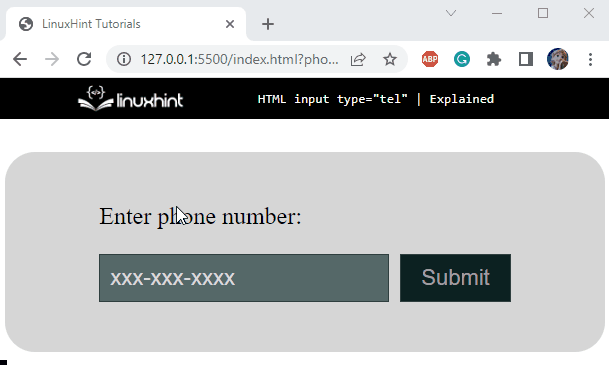
Step 4: Add “pattern” Attribute to Input Field
As we know, there is no validation procedure for telephone numbers as they vary from place to place. The pattern attribute is utilized for the specification of the telephone number’s format. As a result, the user can only add a telephone number according to the pattern:
Let’s provide a wrong pattern and see what happens:
It can be observed that the input field notifies the user to enter a number that should match the pattern.
So, let’s enter a telephone number with the correct pattern, click on the “Submit” button and see what happens:

Cool! We have successfully learned how to use an input element of type tel.
Conclusion
To make a phone number field, the HTML input type tel can be utilized. This type can have several attributes to add additional functionalities such as placeholder, pattern, required, and more. More specifically, the pattern attribute is used for setting the pattern for the phone number, and the required attributes restrict the user to submit a non-empty value. This article has demonstrated the HTML input type tel and its attributes with examples.