- Type Attribute
- Name attribute
- Min and Max Attribute
- Autofocus Attribute
- Disabled Attribute
- Placeholder Attribute
- Readonly Attribute
- Required Attribute
- Multiple Attribute
- Size Attribute
- Autocomplete Attribute
This write-up will present a comprehensive overview of all the above-mentioned attributes. Let’s proceed!
Type Attribute
As the name itself suggests the type attribute in the <input> tag determines the input type, the by-default value of the type attribute is text. We can assign different values to the type attribute such as password, email, etc. The basic syntax of the type attribute is shown in the following figure:
Different values are specified for the type attribute in <input> tag. The behavior of the type attribute will be different for different values.
Name Attribute
It specifies the name of the input element, Following will be the basic syntax of the name attribute:
It wouldn’t affect the output instead the name attribute tells the server about the input field.
Min and Max Attribute
These attributes are used to specify the minimum and maximum values of the input element. The below snippet shows the syntax of the min and max attributes:
Autofocus Attribute
The autofocus attribute determines that an <input > element should get autofocus when the page loads and the below figure shows the syntax of autofocus attribute:
Disabled Attribute
The disabled attribute allows us to disable an element, in such case user wouldn’t be able to use or click on that field:
Example
Lets consider the below-given code that implements all the above mentioned attributes for different fields:
<label>Student Name:</label>
<input type="text" name="name" value="" autofocus>
<br><br>
<label>Father Name:</label>
<input type="text" name="fname" value="" disabled>
<br><br>
<label>Age:</label>
<input type="number" name="age" value="" min="20" max="60">
<br><br>
<input type="submit">
</form>
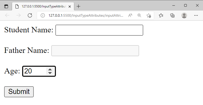
The above snippet creates multiple input fields, the autofocus attribute is enabled in the first field so, whenever we load the page the cursor will point to that field. We wouldn’t be able to click on the second field because it contains the disabled attribute. The third input field is a number type field and we specify min and max attributes in it so it will take the value between 20 and 60 only:
The output verifies that all the attributes are operating properly.
Placeholder Attribute
It provides a hint about the expected value of the input field. The basic syntax of the placeholder attribute will be as follows:
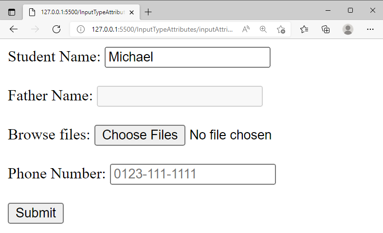
Anything we specify within the placeholder will be displayed as a hint as shown below:
Readonly Attribute
It determines that the field is read-only which means that the field cannot be modified. The syntax of the read-only attribute is shown in the following figure:
We specify value= “Michael” and enable the read-only attribute. As a result, we wouldn’t be able to change the value of that input field:
Required Attribute
The required attribute determines that the form can’t be submitted if the input field is not filled. The basic syntax of the required attribute is shown in the following snippet:
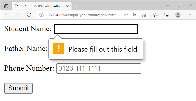
If we click on the submit button without filling the input field then we will get the following result:
Multiple Attribute
It allows us to enter multiple values and it is mostly used with the “file” input type where it allows a user to pick multiple files. Below code snippet, shows the syntax of “multiple” attribute:
Above snippet generates the following output:
Size Attribute
It is used to set the size(width) of the input field, the syntax of the size attribute is shown in the below-given snippet:
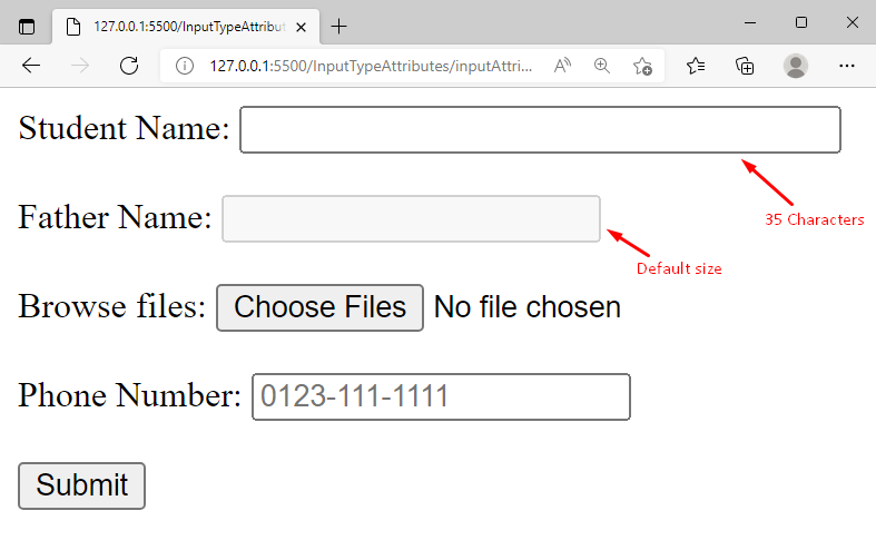
The default size of the input fields is 20 characters and we modified the size of the first input field as 35 so, it will generate the following output:
Autocomplete Attribute
Enabling the autocomplete attribute allows a browser to predict and auto-complete the input field. The below-given snippet shows how to use autocomplete attribute in the input tag:
Above code-snippet shows the following output:

The output verified that if autocomplete=“on”, then the browser suggests the already entered data.
Conclusion
The <input> tag attributes are used to control the behavior of the form’s input fields e.g. the type attribute determines the input type, the autofocus attribute is used to focus on the specific element on page load. Enabling the autocomplete attribute provides already entered data as suggestions and multiple attribute allows us to add multiple files. This write-up demonstrated a detailed guide for the profound understanding of HTML <input> tag attributes.


