In Tailwind CSS, breakpoints are the specific screen sizes where the styles and layout can be adjusted to create responsive web pages. Tailwind provides a set of breakpoints for different screen sizes, such as “sm”, “md”, “lg”, “xl”, and “2xl”. However, sometimes users may need to use more than one breakpoint for a particular style. In this situation, the multi-range breakpoints can be defined and used.
This post will explain the method to use multi-range breakpoints in Tailwind.
How to Use Multi-range Breakpoints in Tailwind?
To use multi-range breakpoints in Tailwind, look at the given below steps:
- Configure Multi-range Breakpoints in “tailwind.config.js” File
- Utilize Defined Multi-range Breakpoints in HTML Program
- Verify Output
Step 1: Configure Multi-range Breakpoints in “tailwind.config.js” File
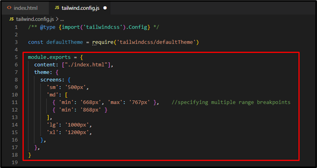
First, specify multiple ranges for a particular breakpoint in the “tailwind.config.js” file. For instance, we have defined two ranges for the “md” breakpoint:
content: ["./index.html"],
theme: {
screens: {
'sm': '500px',
'md': [
{ 'min': '668px', 'max': '767px' }, //specifying multiple range breakpoints
{ 'min': '868px' }
],
'lg': '1000px',
'xl': '1200px',
},
},
}
Here, the first range of the “md” breakpoint applies to screen sizes between “668px” and “767px”, while the second range applies to screen sizes “868px” and above. When the screen size appears to “768px”, it reverts back to the “sm” breakpoint between the “768px” and “868px” screen sizes.
After that, it applies the “md” breakpoint again:
Step 2: Utilize Defined Multi-range Breakpoints in HTML Program
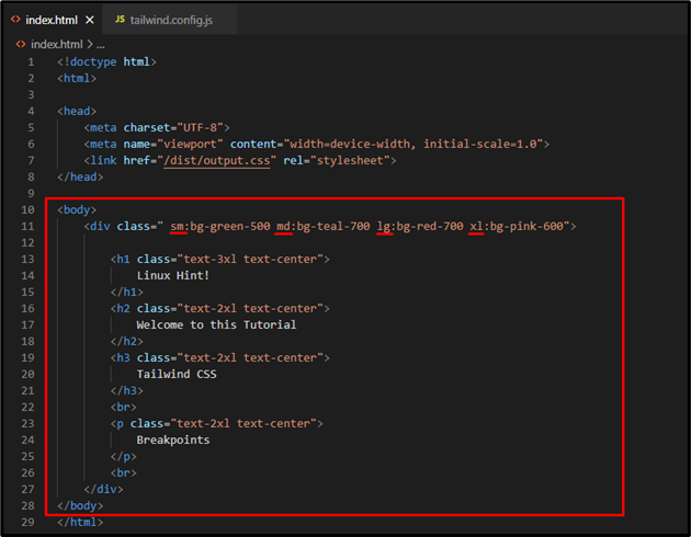
Now, use the specified multi-range breakpoints in the HTML program:
<div class="sm:bg-green-500 md:bg-teal-700 lg:bg-red-700 xl:bg-pink-600">
<h1 class="text-3xl text-center">
Linux Hint!
</h1>
<h2 class="text-2xl text-center">
Welcome to this Tutorial
</h2>
<h3 class="text-2xl text-center">
Tailwind CSS
</h3>
<br>
<p class="text-2xl text-center">
Breakpoints
</p>
<br>
</div>
</body>
Here:
- First, the “sm:bg-green-500” class sets the background color to green for screens that match the “sm” breakpoint.
- Then, the “md:bg-teal-700” class applies the background color to teal for the “md” breakpoint screens.
- Next, the “lg:bg-red-700” class changes the background color to red when it matches the “lg” breakpoint.
- Finally, the “xl:bg-pink-600” class sets the pink color for the background for the “xl” breakpoint screen:
Step 3: Verify Output
Run the HTML program with live server extension to view the output:
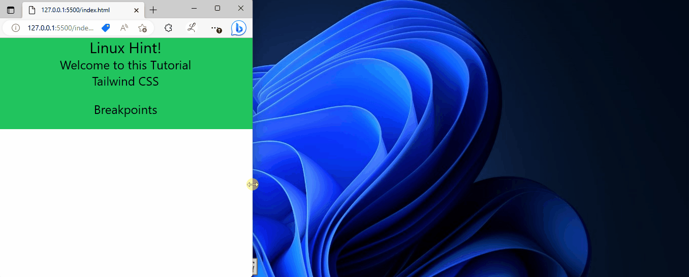
In the above output, the background color of the web page changes according to which each one is styled.
Conclusion
To use multi-range breakpoints in Tailwind, first, navigate to the “tailwind.config.js” file. Then, in the “theme” section, add the “screens” property and specify the multiple ranges for the desired breakpoint. Next, utilize the defined multi-range breakpoint in the HTML program and view the HTML web page for verification. This post has explained the method to use multi-range breakpoints in Tailwind.