This article will present the method to use hover, focus, and active on Tailwind CSS.
How to Use Hover, Active, and Focus on Tailwind CSS?
To style an element on hover, active, and focus states, use the “hover”, “active”, and “focus” modifiers in the HTML program. Then, verify the output by viewing the web page. The step-by-step procedure is mentioned below:
Step 1: Utilize Hover, Focus, and Active Modifier in the HTML Program
Create an HTML program and utilize the “hover”, “focus” and “active” modifiers to style an element on hover, focus, and active states. For instance, we have specified the following modifiers:
Here:
- “bg-violet-500” sets the background color of the button to a shade of violet.
- “hover:bg-blue-700” changes the button’s background color to blue when the button is hovered over.
- “active:bg-red-700” changes the background color of the button to red when the button is clicked or activated.
- “focus:ring focus:ring-yellow-500” adds a yellow ring around the button when it is in focus.
- “py-2” adds padding on the y-axis (top and bottom) of the button.
- “px-4” adds padding on the x-axis (left and right) of the button.
- “rounded” rounds the corners of the button.
Step 2: Verify Output
To verify whether the hover, focus, and active states are working properly, view the HTML web page:
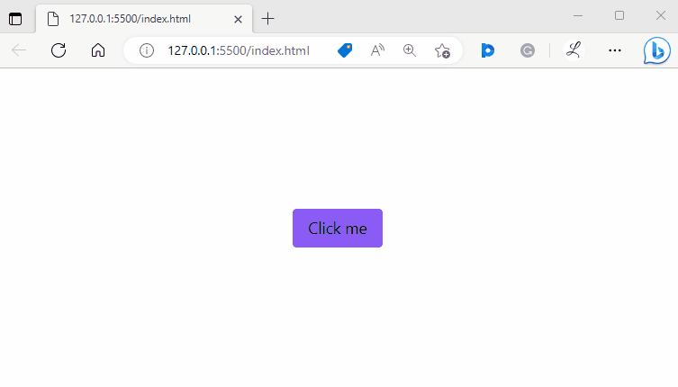
In the above output, the color of the button is violet. Its color changed to blue when it hovered over. While clicking, the color is changing to the red color which shows the active state. The yellow ring represents the focus state. The output indicates that the hover, focus, and active states are working properly.
Conclusion
In Tailwind CSS, utilize the “hover”, active”, and “focus” modifiers in the HTML program to style an element on hover, active and focus states. Then, view the web page to verify the output. Users can also apply different styles according to the requirement. This article has demonstrated the method of using hover, focus, and active in Tailwind.