This article will explain the following content:
- How to Use flex-row to Position Flex Items in Tailwind?
- How to Use flex-col to Position Flex Items in Tailwind?
How to Use flex-row to Position Flex Items in Tailwind?
To use flex-row to position flex items in Tailwind, make an HTML file and use the “flex-row” utility with the flex container in the HTML program. This utility positions the flex items horizontally. Then, verify the changes by viewing the HTML web page.
Check out the provided steps for a better understanding:
Step 1: Utilize the “flex-row” Utility in HTML Program
Make an HTML program and use the “flex-row” utility with the flex container to position flex items in a row:
Here:
- “flex” class creates a flexible layout and adjusts the child element’s sizes based on available space.
- “flex-row” class sets the flex’s direction of the container to be a row.
- “basis-1/3”, and “basis-1/2” classes set the inner <div>’s width to 33.33%, and 50% of their parent elements, respectively.
Step 2: Verify Output
To verify whether the flex items have been positioned in a row, view the HTML web page:
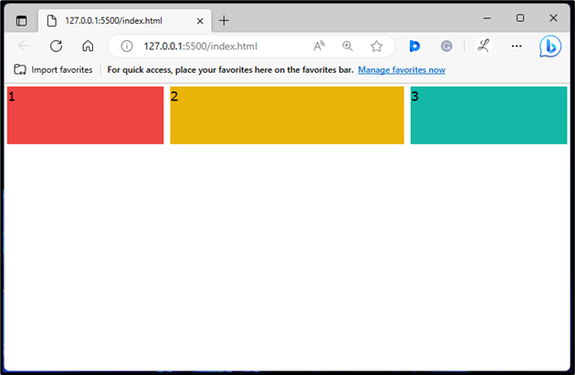
In the above output, the flex items are in a row position.
How to Use flex-col to Position Flex Items in Tailwind?
To use the flex-col to position flex items in Tailwind, make an HTML file and use the “flex-col” utility with the flex container in the HTML program. This utility positions the flex items vertically. Next, view the HTML web page to verify the changes.
Follow the below-listed steps for a better understanding:
Step 1: Utilize the “flex-row” Utility in HTML Program
Use the “flex-col” utility with the flex container in the HTML program to position flex items in a column:
Here:
- “flex” class creates a flexible layout and adjusts the child element’s sizes based on available space.
- “flex-col” class sets the flex’s direction of the container to be a column.
- “basis-1/3”, and “basis-1/2” classes set the inner <div>’s width to 33.33%, and 50% of their parent elements, respectively.
Step 2: Verify Output
Ensure that the flex items have been positioned in a column by viewing the HTML web page:
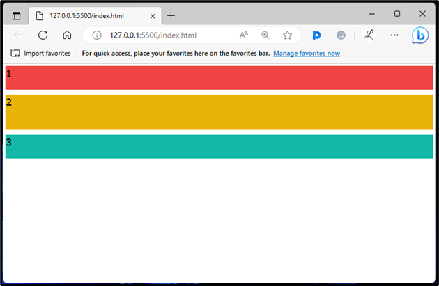
The above output has displayed the flex items in a column position.
Conclusion
To use the “flex-row” and “flex-col” to position flex items in Tailwind, use the “flex-row” and “flex-col” utilities with the desired flex containers in the HTML program. The “flex-row” utility positions the flex items horizontally and the “flex-col” utility positions the flex items vertically. Lastly, verify the changes by viewing the HTML web page. This article has explained the method to use the “flex-row” and “flex-col” to position flex items in Tailwind CSS.