This article will explain the method to use flex-direction with breakpoints and media queries in Tailwind CSS.
How to Use Flex Direction with Breakpoints and Media Queries in Tailwind?
To use flex-direction with breakpoints and media queries in Tailwind, make an HTML program. Then, define values and styling for various screen sizes by utilizing the “sm”, “md” or “lg” breakpoints with the desired “flex-direction” utilities. Next, adjust the screen size of the web page to ensure changes.
Try out the following steps for a practical demonstration:
Step 1: Use Breakpoints and Media Queries With Flex Direction in HTML Program
Create an HTML program and define different values and styling for various screen sizes with the “flex-direction” utility. For instance, we have used the “md” breakpoint with the “flex-row” utility and the “lg” breakpoint with the “flex-col-reverse” utility:
Here:
- “flex” class creates a flexible layout and adjusts the child element’s sizes based on available space.
- “flex-col” class positions the flex items vertically.
- “md:flex-row” class positions the flex items horizontally on the medium screen.
- “lg:flex-col-reverse” class positions the flex items vertically in the reverse direction on the large screen.
- “basis-1/3”, and “basis-1/2” classes set the inner <div>’s width to 33.33%, and 50% of their parent elements, respectively.
Step 2: Verify Output
Run the HTML program and view the web page to ensure that the breakpoints and media queries have been applied with flex-direction:
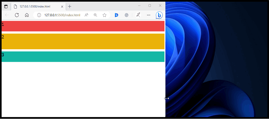
It can be seen that the flex items are changing with the screen sizes according to which the breakpoints are specified with “flex-direction”.
Conclusion
To use flex-direction with breakpoints and media queries in Tailwind, use the “sm”, “md” or “lg” breakpoints with the “flex-direction” utilities in the HTML program. These breakpoints specify styling for different screen sizes. To ensure changes, view the web page on various screen sizes. This article has explained the method to use flex-direction with breakpoints and media queries in Tailwind CSS.