Tailwind is a well-known CSS framework that offers a variety of utility classes for building responsive and customizable web pages. It also supports custom media queries that permit users to define their own breakpoints and apply different styles based on screen size or other conditions. Using media queries, users can apply different styles depending on various media features, such as the orientation of the device, the resolution of the screen, the width and height of the viewport, and more.
This article will explain the method to use custom media queries in Tailwind.
How to Use Custom Media Queries in Tailwind?
To use custom media queries in Tailwind, follow the below-mentioned instruction:
- Open the “tailwind.config.js” file.
- Go to the “theme.extend” section and add the “screens” property.
- In the “screens” property, specify the desired custom media queries.
- Utilize the defined custom media queries in the program file.
- Verify the output by viewing the web page.
Step 1: Configure Custom Media Queries in “tailwind.config.js” File
First, specify the desired custom media queries. For instance, here we have defined two custom media queries, one for the print screen and another for the portrait orientation:
content: ["./index.html"],
theme: {
extend: {
screens: {
//custom media query for print screen
'print': {'raw': 'print'},
//custom media query for portrait orientation
'portrait': {'raw': '(orientation: portrait)'},
}
}
},
}
Here:
- “‘print’: {‘raw’: ‘print’}” creates a custom media query named “print” that targets print media. It will be triggered when printing the page.
- “’portrait’: {‘raw’: ‘(orientation: portrait)’}” creates a custom media query named “portrait” that targets devices with a portrait orientation.
Step 2: Utilize Defined Custom Media Queries in HTML Program
Now, use the specified custom media queries in the HTML program:
<div class="h-screen print:text-red-800 portrait:text-teal-400 portrait:bg-black"><h1 class="text-3xl text-center">
Linux Hint!
</h1>
<h2 class="text-2xl text-center">
Welcome to this Tutorial
</h2>
<h3 class="text-2xl text-center">
Tailwind CSS
</h3>
<br>
<p class="text-2xl text-center">
Custom Media Queries
</p>
<br>
</div>
</body>
Here:
- “print:text-red-800” class applies the text color red to the element when it is being printed.
- “portrait:text-teal-400 portrait:bg-black” classes apply the text color teal and background color black to the element when the device is in portrait orientation.
Step 3: Verify Output
Finally, run the HTML code using the live server extension to view the HTML web page:
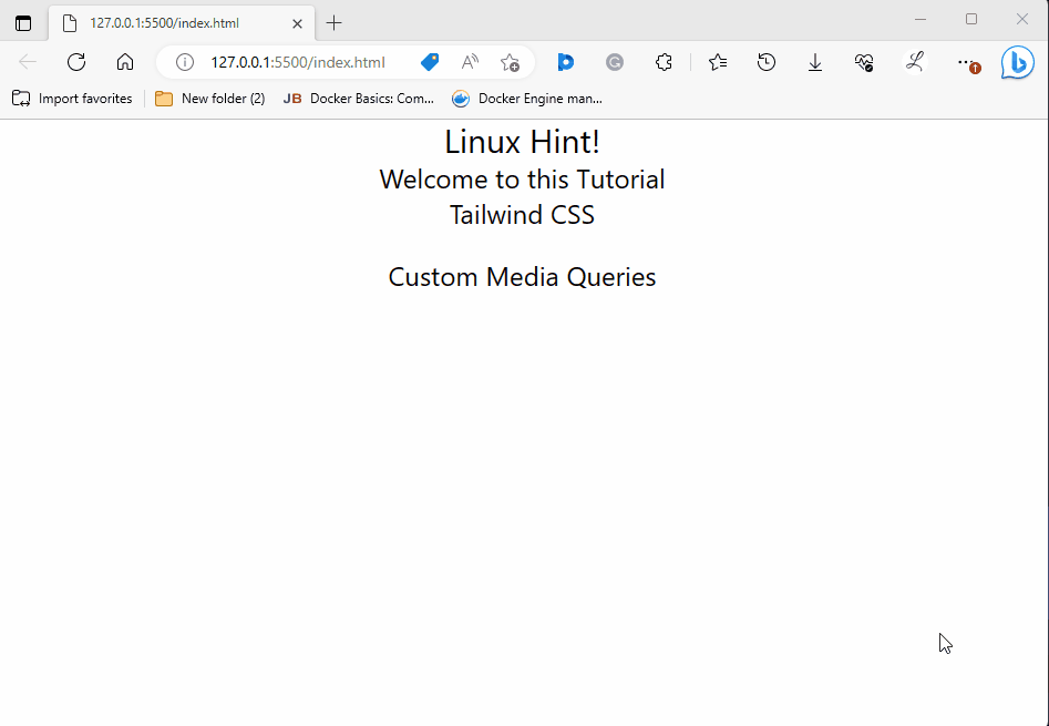
It can be seen that when we clicked on the “Print” option, the text color of the content changed and when the device is in a portrait orientation, the text color and background color of the web page changed according to which it was styled.
Conclusion
To use custom media queries in Tailwind, navigate to the “theme.extend” section in the “tailwind.config.js” file, add the “screens” property, and define the desired custom media queries. After that, use the specified custom media queries in the program file. Lastly, verify the output by viewing the web page. This article has explained the method to use custom media queries in Tailwind.