This article will clarify the method of using the “content-stretch” utility in Tailwind CSS.
How to Use “content-stretch” in Tailwind?
To use the “content-stretch” in Tailwind, make the HTML file. Then, add the “content-stretch” utility with the particular grid container in the HTML program. This utility allows grid items to occupy the available space along the container’s cross-axis. Lastly, verify changes on the web page.
Look at the below-mentioned steps for the practical implementation.
Step 1: Use the “content-stretch” Utility in the HTML Program
Make an HTML program and use the “content-stretch” utility with the desired grid container to enable its items to occupy the available space along its cross-axis:
Here, in the parent <div> element:
- “h-56” class is used to set the height of the <div> container to 56 units.
- “grid” class creates a grid layout.
- “content-stretch” class stretches the grid items along the container’s cross axis.
- “grid-cols-3” class sets the columns’ number in the grid to 3.
- “gap-4” class sets a spacing of 4 units between each grid item.
- “text-center” class aligns the text within each grid item to the center.
- “bg-teal-700” class sets the background color of the grid container to teal.
In the child <div> elements:
- “bg-yellow-500” class applies the yellow color to the background of the grid items.
- “p-3” class adds 3 units of padding to the content inside the child <div> items.
Step 2: Verify Output
To verify whether the “content-stretch” utility has been applied or not, view the HTML web page:
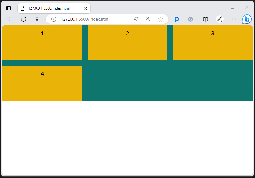
In the above output, it can be observed that the grid items have occupied the available space along the container’s cross-axis. This indicates that the “content-stretch” utility has been applied successfully.
Conclusion
To use the “content-stretch” in Tailwind, add the “content-stretch” utility with the desired grid container in the HTML program to fill the available space along its cross-axis. For verification, navigate to the web page and view changes on it. This article has clarified the method of using the “content-stretch” utility in Tailwind CSS.