This article will demonstrate various examples of using the “align-items” utilities in Tailwind CSS.
How to Use “align-items” in Tailwind?
To use the “align-items” utilities in Tailwind, make an HTML structure. Then, add the “align<value>” utility with the specific element in the HTML program to control its elements’ position along its cross-axis.
Syntax
....
</element>
Replace <value> with one of the following options: “start”, “center”, “end”, “baseline” or “stretch”.
Go through the below-provided examples for the practical demonstration.
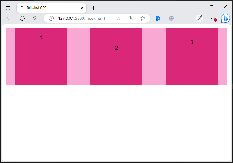
Example 1: Use the “items-start” Utility in Tailwind
The “items-start” utility aligns the grid or flex items to the start/beginning of the container’s cross-axis (vertically). In this example, we will use the “items-start” utility in the “<div>” element to align its flex items to the beginning of its cross-axis:
Here, in the parent <div>:
- “flex” class is used to create a flex container.
- “items-start” class aligns flex items to the beginning of the container’s cross-axis.
- “justify-around” class justifies flex items with equal spacing on each item’s side along the container’s main axis.
- “text-center” class centers the text inside the flex items horizontally.
- “h-44” class sets the height of the <div> container to 44 units.
- “m-3” class applies the 3 units of margin to all sides of the flex container.
- “bg-pink-300” class sets the container’s background color to light pink color.
- “gap-4” class sets 4 units of spacing between the flex items.
In the child <div> elements:
- “bg-pink-600” class applies the dark pink color to the background color of the flex items.
- “py-4” class adds the vertical padding of 4 units to the first flex item.
- “py-12” class adds 12 units of vertical padding to the second flex item.
- “py-8” class adds the vertical padding of 8 units to the third flex item.
- “w-40” class sets the width of the flex item to 40 units.
Output
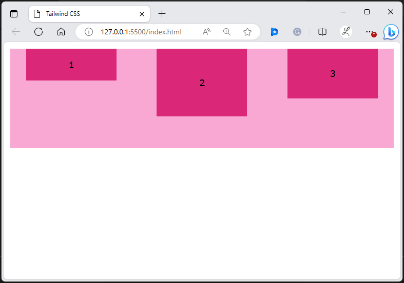
It can be observed that the flex items have been aligned to the start of the container vertically.
Example 2: Use the “items-center” Utility in Tailwind
The “items-center” utility aligns the grid or flex items to the center of the container’s cross-axis. In this example, we will use the “items-center” utility in the “<div>” element to align its flex items to the center of its cross-axis:
Output
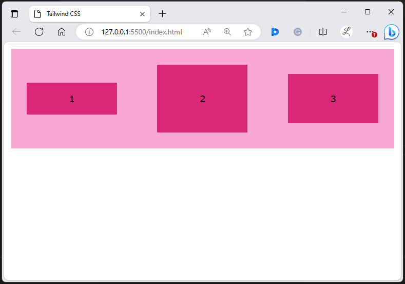
The above output shows that the flex items have been aligned to the center of the container vertically.
Example 3: Use the “items-end” Utility in Tailwind
The “items-end” utility aligns the grid or flex items to the end of the container’s cross-axis. In this example, we will use the “items-end” utility in the “<div>” element to align its flex items to the end of its cross-axis:
Output
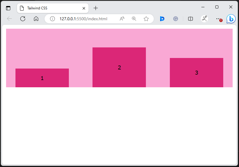
It can be seen that the flex items have been aligned to the end of the container vertically.
Example 4: Use the “items-baseline” Utility in Tailwind
The “items-baseline” utility aligns the grid or flex items to the baseline of the container’s cross-axis. In this example, we will use the “items-baseline” utility in the “<div>” element to align its flex items to the baseline of its cross-axis:
Output
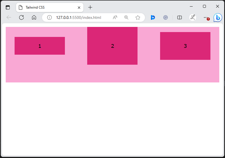
According to the above output, the flex items have been aligned to the baseline of the container.
Example 5: Use the “items-stretch” Utility in Tailwind
The “items-stretch” utility stretches the grid or flex items to fill the container’s cross-axis. In this example, we will use the “items-stretch” utility in the “<div>” element to stretch its flex items and fill its cross-axis:
Output
It can be observed that the flex items have been stretched and filled the container vertically.
Conclusion
To use the “align-items” in Tailwind, add the “items-<value>” utility class with the desired elements in the HTML code. These utilities align the flex or grid items along the cross-axis of the container. For verification, check out the HTML web page and view changes. This write-up has demonstrated the examples to use the “align-items” utilities in Tailwind CSS.