This article will explain the method to style the file input button in Tailwind.
How to Style File Input Buttons in Tailwind?
To style the file input button in Tailwind, it is required to use the “file” modifier with other utility classes in the HTML program. It creates a custom file input button. Next, view the web page for verification.
Let us explore the step-by-step procedure:
Step 1: Use the File Modifier in HTML Program
Make an HTML program and utilize the “file” class before desired utility classes to style the button in the file inputs. For instance, we have used the “file” modifier with the following classes in our code:
<div class="h-screen p-10 bg-purple-400">
<form class="flex items-center space-x-6">
<label class="block">
<input type="file" class="block w-full text-gray-800 text-sm
file:mr-4 file:px-4 file:py-2 file:text-sm file:border-0
file:rounded-full file:font-semibold file:text-violet-700 file:bg-violet-50
hover:file:bg-amber-100 hover:file:cursor-pointer" />
</label>
</form>
</div>
</body>
Here:
- “block” is used to display the input field as a block-level element.
- “file:mr-4” class defines a right margin of 4 units for the input field.
- “file:py-2” class defines vertical padding of 2 units for the input field.
- “file:px-4” class sets horizontal padding of 4 units for the input field.
- “file:rounded-full” sets the fully rounded corners for the input field.
- “file:border-0” sets no border for the input field.
- “file:text-sm” class sets the small font size inside the input field’s text.
- “file:font-semibold” sets the text inside the input field to semi-bold.
- “file:bg-violet-50” defines the light violet color for the background of the input field.
- “file:text-violet-700” sets the dark violet color for the text color inside the input field.
- “hover:file:cursor-pointer” changes the cursor to the pointer when the user hovers over the input field.
- “hover:file:bg-amber-100” changes the background color of the input field to light amber while hovering over.
Step 2: Verification
To ensure that the file input button has been styled properly, view the HTML web page:
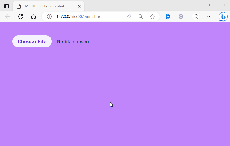
The above output shows that the file input button has been styled successfully and the user can choose and add the desired file.
Conclusion
To style the file input button in Tailwind, use the “file” modifier with other utility classes in the HTML program. It creates a custom file input button. It permits users to upload single or multiple files from their devices. Users can also modify the style according to the requirement. This article has explained the method to style the file input button in Tailwind.