This article will explain the method to set the flex-basis in Tailwind CSS.
How to Set Flex Basis in Tailwind?
To set the flex-basis in Tailwind CSS, make an HTML file. Then, use the “basis-<size>” utility class in the HTML program and specify the flex item size. This utility sets the initial size of the flex items. To ensure the changes, view the web page.
Look at the given-provided steps for a practical demonstration:
Step 1: Set Flex Basis in HTML Program
Make an HTML program and utilize the “basis-<size>” utility class to set the size of the flex item. For instance, we have used “basis-1/4”, “basis-1/3”, and “basis-1/2” utilities to set three flex items:
Here:
- “flex” class is used to create a flexible layout and adjust the child element’s sizes based on available space.
- “h-20” class sets the height of the <div> to 20 units.
- “basis-1/4” class sets the inner <div> element’s width to 25% of its parent element.
- “basis-1/3” class sets the width of the inner <div> to 33.33% of its parent container.
- “basis-1/2” class sets the <div>’s width to 50% of its parent container.
- “bg-red-400” class applies a red background color to the <div>.
- “bg-teal-400” class sets the teal color to the <div>’s background.
- “bg-orange-400” class applies the orange background color to the <div>.
- “m-1” class adds a margin of 1 unit around each <div> element.
Step 2: Verify Output
To ensure that the flex-basis has been set and working properly, view the HTML web page:
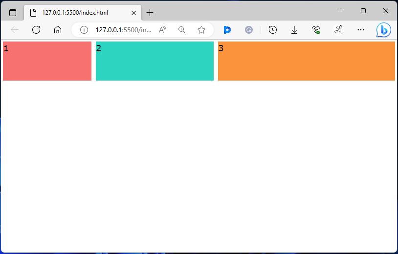
In the above output, the flex-basis can be seen according to which they were styled.
Conclusion
Flex basis enables users to create flexible layouts that adjust to various screen sizes and resolutions. To set the flex-basis in Tailwind CSS, the “basis-<size>” utility class is used in the HTML program. Users need to specify the flex item size and ensure the changes by viewing the web page. This article has explained the method to set the flex-basis in Tailwind CSS.