In Tailwind CSS, replaced elements are the elements whose content is replaced by an external resource, such as images and videos. Sometimes, users face a challenge to position a replaced element within the container. This is because these elements can overflow the container if their size is larger than the available space. Tailwind CSS provides utility classes to control how the content of a replaced element is positioned and aligned within the container.
This article will illustrate the method to position replaced elements within a container in Tailwind CSS.
How to Position Replaced Elements Within a Container in Tailwind?
To position replaced elements within a container in Tailwind, make an HTML program and use the “object-<position/side>” utilities with the desired elements. It is required to define the specific side i.e. left, right, or center in the “object-<position/side>” utility to position the replaced elements.
Syntax
Example
In this example, we will make a container and use all the “object-<position/side>” utilities with “<img>” (image) elements to specify their replaced position within the container:
<div class="bg-sky-300 grid grid-rows-3 grid-flow-col m-5 space-y-4 p-4 justify-between">
<img class="object-none object-left-top w-24 h-24 my-4" src= "https://cdn.pixabay.com/photo/2015/04/23/22/01/mountains-736886_1280.jpg">
<img class="object-none object-left w-24 h-24" src= "https://cdn.pixabay.com/photo/2015/04/23/22/01/mountains-736886_1280.jpg">
<img class="object-none object-left-bottom w-24 h-24" src= "https://cdn.pixabay.com/photo/2015/04/23/22/01/mountains-736886_1280.jpg">
<img class="object-none object-top w-24 h-24" src= "https://cdn.pixabay.com/photo/2015/04/23/22/01/mountains-736886_1280.jpg">
<img class="object-none object-center w-24 h-24" src= "https://cdn.pixabay.com/photo/2015/04/23/22/01/mountains-736886_1280.jpg">
<img class="object-none object-bottom w-24 h-24" src= "https://cdn.pixabay.com/photo/2015/04/23/22/01/mountains-736886_1280.jpg">
<img class="object-none object-right-top w-24 h-24" src= "https://cdn.pixabay.com/photo/2015/04/23/22/01/mountains-736886_1280.jpg">
<img class="object-none object-right w-24 h-24" src= "https://cdn.pixabay.com/photo/2015/04/23/22/01/mountains-736886_1280.jpg">
<img class="object-none object-right-bottom w-24 h-24" src= "https://cdn.pixabay.com/photo/2015/04/23/22/01/mountains-736886_1280.jpg">
</div>
</body>
Here, in the parent <div> element:
- “bg-sky-300” class sets the background color of the <div> container to sky.
- “grid” class enables a grid layout.
- “grid-rows-3” class sets the rows number in the grid to 3.
- “grid-flow-col” class defines the flow of grid items in columns.
- “m-5” class adds 5 units of margin around the container.
- “space-y-4” class adds a vertical spacing of 4 units between the child <img> elements within the container.
- “p-4” class adds 4 units of padding to the content inside the container.
- “justify-between” class aligns the child elements within the container and evenly distributes them.
In the <img> elements:
- “object-none” class does not apply any position to the element and displays the element at its default position in the container.
- “object-left-top” class positions the <img> element to its container’s top-left corner.
- “object-left” class aligns the element to the left edge of the container and keeps it vertically centered.
- “object-left-bottom” class positions the <img> element to the bottom-left corner of its container.
- “object-top” class positions the element at the top edge of its container and sets it horizontally centered.
- “object-center” class positions the element at the center of the container and keeps it horizontally and vertically centered.
- “object-bottom” class positions the element at the bottom edge of its container and keeps it horizontally centered.
- “object-right-top” class positions the <img> element to the container’s top-right corner.
- “object-right” class positions the element to the right edge of its container and keeps it vertically centered.
- “object-right-bottom” class positions the element to its container’s bottom-right corner.
Output
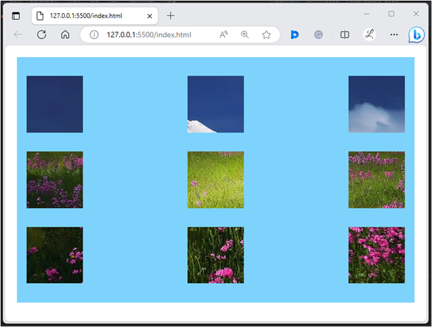
In the above web page, it can be observed that all the replaced element’s content has been positioned successfully.
Conclusion
To position replaced elements within a container in Tailwind, the “object-<position/side>” utilities are used with the desired elements, such as images. Users need to define the specific position or side i.e. left, right, or center in the “object-<position/side>” utility to position the replaced elements. This article has illustrated the method to position replaced elements within a container in Tailwind CSS.