This article demonstrates a practical demonstration to play/add multiple CSS animations at the same time.
How to Play Multiple CSS Animations at the Same Time?
By applying multiple CSS animations at the same time, the developers can easily create more engaging interfaces. To play many CSS animations at the same time, give each one a unique name and apply those names to the same or separate components on the page.
Follow the below procedure to play/add more than one animation at the same time.
Step 1: Creation of Structure
First, create an HTML element in which the animations get applied in upcoming steps. For instance, the image is going to be inserted:
In the above code snippet:
- First, the image path is set to the “src” attribute.
- Next, the value of “100px” is provided to the CSS “width” and “height” properties.
- Also, set the value of “animate” to the “class” attribute.
Step 2: Setting Up Animations
The “keyframes” are utilized to create custom animations according to the need of the webpage. For instance, two animations are created in below code snippet:
100% {
transform: rotate(180deg);
}
}
@-webkit-keyframes scale {
100% {
transform: scaleX(1) scaleY(1);
}
}
In the above code snippet:
- First, the “@-webkit-keyframes” mechanism is being utilized to set up “spin” and “rotate” named animations.
- Next, utilize the “transform” property which has a value of the “rotate()” in the “spin” animation body. This function rotates the element at an angle of “180deg”.
- After that, set the animation that grows or extends the original element by a factor of “1” in both the “X” and “Y” axis in the “scale” animation body.
Step 3: Applying Animation on HTML Elements
Inside the CSS portion, select the class “animate” which is assigned to the “<img>” tag, and provide the following CSS properties:
position: absolute;
left: 60%;
width: 110px;
height: 110px;
margin: -40px 0 0 -40px;
-webkit-animation: scale 3s infinite linear;
-webkit-animation: spin 2s infinite linear;
}
Description of the properties used in the above code block:
- First, set the value of “absolute” to the CSS “position” property. It aligns the “img” element according to the animation.
- Then, provide the values of “60%”, “110px” and “110px” to the CSS “left”, “width” and “height” properties. These properties are utilized to set the position and size of an element.
- After that, set the value of “scale 3s infinite linear” to the “-webkit-animation” CSS property.
- And the “3s” is the duration of that animation, the “infinite” is the duration of the animation, and the “linear” is the direction of the animation.
- In the end, provide the values of “spin 2s infinite linear” to the CSS “-webkit-animation” property. This property adds the second animation named “spin” on the “img” element.
After the compilation of the above code block, the animation looks like this:
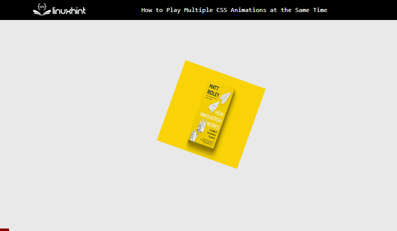
The above gif illustrates that only “spin” animation is playing on the targeted element.
Step 4: Playing Multiple Animations on HTML Elements
As in the above step, only one animation has been applied to the element. This is because multiple values have been assigned to the same “-webkit-animation” property.
To resolve this issue, wrap the target element with another HTML element. As the “div” is already used as a wrapper in the first step, select its “span” and update the code like:
position: absolute;
left: 60%;
width: 110px;
height: 110px;
margin:-40px 0 0 -40px;
-webkit-animation: scale 3s infinite linear;
}
.span {
position: relative;
top: 160px;
-webkit-animation: spin 2s infinite linear;
}
In the above code:
- At first, the “animate” class remains the same and only the second animation is removed from it which is placed in the “span” class.
- After that, set the position by utilizing the “position” and “top” properties.
After the execution of the above code snippet, the webpage now appears like this:
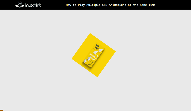
The output shows that both animations have been applied to the selected HTML element at the same time.
Conclusion
To apply multiple CSS properties, wrap the element with HTML elements and apply animations to them so that each HTML element holds a single animation. As the child property inherits the animation applied on the parent HTML element multiple animations get applied without causing errors or ambiguity for the compiler. That is the procedure to play/add more than one CSS animation at the same time.