This article will demonstrate how we can make a responsive table through CSS.
How to Make/Create a Responsive Table?
Creating a responsive table in HTML requires the use of the “overflow-x” property in the “<div>” element in which the “<table>” is created.
Syntax
The syntax to add the “overflow-x” property to make the table responsive is as follows:
Here, the “overflow-x” property adds the scroll bar to make the table responsive.
Prerequisite: Create a Table
Let’s create a table which is horizontally expanded in such a way that overflows the screen width by adding multiple “<th>” and “<td>” elements:
<div class="myclass">
<table>
<tr>
<th>Name</th>
<th>Standard</th>
<th>Score</th>
<th>Score</th>
<th>Score</th>
<th>Score</th>
<th>Score</th>
<th>Score</th>
<th>Score</th>
<th>Score</th>
<th>Score</th>
<th>Score</th>
<th>Score</th>
<th>Score</th>
<th>Score</th>
</tr>
<tr>
<td>Smith</td>
<td>8th</td>
<td>50</td>
<td>50</td>
<td>50</td>
<td>50</td>
<td>50</td>
<td>50</td>
<td>50</td>
<td>50</td>
<td>50</td>
<td>50</td>
<td>50</td>
<td>50</td>
<td>50</td>
</tr>
<tr>
<td>Jack</td>
<td>9th</td>
<td>70</td>
<td>70</td>
<td>70</td>
<td>70</td>
<td>70</td>
<td>70</td>
<td>70</td>
<td>70</td>
<td>70</td>
<td>70</td>
<td>70</td>
<td>70</td>
<td>70</td>
</tr>
<tr>
<td>John</td>
<td>10th</td>
<td>55</td>
<td>55</td>
<td>55</td>
<td>55</td>
<td>55</td>
<td>55</td>
<td>55</td>
<td>55</td>
<td>55</td>
<td>55</td>
<td>55</td>
<td>55</td>
<td>55</td>
</tr>
</table>
</div>
In the above HTML code snippet:
- An “<h2>” heading has been added with the text “Responsive Table”.
- A “<div>” container element is defined with the class declared as “myclass”.
- After that, a “<table>” element is added to create a table on the web page.
- Inside the “<table>” element, four “<tr>” elements have been added to make four rows of the table.
- Inside the first row, multiple “<th>” elements have been added that define the header content.
- Inside the second, third, and fourth row, the “<td>” elements have been added to insert the content in the table rows.
In the CSS style element, it is required to define the “overflow-x” property to make the table responsive. You can also add some other properties to make the table look more presentable:
{
overflow-x: auto;
}
table {
border-spacing: 0;
width: 100%;
border: 1px solid #ddd;
}
th, td
{
text-align: left;
padding: 8px;
}
tr:nth-child(even)
{
background-color: #f2f2f2;
}
In the above CSS style element:
- The class selector “.myclass” has been added that refers to the div container in which the table has been created.
- Inside it, the “overflow-x” property is defined with the value “auto”. This will create a horizontal scroll bar at the end of the table.
- After that, there is the table element selector that has the CSS properties defined inside it.
- The “border-spacing” property defines the spaces between the table cells as zero.
- The “width” property defined as “100%” expands the table in such a way that it covers the whole horizontal area of the screen.
- The “border” property sets the table border to “1px” here.
- After that, the “th” and “td” element selectors define properties for the table headings and the table cells.
- Inside it, there is the “text-align” property that aligns the content to the left side of the screen.
- The “padding” property defines the distance between the content and the border as “8px”.
- The “background-color” property is added with the background color defined in it for half of the rows of the table.
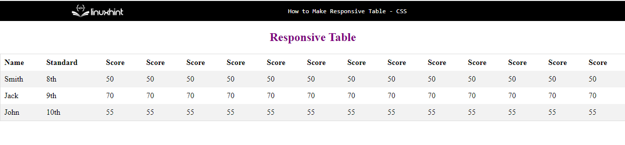
The above code will make a wide table in the output and the following will be the display:
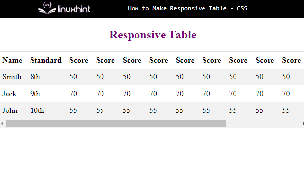
If the screen size is minimized in such a way that it overflows of borders of the screen, there will be a horizontal scroll bar displayed at the bottom because of the use of “overflow-x” property:
This concludes how to make responsive tables in HTML.
Conclusion
The responsive tables in HTML are created by adding the CSS “overflow-x” property for the div element in which the table is created. This property simply creates a horizontal scroll bar right at the end of the table that makes the table horizontally scrollable. This post demonstrated a useful method to make a simple table responsive.