This article will demonstrate the method for creating a flip card with CSS.
How to Make/Create a Flip Card Using CSS?
We will create a flip card that contains an image on the front side and its back comprising the image description.
Step 1: Create an HTML Page
First, add a div element with the name “flip-container”. This container will hold the flip card inside it. For this:
- Add a div element and assign it a class name as “flip-card”.
- Then, place two div elements with class names “font-side” and “back-side”, respectively.
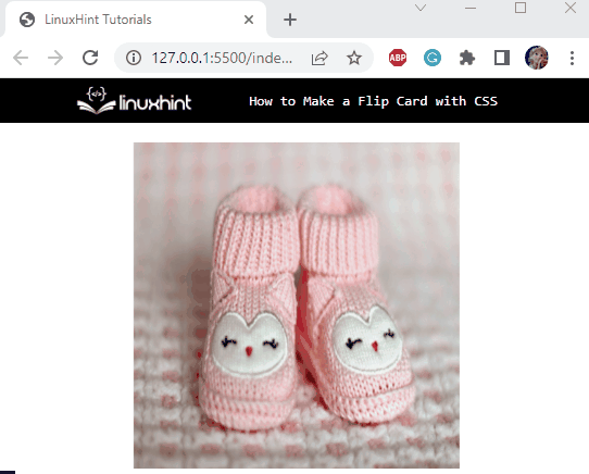
As we have discussed above, the front side will display an image, and the back side will contain the description of the image:
<div class="flip-card">
<div class="front-side">
<img src="/images/baby-pink-shoes.jpg" alt="baby step shoes" style="width: 300px; height: 300px;">
</div>
<div class="back-side">
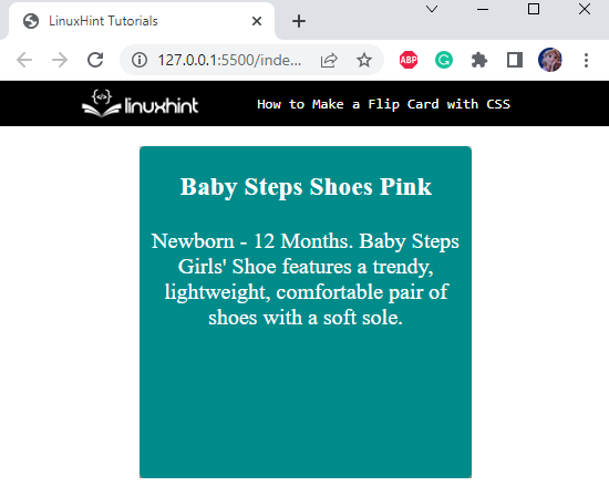
<h3>Baby Steps Shoes Pink</h3>
<p> Newborn - 12 Months. Baby Steps Girls' Shoe features a trendy, lightweight, comfortable pair of shoes with a soft sole.
</p>
</div>
</div>
</div>
Let’s apply CSS styling properties to the above-stated code.
Step 2: Style “flip-container” div
position: relative;
width: 300px;
height: 300px;
margin: auto;
}
The flip container is styled with the following CSS properties:
- “position” property is utilized for the setting of the element’s position. The value “relative” positions the element relative to its normal position.
- “height” property defines the height of the selected HTML element.
- “width” property signifies its width.
- “margin” property’s value indicates the space around the added element.
Step 3: Style “flip-card” div
position: absolute;
width: 100%;
height: 100%;
transform-style: preserve-3d;
transition: all 0.5s ease;
}
The “flip-card” div element is styled using the following CSS properties:
- “position” property with the value “absolute” positions the element relative to its positioned parent element.
- “transform-style” property is utilized to set the space of its child elements flat or 3D. The value “preserve-3d” specifies the 3D space of its children.
- “transition” property with the value “all 0.5s ease” indicates that “all” properties are applied with the transition duration of “0.5s”. The value “ease” specifies the transition effect to start as slow, then fast, and then move back to slow.
Step 4: Style “front-side” and “back-side” div Elements
.back-side {
position: absolute;
width: 100%;
height: 100%;
backface-visibility: hidden;
}
To hide the back face of the “back-side” div as well as the “front-side” div element, use the “backface-visibility” with the value “hidden”.
Step 5: Style “back-side” div
background: darkcyan;
color: #fff;
border-radius: 5px;
text-align: center;
font-size: 25px;
transform: rotateY(180deg);
}
The “back-side” div element holds the following CSS properties:
- “background” property sets the element’s background color.
- “color” property sets the element’s font color.
- “border-radius” property makes the element’s edges round.
- “font-size” property is utilized for specifying the element’s font size.
- “text-align” property’s value represents the alignment style of the added text.
So, the back side of the card will look like this:
When we hover over the card container, we want the card to rotate by 180 degrees, revealing the back side and hiding the front side. So, let’s rotate the back side by utilizing the CSS “transform” property.
- “transform” property is utilized to set the element’s transformation around the ordinates. The value “rotateY(180deg)” will rotate the element 180 degrees around the y-axis.
Here is our flip card:

Lastly, head over to add the hover effect to the card.
Step 6: Style “flip-card” div on hover
transform: rotateY(180deg);
}
The “.flip-container:hover” refers to the hover effect on the flip-container. When the mouse hovers over the “flip-container” div, the “flip-card” div will also rotate by 180 degrees. To do this, the CSS “transform” property with the value “rotateY(180deg)” is utilized.
So, here is the final result:
That was all about making a flip card with CSS.
Conclusion
The flip card is the common decorative component utilized in any web application. This card contains front and back sides. On hover, it flips and continuously changes its sides. This flip effect is added to it by utilizing the “transform” property with the value “rotateY()” function. This post has demonstrated the procedure to make a flip card with CSS.