This article will illustrate the method to make flex items grow and shrink in Tailwind CSS.
How to Make Flex Items Grow and Shrink in Tailwind?
To make the flex items grow and shrink in Tailwind, make the HTML file. Then, use the “flex-grow” and “flex-shrink” utilities with the desired flex items in the HTML program. These utilities allow flex items to grow or shrink according to the space within the flex container. Next, ensure changes by adjusting the screen size of the HTML web page.
Check out the provided steps for a practical demonstration:
Step 1: Make Flex Items Grow and Shrink in HTML Program
Make an HTML program and use the “flex-grow” and “flex-shrink” utilities with the desired flex items to make them grow or shrink:
Here:
- “flex” class applies flexbox behavior to the <div>.
- “h-20” sets the height of the <div> to be 20 units.
- “flex-grow” class allows the flex item to grow and occupy available space within the flex container.
- “flex-shrink” class allows the flex item to shrink if there is not enough space within the flex container.
- “w-40” sets the 40 units width to the flex item.
- “m-1” class adds a margin of 1 unit around each flex item.
Step 2: Verify Output
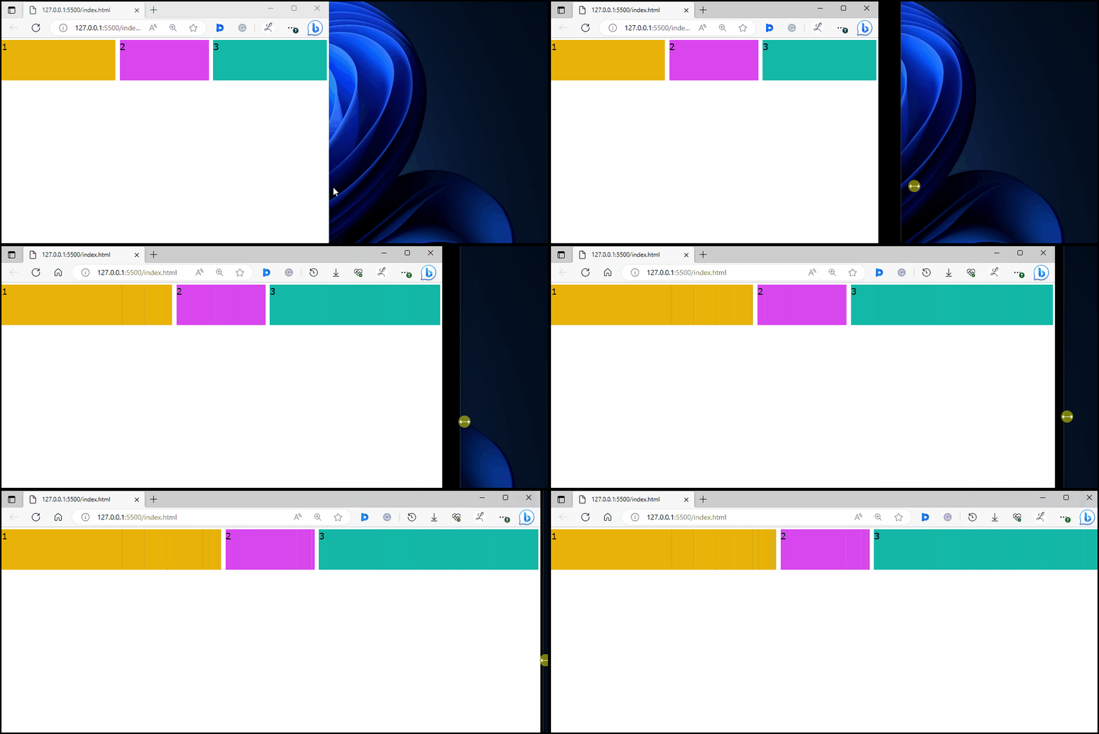
To ensure that the desired flex items have been set to grow and shrink, view the HTML web page by changing the screen size:
It can be seen that flex item “2” is the same while flex items “1” and “3” are growing with the screen size. It indicates that the flex items have been successfully set to grow and shrink.
Conclusion
To make the flex items grow and shrink in Tailwind, use the “flex-grow” and “flex-shrink” utilities with the desired flex items in the HTML program. To ensure changes, adjust the screen size of the HTML web page. This article has explained the method to make flex items grow and shrink in Tailwind CSS.

