While developing a web application, the developers always tend to implement the CSS styling properties effectively. CSS provides several styling properties, such as color, position, alignments, and many more. In addition to these properties, it permits us to set the animation action on elements. For this purpose, the “@keyframes” rules will be used.
This article will demonstrate how we can make blinking/flashing text with CSS.
How to Make Blinking Text With CSS?
To make the text blink, the CSS “opacity” property with the “@keyframes” rule can be applied. Check out the examples below.
Example 1: Make Blinking Text
In HTML, add a “<div>” element, and assign it a “blink-style” class. Next, add a “<h3>” element to specify a heading between the div element:
<h3>Linuxhint</h3>
</div>
Let’s move ahead to styling the HTML elements.
Style “blink-style” div
background: rgb(0, 0, 0);
}
The CSS “background” property is applied to the div element with the class “blink-style”.
Style “h3” Element
text-align: center;
font-family: Verdana;
color: #ffc310;
animation: blink-text 1.9s linear infinite;
font-size: 6em;
}
The HTML “<h3>” element is decorated with the following CSS properties:
- “text-align” property sets the alignment of the element’s text.
- “font-family” defines a font style for the text.
- “color” is used to color the element’s text.
- “animation” is the shorthand property that specifies the animation name, animation duration, animation-timing function, and animation-iteration-count property values.
- “font-size” property adjusts the font size mainly in “px” and “em” units.
Apply “@keyframe rule” to “blink-text” animation
0% {
opacity: 0;
}
50% {
opacity: 1;
}
100% {
opacity: 0;
}
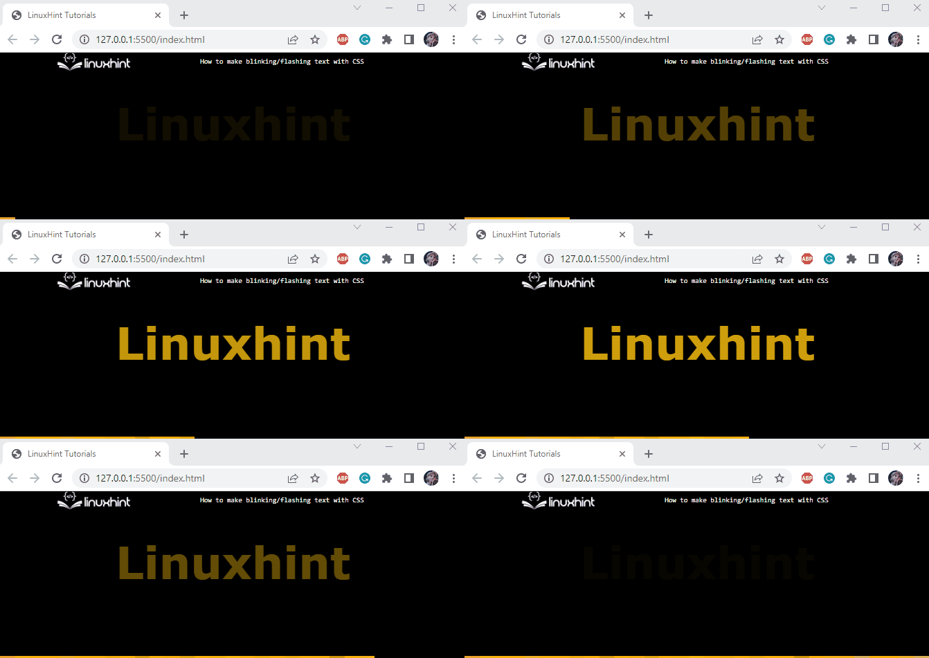
The animation name “blink-text” is specified in the animation property. The “@keyframe” rule is added before the animation name that signifies the animation behavior at different intervals as mentioned below:
- At “0%” animation, the text opacity is set as 0.
- At “50%” animation, the text opacity is set to 1.
- At “100%” animation, text opacity is set to 0.
Output
Example 2: Making Multiple Blinking Text
To make multiple blinking texts in the HTML, follow the below-given steps:
- First, place a “<div>” element and assign it a class “text-div”.
- Then, add two “<p>” elements to include some text.
- The first “<p>” element is assigned a class “flashing”.
- The second one is assigned two classes, “flashing” and “one”. Both classes are accessed in the CSS to declare styling properties:
<p class="flashing">Twinkle Twinkle</p>
<p class="flashing one">Little star *</p>
</div>
Now, check out the CSS section to style the HTML “<p>” elements.
Style “text-div” div
width: 400px;
margin: auto;
background-color: rgb(42, 49, 49);
padding: 8px;
}
The “.text-div” is used to access the <div> element. Within the curly brackets, the following CSS properties are applied to the “.text-div”:
- “width” property adjusts the element’s width.
- “margin” adds space around the element.
- “background-color” sets the background color.
- “padding” produces space within the element’s boundary.
Style “flashing” class
color: yellow;
font-size: 40px;
font-family: cursive;
font-weight: bold;
animation: flashing-style 0.6s linear infinite;
}
The “.flashing” is used to access the HTML <p> tags. The following properties are implemented in this class:
- “font-weight” indicates the thickness of the font.
- Other properties are explained in the above section.
Apply “@keyframe rule” to “flashing-style” animation
0% {
opacity: 0;
}
}
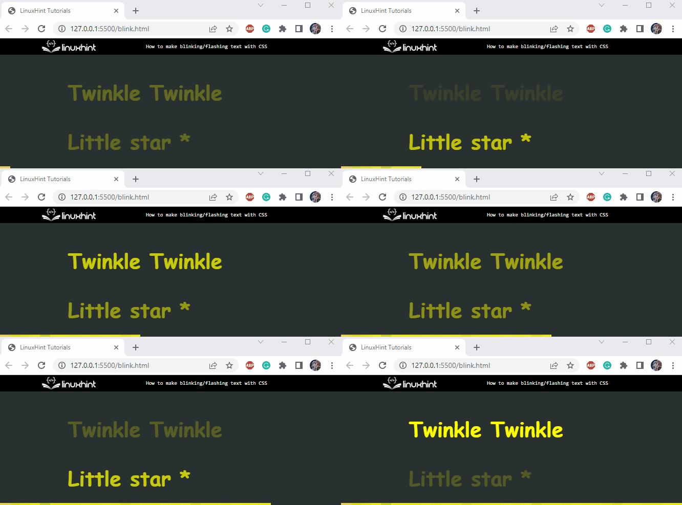
Adjust the behavior of “flashing-style” animation using the “@keyframe” rules. At the start of the animation, the text opacity will be 0, indicating the elements’ complete transparency level.
To make the animation on the second “<p>” element slightly different, the class “one” is declared with the following animation styles:
Style “one” class
animation: one 1s linear infinite;
}
@keyframes one {
50% {
opacity: 0;
}
}
Output
We have effectively learned how to make the blinking text using different CSS styling properties.
Conclusion
In HTML, several CSS properties are utilized to make the text style blinking. The “animation” and “opacity” properties are commonly defined in this context. To adjust the blinking behavior, the “@keyframe” rule is declared for an animation property. This article has explained how to make blinking or flashing text in HTML using CSS.


