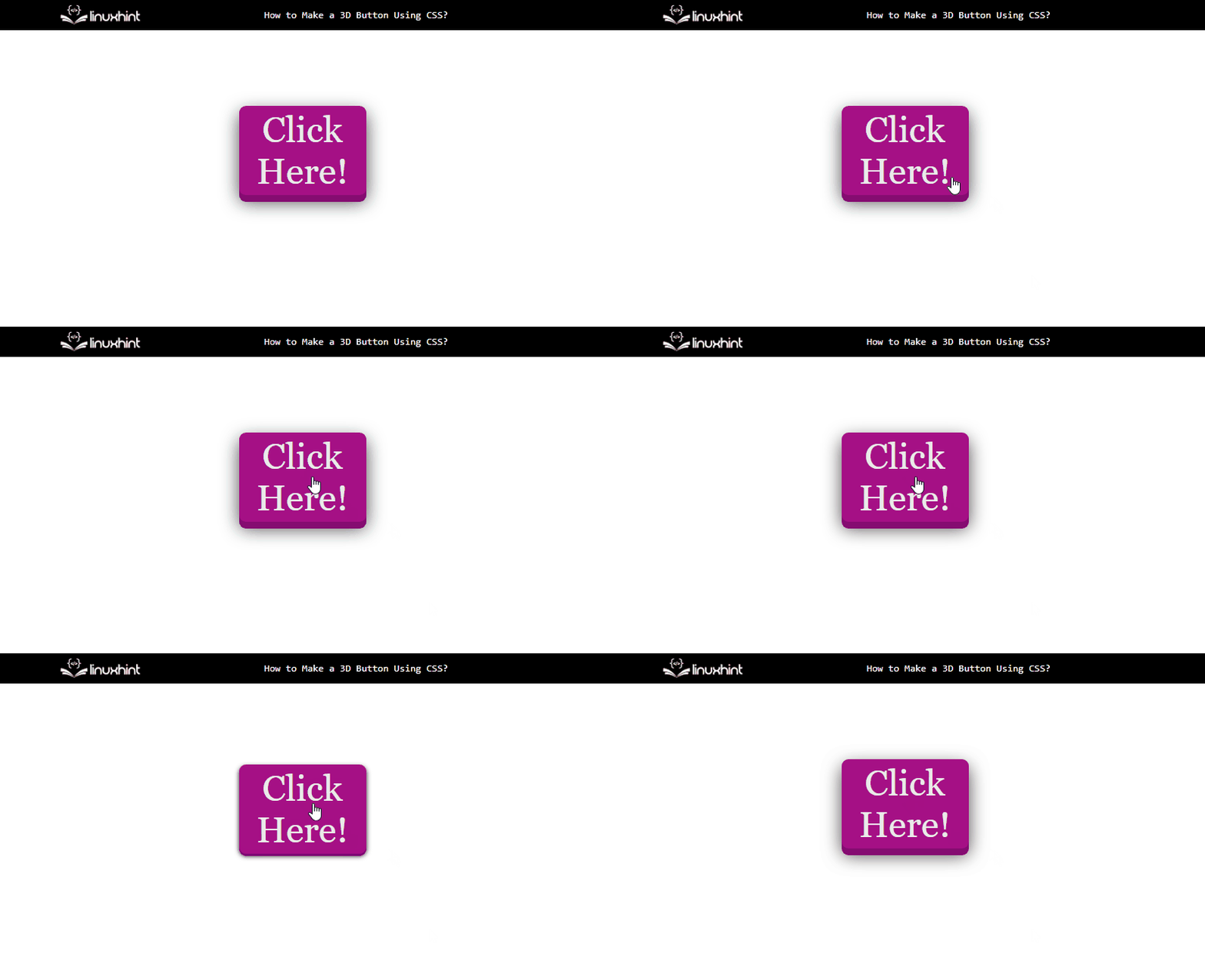
Let’s discuss how a 3D button is created and added to a web page through CSS styling.
Creating a 3D Button Using CSS
Let’s add a simple example of creating a 3D button in HTML using CSS styling properties. Start by creating an anchor tag with the href attribute equal to the “javascript: void(0)” function to create a simple clickable button:
The <a> tag created has an href attribute containing the “javascript: void(0)” function. This function changes the shape of the cursor when it is pointed at the button. Between the opening and closing anchor tags is the text to be displayed on the button “Click Here”.
Now, it is required to style the simple button through the CSS styling properties to create a three-dimensional display:
Add some text decoration properties for the text to be displayed on the button:
text-decoration: none;
background-color: rgb(165, 16, 133);
font-family: Georgia, 'Times New Roman', Times, serif;
font-size: 3em;
display: block;
Then, there add some “web kit” properties to add shadow effects and radius to the button:
-webkit-box-shadow: 0px 9px 0px rgb(114, 19, 98), 0px 9px 25px rgba(0, 0, 0, .7);
-moz-box-shadow: 0px 9px 0px rgb(126, 22, 108), 0px 9px 25px rgba(0, 0, 0, .7);
box-shadow: 0px 9px 0px rgb(133, 12, 113), 0px 9px 25px rgba(0, 0, 0, .7);
The button should also be decorated with respect to its area, margin, and padding, etc:
width: 160px;
text-align: center;
padding: 4px;
To add shadow effects to the button when it is active or clicked, there is a CSS “:active” selector:
-webkit-box-shadow: 0px 3px 0px rgb(102, 27, 96), 0px 3px 6px rgba(0, 0, 0, .9);
-moz-box-shadow: 0px 3px 0px rgb(112, 27, 91), 0px 3px 6px rgba(0, 0, 0, .9);
box-shadow: 0px 3px 0px rgb(126, 8, 116), 0px 3px 6px rgba(0, 0, 0, .9);
position: relative;
top: 7px;
}
The complete code snippet for creating the button is as following:
text-decoration: none;
background-color: rgb(165, 16, 133);
font-family: Georgia, 'Times New Roman', Times, serif;
font-size: 3em;
display: block;
padding: 4px;
-webkit-border-radius: 9px;
-webkit-box-shadow: 0px 9px 0px rgb(114, 19, 98), 0px 9px 25px rgba(0, 0, 0, .7);
-moz-box-shadow: 0px 9px 0px rgb(126, 22, 108), 0px 9px 25px rgba(0, 0, 0, .7);
box-shadow: 0px 9px 0px rgb(133, 12, 113), 0px 9px 25px rgba(0, 0, 0, .7);
margin: 100px auto;
width: 160px;
text-align: center;
a:active {
-webkit-box-shadow: 0px 3px 0px rgb(102, 27, 96), 0px 3px 6px rgba(0, 0, 0, .9);
-moz-box-shadow: 0px 3px 0px rgb(112, 27, 91), 0px 3px 6px rgba(0, 0, 0, .9);
box-shadow: 0px 3px 0px rgb(126, 8, 116), 0px 3px 6px rgba(0, 0, 0, .9);
position: relative;
top: 7px;
}
After running the above code, the following will be the output:
This sums up the method to create a 3D button using CSS.
Conclusion
Making a clickable 3D button through the CSS styling property requires creating a simple button through an HTML tag first and then applying CSS web kit properties along with other properties referring to the HTML tag through which the button has been created. This makes the button look three-dimensional. To add the effects to the button for the instance when the button is clicked or active, use the CSS active selector.

