The write-up will discuss different methods for having images and text side by side in HTML.
Prerequisite: Create an HTML File
Before moving to the main subject of the post, follow the below-given instructions for creating an HTML file:
- Add a “<div>” element and name its class “linux-details”.
- Add two “<div>” child elements within the main “<div>” for image and text respectively. Assign the “<img>” tag a class “linux-img” and the “<p>” tag with the class “text”.
- Adjust the font size “<p>” tag by utilizing the “font-size” property.
- Include some text within the “<p>” tag.
HTML
Method 1: How to Have Image and Text Side by Side Using “float” Property?
The CSS “float” property is utilized to determine the element’s position, whether it is floated left or right or none. A floated element will be surrounded by the elements next to it.
Style “linux-details” class
To do so, first, style the “linux-details” class by assigning the following properties:
width: 80%;
padding: 1%;
}
The “.linux-details” is used to access the created container. This class is then applied with the below-explained properties:
- “width” determines the <div> element’s width.
- “padding” allocates space around the content of the element.
Style “linux-img” class
The CSS “float” property is added within the “linux-img” class to adjust the image position:
height: 150px;
width: 150px;
margin-left: 30%;
float: left;
}
Here:
- “height” adjusts the element’s height.
- “margin-left” adds some space to the left side of the element.
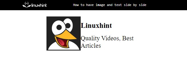
- “float” property with the value “left” floats the image at the left. As a result, the text content next to it will be placed after it.
Output

Method 2: How to Have Image and Text Side by Side Using “grid” Property?
The CSS “grid” property provides a simpler way to design a website layout providing rows and columns.
Style “linux-details” class
Now, the “grid” property is placed within the “linux-details” class:
display: grid;
align-items: center;
grid-template-columns: 1fr 1fr;
column-gap: 5px;
}
The “linux-details” class is assigned the following properties:
- “display” property with the value assigned as “grid” provides a layout containing rows and columns.
- “align-items” with the value “center” placed is used to place the element in the center.
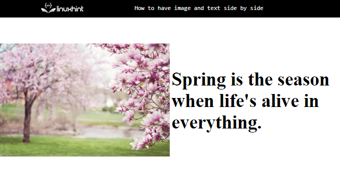
- “grid-template-columns” property with the value “1fr 1fr” provides two columns of one fraction each.
- “column-gap” property adds space between the columns.
Style “img” Element
max-width: 100%;
max-height: 100%;
}
The “<img>” element is provided the below-mentioned properties:
- “max-width” property determines the element’s maximum width.
- “max-height” defines the element’s maximum height.
Output

Method 3: How to Have Image and Text Side by Side Using “flex” Property?
The CSS “flex” property places the elements in a row (by default).
Style “linux-details” class
display: flex;
align-items: center;
justify-content: center;
padding: 5%;
}
Here is the explanation of the properties mentioned above:
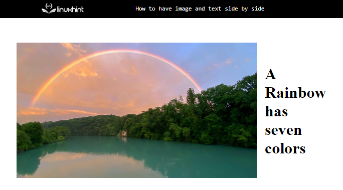
- “display” property with the value “flex” will place the “<div>” element’s content in a row.
- “align-items” aligns the flexible items vertically.
- “justify-content” sets the flexible item’s alignment horizontally.
Style “text” class
font-size: 20px;
padding-left: 20px;
}
The “text” class is styled by utilizing the following properties:
- “font-size” property sets the size of the font.
- “padding-left” adds space at the left of the text.
Output

That was all about having an image and text side by side using different properties.
Conclusion
Several properties can be utilized to place an image and text side by side on a website. The most commonly used properties are “float”, “grid”, and “flex”. To do so, create a “<div>” container. Add two more “<div>” elements for the image and text. Then, apply one of the mentioned properties to the main “<div>” tag for the image and text position adjustments. This blog has explained various properties for placing an image and text side by side.
