Tailwind is a CSS framework that has a broad range of utility classes that can be efficiently utilized to create custom designs. It enables users to create plugins to extend Tailwind’s functionality and add their utilities, components, or variants. Plugins are used to customize and enhance Tailwind’s default utility classes or add new utility classes altogether. They can also be used to define custom variants, add new components, or introduce custom utilities.
This article will describe the procedure of creating a plugin in Tailwind CSS.
How to Create Plugins in Tailwind?
To create plugins, use the “tailwindcss/plugin” module in the “tailwind.config.js” file and export desired functions that take the Tailwind config as an argument. Then, add the “plugins” section, use the “plugin()” function, and pass the desired plugin functions as an argument. Next, configure the required plugins. After that, use the created plugins in the HTML program and view the web page.
Step 1: Configure Plugins in the “tailwind.config.js” File
Open the “tailwind.config.js” file and use the “tailwindcss/plugin” module. Then, add the “plugins” section, and configure the desired plugins in it. For instance, we have configured the following plugins:
const plugin = require('tailwindcss/plugin')
module.exports = {
content: ["./index.html"],
plugins: [
plugin(function ({ addBase, addComponents, addUtilities}) {
//adding base
addBase({
'h1': {
fontSize: theme('fontSize.3xl'),
},
'h2': {
fontSize: theme('fontSize.2xl'),
},
})
//adding components
addComponents({
'.card': {
borderRadius: theme('borderRadius.lg'),
backgroundColor: theme('colors.white'),
padding: theme('spacing.6'),
boxShadow: theme('boxShadow.xl'),
},
'.btn-blue': {
backgroundColor: 'blue',
color: '#fff',
padding: '10px 20px',
display: 'inline-block',
borderRadius: '4px',
'&:hover': {
backgroundColor: '#2779bd'
},
},
})
//adding utilities
addUtilities({
'.content-auto': {
contentVisibility: 'auto',
},
'.bg-coral': {
background: 'coral'
},
'.skew-5deg': {
transform: 'skewY(-5deg)',
},
})
})
]
};
Here:
- The “plugins” array contains a custom plugin defined using the plugin function. It has three functions as parameters i.e., “addBase”, “addComponents” and “addUtilities”.
- The “addBase()” function is used to add base styles to the document. In our case, it adds styles for h1 and h2 elements and sets their font sizes based on the theme values “theme(‘fontSize.3xl’” and “theme(‘fontSize.2xl’)”.
- The “addComponents()” function is utilized to add new component styles. In this case, it adds styles for the “.card” and “.btn-blue” classes.
- The “.card” class defines styles for a card component with properties like background color, border radius, padding, and box-shadow.
- The “btn-blue” class sets styles for a button with a blue background color, white text color, padding, display, border radius, and a hover effect.
- The “addUtilities()” function is used to add utility classes that can be added and used directly in the HTML program. In this case, it adds utility classes like “content-auto”, “bg-coral”, and “skew-5deg”.
- The “content-auto” class sets the contentVisibility property to auto.
- The “bg-coral” class sets the background color to coral.
- The “skew-5deg” class applies a skew transformation with a skew angle of -5 degrees.
Step 2: Utilize the Created Plugins in HTML Program
Now, use the configured plugins in the HTML program:
Step 3: Verify Output
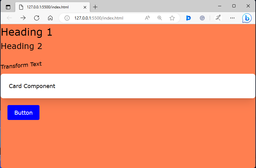
Ensure that the created plugins are working properly by viewing the HTML web page:
The above output indicates that the created plugins are working successfully.
Conclusion
To create a plugin, use the “tailwindcss/plugin” module in the “tailwind.config.js” file. Then, add the “plugins” section, and utilize the “plugin()” function. After that, pass the desired plugin functions as an argument. In the end, configure the required plugins and utilize them in the HTML program. This article has illustrated the method of creating a plugin in Tailwind CSS.

