The “two-column” layout design pattern divided the webpage into two columns to display the content side by side. In the design sense, the left column usually contains navigation and related content is displayed on the right-side column, but it is not compulsory. The developers utilize it to improve readability, allow minimum space consumption, and help in creating a visual hierarchy of the page.
This blog demonstrates different methods by which a two-column layout can be created:
How Can I Create a Two Column Layout?
The two-column layout in web design helps developers in arranging the content on a webpage in a visually appealing and easy-to-read manner. It is mostly utilized to organize content into distinct sections or to balance the visual weight of a page. The two-column layout can be seen on News websites, E-commerce websites, Blogs, and Business websites.
Let us visit some methods by which the two-column layout can be generated:
Method 1: Using Float Property
The CSS “float” property is used for the movement of HTML elements in the left or right direction. It plays a vital role in the creation of responsive designs and in positioning the element on the webpage. In the below code snippets, the “float” property is utilized along with other CSS properties to create two column layouts:
<div class="twoColumnLayout" style="background-color: forestgreen;">
Add dummy data for the Column one Section
</div>
<div class="twoColumnLayout" style="background-color: teal; ">
Add dummy data for the Column two Section
</div>
</div>
The explanation of the above code block:
- At first, the root “div” element is created and a class of “createTwoColumn” is assigned to it.
- Next, create two nested “div” elements having a class of “twoColumnLayout” along with dummy data. These divs act like two columns when rendered on the web browser.
- After that, assign different “background-color” properties to both “div” elements for visual separation.
Now, utilize the CSS properties for setting up the two-column layout:
width: 100%;
}
.twoColumnLayout {
width:100%;
color: white;
}
@media (min-width: 768px) {
.twoColumnLayout {
width: 50%;
float:left;
}
.createTwoColumn {
content: "";
display: table;
clear: both;
}
}
The description of above used CSS properties:
- First, the root “createTwoColumn” class is selected and the value of “100%” is provided to the CSS “width” property. This occupies all the horizontal space of the webpage.
- Next, the same property and value are provided to the child “div” elements.
- After that, the media query is utilized to apply styles if the viewport increases from “768” pixels.
- Inside it, set “50%” as a value to the “width” property. And move the element toward the “left” side to display both child elements side by side.
- After that, select the child div elements and set the value of “table” and “both” to the “display” and “clear” CSS properties.
After the end of the compilation phase, the HTML elements work like this:
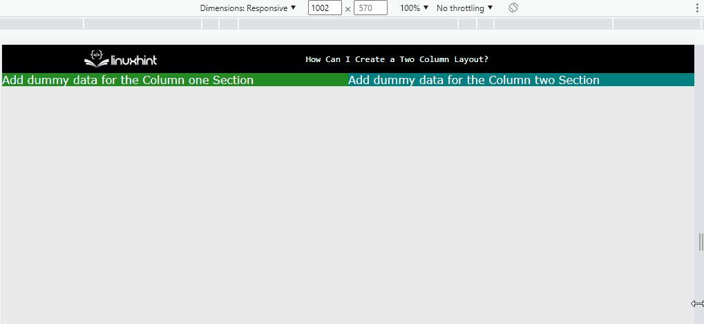
The GIF shows that a responsive two-column layout has been created.
Method 2: Using Flex Layout
The “flex” layout is the best choice while the creation of dynamic and responsive layouts. That is why the flex layout can be utilized for the creation of a “two-column” layout on the webpage. Visit the below code snippet:
display: flex;
flex-direction: row;
flex-wrap: wrap;
width: 100%;
}
.twoColumnLayout {
flex: 50%;
}
In the above code snippet:
- First, the “root” class named “createTwoColumn” is selected and the value of “flex” is provided to the “display” property to create a flex layout.
- Next, set the values of “row” and “wrap” to the “flex-direction” and “flex-wrap” CSS properties to set the direction of the flexbox layout.
- In addition, set the “100%” width of the flexbox.
- After that, select the “twoColumnLayout” class and provide the value of “50%” to the CSS “flex” property. It occupies half of the space when the screen dimensions decrease.
After the end of the compilation process:
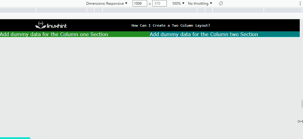
The output shows that a responsive two-column layout has been created using Flexbox.
Method 3: Using Grid Layout
The “Grid” layout is another powerful method that uses a combination of rows and columns to create responsive and dynamic web pages. It occupies comparatively less code in contrast with the flexbox layout. Visit the below code snippet to create two column layouts using the grid method:
display: grid;
grid-template-columns: 50% 50%;
}
In the above code snippet:
- At first, the “grid” value is passed to CSS “display” property to create a grid layout.
- Next, set the value of “50%” to the CSS “grid-template-columns” property. In this way, both columns in the two-column layout consume the same space.
After the code execution, the display is like as below:
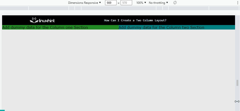
The above gif shows that the responsive two-column layout has been created using Grid Layout.
Conclusion
Two column layouts can be created using the “float” property, “flexbox” layout, and “grid” layout. For the float property, initially the width of “100%” is provided to both columns. And inside the media query, the viewport increases the width by “50%”. For Flexbox, a simple flexbox layout is created in the direction of “row” having the width of the child element set to “50%”. For the grid, the value of “50%” is assigned to the CSS “grid-template-columns” property.