This article will demonstrate the method to apply the hover effect on the row grid in Tailwind CSS.
How to Apply Hover on Row Grid in Tailwind?
To apply the hover effect on the row grid in Tailwind, make an HTML file and use the “hover” class with the “grid-rows-<value>” utility in the HTML program. It changes the number of rows when the mouse hovers over the rows grid. After that, view the web HTML page and hover the mouse on grid items to ensure changes.
Check out the given-provided steps for practical implementation:
Step 1: Use Hover Property With the Row Grid in HTML Program
Create an HTML program and use the “hover” property with the “grid-rows-<value>” utility. For instance, we have used the “hover:grid-rows-5” class to change the number of rows on hover:
<div class="grid grid-rows-3 hover:grid-rows-5 grid-flow-col gap-3 m-3 text-center">
<div class="bg-teal-500 p-5">1</div>
<div class="bg-teal-500 p-5">2</div>
<div class="bg-teal-500 p-5">3</div>
<div class="bg-teal-500 p-5">4</div>
<div class="bg-teal-500 p-5">5</div>
<div class="bg-teal-500 p-5">6</div>
<div class="bg-teal-500 p-5">7</div>
<div class="bg-teal-500 p-5">8</div>
<div class="bg-teal-500 p-5">9</div>
<div class="bg-teal-500 p-5">10</div>
</div>
</body>
Here, in the parent <div> element:
- “grid” class is utilized to create a grid layout.
- “grid-rows-3” class specifies that the grid should have 3 equally sized rows.
- “hover:grid-rows-5” class changes the grid into 5 equal-sized rows when a mouse hovers over it.
- “grid-flow-col” class places the grid items horizontally in columns.
- “gap-3” class sets a spacing of 3 units between each grid item.
- “m-3” class applies a margin of 3 units around the grid container.
- “text-center” class sets the text of each grid item to the center.
In the child <div> elements:
- “<div>” represents the number of grid items.
- “bg-teal-500” class sets the teal color to the background of grid items.
- “p-5” class adds a padding of 5 units to the content inside the child <div> items.
Step 2: Verify Output
To verify that the hover effect has been applied on the row grid, view the web page, and move the mouse over the grid items:
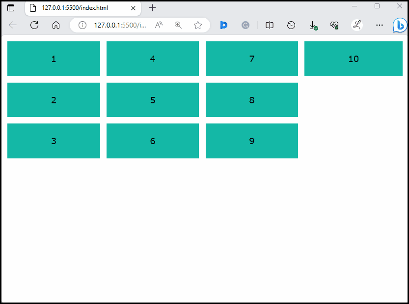
It can be observed that initially there are 3 rows and when the mouse hovers over it, the number of rows has changed to 5. This indicates that the hover effect has been applied successfully on the row grid.
Conclusion
To apply the hover effect on the row grid in Tailwind, utilize the “hover” class with the “grid-rows-<value>” utility in the HTML program. It changes the number of rows on hover. To ensure changes, view the web HTML page and hover the mouse on grid items. This article has illustrated the method to apply the hover effect on the rows grid in Tailwind CSS.