This article will demonstrate the method to apply breakpoints and media queries on the column grid in Tailwind CSS
How to Apply Breakpoints and Media Queries on Column Grid in Tailwind?
To apply breakpoints and media queries on the column grid in Tailwind, make an HTML program. Then, define the number of columns for various screen sizes using the “sm”, “md” or “lg” breakpoints with the “grid-cols-<value>” utilities. Next, adjust the screen size of the web page to ensure changes.
Follow the below-mentioned steps for its practical implementation:
Step 1: Use Breakpoints and Media Queries With Column Grid in HTML Program
Create an HTML program and define the number of columns for different screen sizes with the “grid-cols-<value>” utility. For instance, we have used the “md” breakpoint with the “grid-cols-5” utility and “lg” breakpoints with the “grid-cols-6” utilities to change the number of columns on various screen sizes:
<div class="grid grid-cols-3 md:grid-cols-5 lg:grid-cols-6 gap-3 m-3 text-center">
<div class="bg-teal-500 p-5">1</div>
<div class="bg-teal-500 p-5">2</div>
<div class="bg-teal-500 p-5">3</div>
<div class="bg-teal-500 p-5">4</div>
<div class="bg-teal-500 p-5">5</div>
<div class="bg-teal-500 p-5">6</div>
<div class="bg-teal-500 p-5">7</div>
<div class="bg-teal-500 p-5">8</div>
<div class="bg-teal-500 p-5">9</div>
<div class="bg-teal-500 p-5">10</div>
</div>
</body>
Here:
- “grid” class is used to create a grid layout.
- “grid-cols-3” class specifies that the grid should have 3 equally sized columns.
- “md:grid-cols-5” class changes the grid into 5 equal-sized columns on medium screen size.
- “lg:grid-cols-6” class changes the grid into 6 equal-sized columns on the large screen size.
- “gap-3” class applies a spacing of 3 units between each grid item.
- “m-3” class sets a margin of 3 units around the grid container.
- “text-center” class sets the text of each grid item to the center.
- “bg-teal-500” class sets the teal color to the background of grid items.
- “p-5” class adds a padding of 5 units to the content inside the child
items.
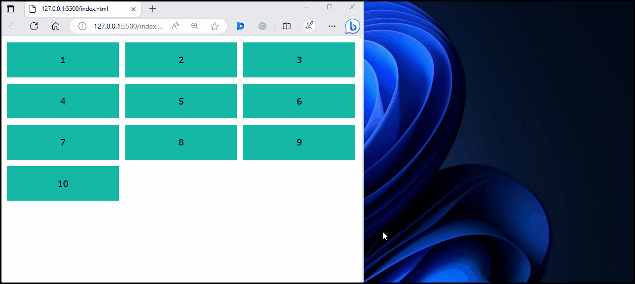
Step 2: Verify Output
View the HTML web page and change the screen size to ensure that the breakpoints and media queries have been applied on the column grid:
In the above web page, it can be observed that the number of columns changes with the screen size. This indicates that the breakpoints and media queries have been applied on the column grid successfully.
Conclusion
To apply breakpoints and media queries on the column grid in Tailwind, specify the number of columns for various screen sizes using the “sm”, “md” or “lg” breakpoints with the “grid-cols-<value>” utilities. Verify changes on the web page by changing the screen size. This article has demonstrated the method to apply breakpoints and media queries on the column grid in Tailwind CSS.
About the author
Laiba Younas
I have done bachelors in Computer Science. Being passionate about learning new technologies, I am interested in exploring different programming languages and sharing my experience with the world.