This article will guide you on how to add datepicker in form using HTML.
How to Add Datepicker in form Using HTML?
The syntax to add a datepicker in the form is given as follows:
Here, both the input field type and id are set as “date”.
Example: Adding a Datepicker in form Using HTML
In the HTML file, add a div element with the “main-content” class name. Within this div:
- Add another div with the “form-content” class.
- Then, add an HTML <form> element that holds the input fields for name and date of birth.
- The label element surrounds these input fields.
- <br> tags are specified to add line breaks.
- Lastly, add <button> element to create a button on the form:
Now, move on to the CSS section to style the elements.
Style “body” Element
background-color: #7D6E83;
}
The body section is applied with the “background-color” property to set its background color.
Style “main-content” div
background-color: #DFD3C3;
width: 450px;
height: 300px;
padding: 8px;
padding-top: 5px;
border-radius: 10px;
margin: auto;
font-size: 18px;
}
The “.main-content” refers to the div main-content. Below are the properties applied to it:
- “background-color” property sets the element’s background color.
- “width” property sets the element’s width.
- “height” property sets the element’s height.
- “padding” property sets space around the element’s content or inside the border.
- “padding-top” property adds space to the top of the element’s content.
- “border-radius” property makes the element’s edges round.
- “margin” property adds space around the element.
- “font-size” property is utilized to set the font size.
Style “form-content” div
width: 400px;
margin: 70px auto;
}
Style “input” Element
padding: 5px;
margin: auto;
width: 250px;
}
Style “button” Element
width: 260px;
padding: 10px;
background-color: #7D6E83;
border-radius: 8px;
color: floralwhite;
font-size: 20px;
box-shadow: 1px 1px 1px 1px gray;
transition: all 0.3s ease;
}
The styling properties applied to the <button> element are explained below:
- “color” property specifies the font color.
- “box-shadow” property applies the shadow on the element having values for x-offset, y-offset, blur, spread, and color.
- “transition” property is utilized to change the element’s properties smoothly. It specifies the property values to which it is applied, its duration, and its type. In our case, “ease” is used to specify the element’s transition to start slowly, then fast, and slow at the end.
Style the “button” Element on “hover”
transform: translate(3px, 3px);
}
The button applied with the “transform” property with the value set as “translate(3px, 3px)” will move the element in the x-axis and y-axis ordinates.
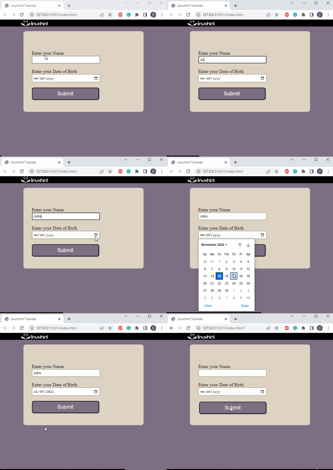
Here is the final look of the form:
It can be observed that the datepicker has been successfully added to the form.
Conclusion
A datepicker is associated with the date input fields where the user can select a date. It provides a user with ease. To do so, input elements are associated with the attribute “date” type, like this “ <input type=”date” id=”date”>. This post has demonstrated how to add a datepicker in form using HTML.

