This article demonstrates the step-by-step procedure for adding a border to a CSS triangle.
How to Add Border to CSS Triangle?
The best way which is going to be demonstrated is by the usage of “:before” or “:after” CSS selectors. These selectors create a copy of the triangle which can be placed before or after the actual triangle and by changing the color of the new one.
Visit the below step-by-step approach for a better demonstration:
Step 1: Creation of Triangle
Suppose the div is already created inside the “<body>” tag of the HTML file. And that div has a value of “triangle-border” to its “class” attribute. Now, apply the following CSS properties to that CSS class:
position: relative;
width: 0;
height: 0;
left: 85px;
border-style: solid;
border-width: 0 100px 100px 100px;
border-color: transparent transparent #000 transparent;
}
In the above code snippet:
- Set the value of “relative” and “85px” to the CSS “position” and “left” properties. It sets the position of the div on the webpage.
- Next, provide the values of “0” for both the “height” and “width” properties to create a triangle space.
- Also, set the “solid” as a value for the “border-style” property to declare the type of border going to be displayed or created.
- After that, set the value of “0” to the border width from the top position and “100px” to the left, right and bottom sides. This creates a structure of the triangle on the webpage.
- In the end, set the value of “transparent” to all sides except the left side and provide it with a value of black to the “border-color” property. This makes the triangle visible on the webpage.
After the execution of the above code snippet:
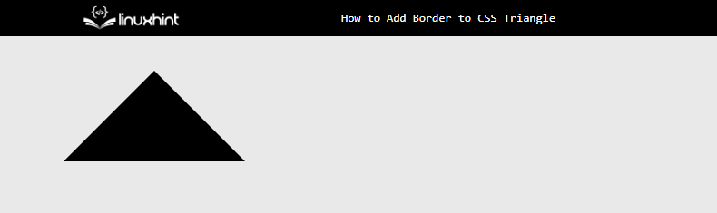
The output shows that the triangle has been created.
Step 2: Adding Border to Triangle Using CSS Selector
After the creation of the triangle shape on the webpage. Now, attach the “:before” selector with the “triangle-border” class and set the following CSS properties:
content: '';
position: absolute;
left: -120px;
top: -12px;
width: 0;
z-index: -1;
height: 0;
border-style: solid;
border-width: 0 120px 120px 120px;
border-color: transparent transparent teal transparent;
}
In the above code snippet:
- First, the empty value is provided to the “content” property and the “absolute” value is set to the “position” property.
- Next, utilize the “left” and “top” properties according to your webpage design. They are utilized to position the div on top of the previously created div.
- After that, utilize the same properties that are used in the above step for the creation of a triangle such as the “border-style”,”border-width”, and “border-color” properties.
After the execution of the above code snippet, the webpage appears like this:
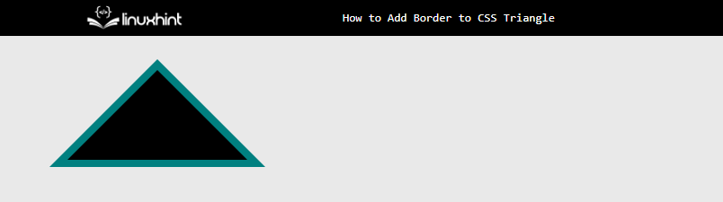
The above snapshot of the webpage shows that the border of the “teal” color has been added to the triangle.
Conclusion
To add a border to the CSS triangle, utilize the “:before” or “:after” CSS selectors. After that, utilize the “border-color” property and provide only color to the “left” side and “transparent” to all remaining sides. After the creation of the triangle, use the CSS “:before” selector and place it on the backside of the previously generated triangle using the “left”, “top” and “z-index” properties. This article has demonstrated the procedure to add a border to the CSS Triangle.