This article demonstrates the possible methods to create a panel in HTML.
How to Create a Panel in HTML Using CSS?
In HTML, a panel is easy to create a consistent look for the users. Follow the below detailed steps and explore them:
Step 1: Creating a Basic Panel
In the HTML file, create a div element, and assign it a class or id. After that add some text that displays on the panel:
Next, select the div class and add the following CSS properties:
padding: 20px;
margin: 20px;
border: 1px solid gray;
background-color: lightcyan;
text-align: center;
}
The output of the above code is displayed as
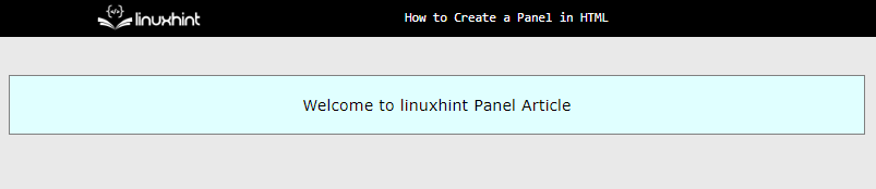
The output illustrates that the panel is displayed perfectly.
Step 2: Create a Panel Containing Button Element
Sometimes, a panel contains some call-to-action elements like a button. To add a button in the panel, follow the below code:
In the HTML file, create a div element and assign it a class or id. Inside the div, create some HTML elements “<h2>”, “<p>”, and “<button>” tags.
Step 3: Apply Custom CSS Properties
After the creation of the structure, select the “<div>”, “<h2>”, “<p>”, and “<button>” tags and apply custom CSS properties:
padding: 20px;
margin: 20px;
border: 1px solid gray;
background-color: lightcyan;
text-align: center;
}
.panelContainer h2 {
font-size: 24px;
font-weight: bold;
}
.panelContainer p {
font-size: 16px;
}
.panelContainer button {
background-color: #007bff;
color: #fff;
padding: 10px 20px;
border: none;
border-radius: 4px;
font-size: 16px;
cursor: pointer;
}
In CSS, “padding” creates a space between the content and the border of that element. After that, style the button element by setting its color, background, font size, etc. These CSS properties are utilized only to enhance user visibility and to make a website more appealing.
After executing the above code snippet, the output looks like this:
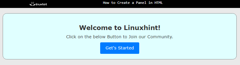
The output confirms that the panel is displayed and contains a “button” element in it.
How to Create a Panel Using Bootstrap?
Bootstrap is a framework of CSS that is very powerful and uses built-in classes to perform specific designs. It has a wide variety of classes for different design elements. The user just needs to download Bootstrap or use it in the HTML file.
The bootstrap code for making a panel is described below:
The description of above bootstrap code is explained below:
- Initially, CSS properties of “margin” and “padding” are used to create a space between element and webpage boundary.
- Next, a bootstrap class of “panel-group” groups all the panels and removes the “margin-bottom” from the panel.
- After that, the panel is created using the “panel” class and the style is set to default with the help “panel-default” class.
- Then, the “panel-heading” class is assigned to the child div to create the header portion of the panel.
- In the end, the bootstrap class of “panel-body” is utilized to create the body section of the panel.
After executing the above code:
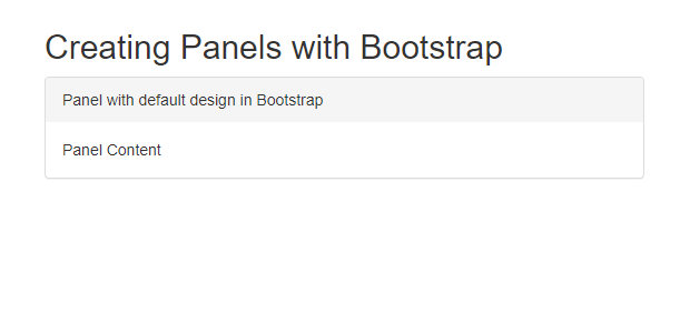
The above output shows that the panel is created using Bootstrap with default styles.
Create a Panel with Different Colors in Bootstrap
Bootstrap offers five types of color variations for panels like a warning, success, info, or danger, etc. These can be used by following codes:
<h2>Creating Panels with Bootstrap</h2>
<div class="panel-group">
<div class="panel panel-primary">
<div class="panel-heading">Panel with primary class design</div>
<div class="panel-body">Panel Content</div>
</div>
<div class="panel panel-danger">
<div class="panel-heading">Panel with danger class design</div>
<div class="panel-body">Panel Content</div>
</div>
<div class="panel panel-success">
<div class="panel-heading">Panel with danger class design</div>
<div class="panel-body">Panel Content</div>
</div>
<div class="panel panel-warning">
<div class="panel-heading">Panel with danger class design</div>
<div class="panel-body">Panel Content</div>
</div>
<div class="panel panel-info">
<div class="panel-heading">Panel with danger class design</div>
<div class="panel-body">Panel Content</div>
</div>
</div>
</div>
Now, Bootstrap classes of “panel-primary”, “panel-danger”,”panel-success”,”panel-warning”, and” panel-info” are utilized for creating a panel for specific situations like a Signup/Login page.
Their output is:
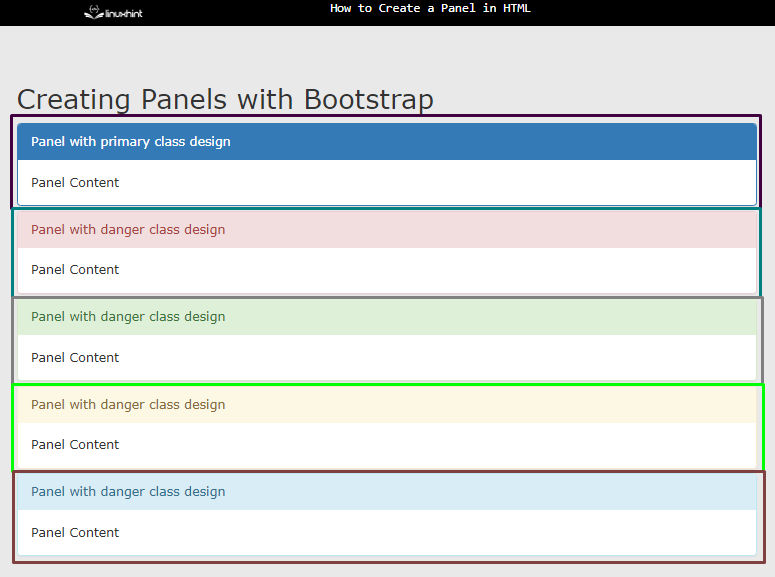
The above output displays that the panels with different classes are displayed using Bootstrap. Different colors of rectangles in the snapshot show the distinct type of panel design.
Conclusion
To create a panel in HTML, create a div element and assign it padding and margin. Using Bootstrap, set the “panel-group” class to the parent element. Then, assign “panel” and “panel-default” classes to its child div to create the panel. For styling the panel, users can change the class from “default” to danger, info, success, warning, and primary.