The glass or blur effect looks very amazing and attracts the focus of users. It could serve as the background for forms or to display some important data. In CSS, the frosted glass or blur effect is mainly used nowadays. The Mac OS is famous due to its frosted glass effect, and Windows also uses this effect to make better appealing interfaces to enhance user experience.
This guide demonstrates the glass/blur effect and how it works for an overlay.
How Can I Make a CSS Glass/Blur Effect Work for an Overlay?
The glass/blur effect is applied using the “filter” and “backdrop-filter” properties of CSS and it works for an overlay. To make a glass/blur effect let’s walk through an example:
Step 1: Create a Structure
In the HTML file, create a parent div element and assign it with a class of “background”. Inside this div, create a child div element and assign it with a class of “front”:
<div class="front">
</div>
</div>
These classes are used later to make the glass/blur effect.
Step 2: Style the “background” Class
Before creating a blur effect, first, build the infrastructure. For instance, select the class of the parent div element and assign them CSS properties to set the background:
{
background: url(../book.jpg) no-repeat;
background-attachment: fixed;
background-size: cover;
align-items: center;
display: grid;
justify-content: center;
height: 100vh;
}
In the above code snippet, the following properties are described:
- First, the “background” property sets the image as the background for the parent div and restricts the repetition of the image.
- In the next step, use the “background-attachment” property to make the image size set fixed.
- After that, the “background-size” and “align-items” properties set the size and alignment of the image to cover and center respectively.
- Finally, the “height” is set to “100vh”. The “vh” is a unit that stands for Vertical Height.
After executing the above code, the webpage looks like this:
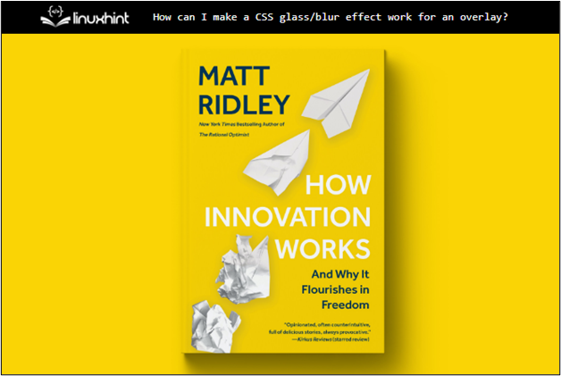
The output shows that the background image is displayed on the webpage.
Step 3: Style the “front” Class
Select the child div class “front” and assign the following properties to create an overlay:
width: 30rem;
height: 20rem;
box-shadow: 0 0 1rem 0 rgba(0, 0, 0, .2);
border-radius: 5px;
position: relative;
z-index: 1;
background: inherit;
overflow: hidden;
}
The description of properties used in the above code:
- First, set the “width” and “height” to “30rem” and “20rem”, respectively. The “rem” is just a measuring unit, where 1 rem equals 16 pixels.
- In the next line, the “box-shadow” and “border-radius” properties are utilized to make the child div element more prominent for better visualization purposes.
- After that, the “background” property is set to inherit as it inherits the background colors, and the “overflow” property is set to hide.
- In the end, the “position” and “z-index” properties are set to relative and 1 to ensure that the child div appears at the top.
After executing the above code, the webpage looks like this:
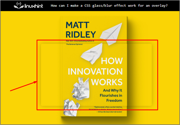
The output shows that the div is placed on top of the “background” div.
Step 4: Using the “filter” Property for Blur Effect
Now use the “:before” selector to apply the blur/glass effect. The “filter” property of CSS comes in handy as below. The code snippet is:
content: " ";
position: absolute;
background: inherit;
z-index: -1;
top: 0;
left: 0;
right: 0;
bottom: 0;
box-shadow: inset 0 0 2000px rgba(255, 255, 255, .5);
filter: blur(5px);
}
The explanation of the above code snippet is illustrated as:
- The content property is empty because no content needs to appear on the child div.
- The “z-index” is set to “-1” and the margin, and padding from all sides are set to zero to avoid extra spaces.
- After that, the “box-shadow” is provided in an “inset” direction meaning that the shadow moves in the inward direction. It makes a more prominent glass/blur effect.
- In the end, the “filter” property is utilized which takes the “blur()” function as a value that defines the ratio/quantity of a blur.
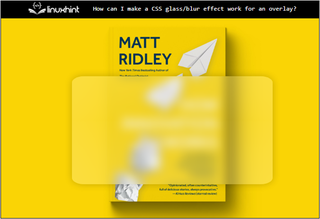
After executing the above code, the webpage looks like this:

The output confirms that the glass/blur effect is created with the help of the “filter” property.
Step 5: Using the “backdrop-filter” Property for Blur Effect
The “backdrop-filter: blur();” is utilized to create a blur/frosted glass effect. Using this method, the line of code is easy to understand:
width: 30rem;
height: 20rem;
box-shadow: 0 0 1rem 0 rgba(0, 0, 0, .2);
border-radius: 5px;
background-color: rgba(255, 255, 255, .15);
backdrop-filter: blur(5px);
}
Select the “front” class and add CSS “backdrop-filter: blur(5px);” property. Other properties in this class remain the same as in the above step.
The output of the above code snippet is shown below:
The output confirms that the glass/blur effect has been successfully applied to the div.
Conclusion
The glass/blur effect can work for an overlay with the help of the “filter” and “backdrop-filter” properties of CSS. The “filter” property is set to “blur()” which takes the blur ratio as an argument. This property uses “:before” or “:after” selectors. The “backdrop-filter” property does not need selectors. This article has successfully demonstrated how to make a glass/blur effect work for an overlay in CSS.