Let’s begin.
How to hide elements using media queries
As already mentioned, media queries help you to design responsive web pages. These responsive websites require you to have a certain screen size to have complete access to certain features. Here we are going to demonstrate how to hide elements using media queries but before that let’s first understand the syntax of these queries.
Syntax
{
//Code;
}
A query always begin with the @media rule and require you to specify the media type on which the query is to be applied. For instance, we have used the screen media type here in the above syntax. Afterward, certain operators like ‘and’ are used to combine media features such as min-width, or max-width.
Now that we have a good understanding of the media query syntax, let’s learn to hide elements using these queries with the help of an example.
HTML
Here we have created three div elements and assigned a different class to each one of them to demonstrate how to hide elements on the basis of different screen sizes.
CSS
background-color: rosybrown;
width: 200px;
height: 100px;
padding: 15px;
margin: 5px;
display: inline-block;
}
In the above code, we are styling all the three div elements all at once using the container class. The elements were given some background color, width, height, padding, and margin. Moreover, we are displaying these elements as inline-block because later on when using media queries their display has to be set to none in order to hide them.
CSS
div.large {
display: none;
}
}
In the above query we are specifying that the devices which have maximum width up to 700px, the div with the class name “large” will hide as the display has been set to none. However, if the screen width is 700px or wider then the elements will be visible.
CSS
div.medium {
display: none;
}
}
Meanwhile, this query states to show the div container with the class name “medium” only when the width of the screen is 300px or wider, otherwise it will be hidden.
CSS
div.small {
display: none;
}
}
And lastly, the query above specifies to show the div container in the condition when the screen width is 200px or wider, otherwise, the media query will hide the
Output
When the screen size is 700px or larger.
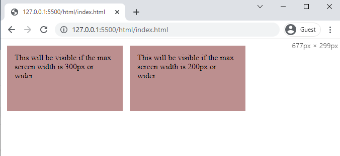
When the screen size is between 300px to 700px.
And when the screen width is between 200px to 300px.
The elements were hidden successfully using media queries.
Conclusion
For the purpose of hiding elements with media queries you simply have to set their display to none inside the specific media query. Media queries prove to be of great use when designing responsive websites, therefore, you can use them in order to make your elements accessible depending upon the screen size of the device. Here in this post, we have demonstrated with the help of an example how you can hide your elements using media queries.


