This post will describe how to apply Gradient borders in CSS.
How to Apply Gradient Borders in CSS?
We have listed down the methods for applying the gradient borders around the HTML element:
- Method 1: Add Gradient Border Around Element Using CSS “border-image” Property
- Method 2: Add Gradient Border Around Element Using CSS “padding” Property
Before jumping into the above-stated methods, let’s first create an HTML page.
Prerequisite
Follow the instructions to create an HTML page:
- Add a “<div>” element and assign it a class “main”.
- Inside this element, add another “<div>” element to place an image. Set its class as “image”. This div element contains the “<img>” tag with the “src”, “alt”, and “width” attributes.
- The “src” attribute specifies the URL of the image.
- The “alt” attribute defines a text that will display on the screen if the image cannot load.
- The “width” determines the image’s width.
Here is the HTML code:
<div class="image">
<img src="/images/red-berries.jpg" alt="red berries in winter" width="300">
</div>
</div>
Let’s apply some CSS styling on the HTML page.
Style “<div>” Element
The div element having class “main” is styled with the following CSS properties:
width: 350px;
height: 230px;
display: flex;
justify-content: center;
align-items: center;
margin: auto;
}
The description of the above-mentioned code is listed below:
- “width” adjusts the element’s width.
- “height” determines the element’s height.
- “display” property defines the display behavior of the element. The value “flex” makes the element layout flexible.
- “justify-content” property aligns the flexible items horizontally.
- “align-items” aligns the flexible items vertically.
- “margin” adds space around the element.
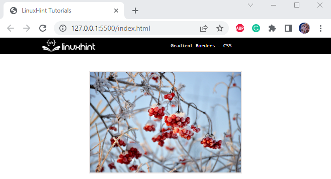
It can be observed that the image is successfully adjusted to the web page:
Method 1: Add Gradient Border Around Element Using CSS “border-image” Property
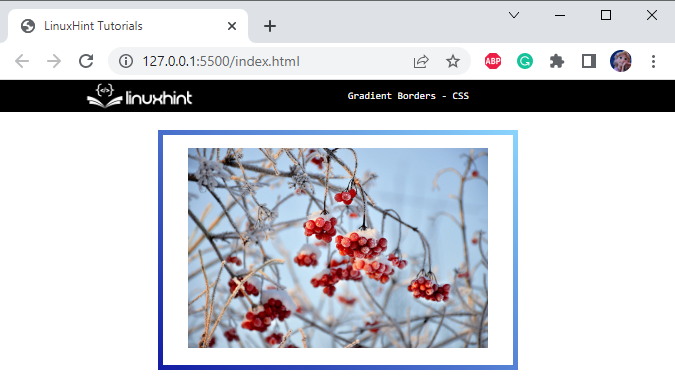
Now, in the ongoing example, the CSS “border-image” property is utilized to generate gradients. In CSS, add the following properties to the div having class “.main”:
border-image: linear-gradient(40deg, rgb(19, 29, 163), rgb(138, 211, 253)) 1;
Below is the explanation of the above-mentioned properties:
- “border” is a shorthand property that applies a border around the element by specifying the width, style, and color of the border.
- “border-image” is assigned the value “linear-gradient()” function, which creates an image with multiple colors that progress in a particular direction. This function holds some parameters. The first value represents the “angle” to which the gradient will tilt, then the start and end of the gradient are specified by the two “color” values. In the end, the opacity is defined.
The below image shows that the gradient border has been successfully applied around the image:
Method 2: Add Gradient Border Around Element Using CSS “padding” Property
To add the gradient element, the two CSS properties that are more important are listed below:
- The “main” div is styled with the “background” property with the value assigned as a “linear-gradient()” function.
- The div container having an “image” class is assigned the “padding” property to produce space around the “<img>” element. This will make it easier to see the gradient background of the “main” class of div as the image border.
Let’s implement these two points.
Style “main” class
width: 380px;
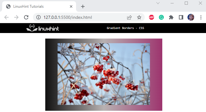
background: linear-gradient(to right, rgb(17, 17, 17), rgb(184, 178, 178), rgba(141, 19, 86, 0.857));
margin: auto;
display: flex;
justify-content: center;
align-items: center;
}
The “.main” is utilized to access the div element having class “main”. The following properties are applied to it:
- “background” property is assigned a “linear-gradient()” function as a value. It has several parameters. The first value represents the gradient direction. The other three parameters represent the gradient colors.
Style “image” div
padding: 10px;
}
The CSS “padding” property is applied to the div container having class “image”. This property will produce space around its content. In our case, we have embedded the image.
The gradient border around the image is shown in the output below:
We have learned the methods to apply gradient borders around the elements using CSS.
Conclusion
In CSS, the “border-image” property with the value assigned as the “linear-gradient()” function is utilized to add gradient borders around the element. The CSS “padding” property can also be helpful to represent the gradient background as a border to the contents. In this post, we have demonstrated how to apply gradient borders around the elements using CSS.


