In this manual, you will learn the method of adding a background image in full-screen mode.
Let’s get started!
How to Make Full-Screen Background Image Using CSS?
To make the full-screen background using CSS, first, create a div and adjust its width and height, and margin to make it appear on the full screen using the “width”, “height”, and “margin” properties of CSS. Then, add a border around it by using the “border” property. To set the border according to the screen, use the “box-sizing” property. Once it is done, we will utilize the property of “background” to add the image in the background.
The syntax of the background property is:
In the above mention syntax, the following four properties of the background property are mentioned:
- background-image: It is utilized to add an image as a background.
- background-repeat: It is used to set the pattern of the repetition of the background image, such as no-repeat, repeat horizontally, and repeat vertically.
- background-position: It is used to adjust the position of the image, such as center, left, and right.
- background-size: It is used to set the size of the image, such as auto, cover, and length.
Let’s move to the example in which we will make a full-screen background image using CSS.
Example
In the HTML, we will create a container and set its class name as “div” and add the heading using the <h1> tag. Moreover, to place the heading in the center of the page, we will use the <center> tag.
HTML
Then, assign the value of the margin property as “0” and height as “100px” to the whole body of the HTML.
CSS
margin:0;
height:100%;
}
In the next step, style the created container using “div” and adjust the width and height of the div as “100px”. We will use border property to add the border around the div with “25px” width, style as “groove” and color of the border as “rgb(184, 147, 147)”:
width:100%;
height:100%;
border:25px groove rgb(184, 147, 147);
}
The outcome of the above-mentioned code is given below. You can see that the heading and border are created:
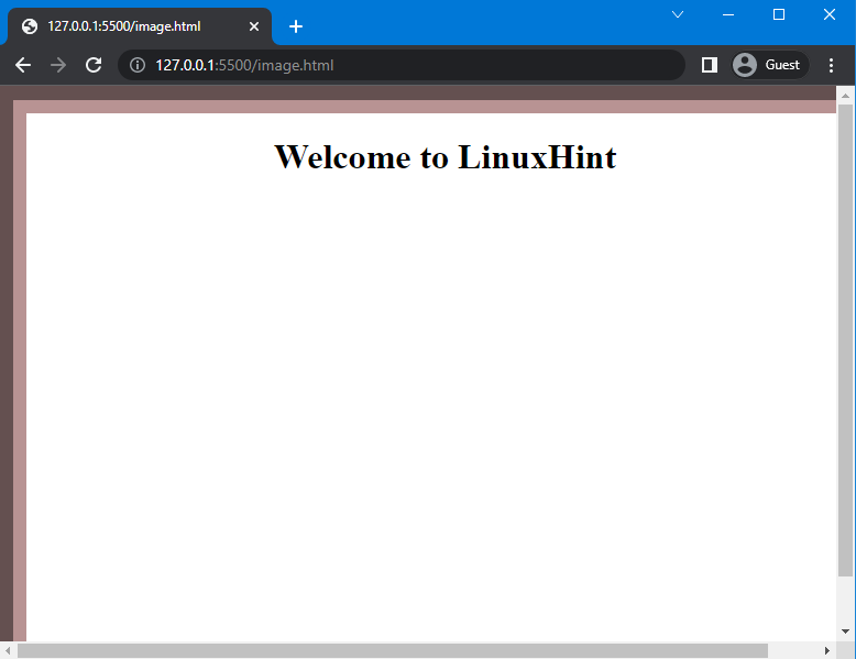
Note: As you can see, in the above-provided image border from the right and bottom is hidden, this is because the width and height of the div are already “100%”, so when we add a border, additional width and height will be added. To avoid this, we will use the “box-sizing” property of CSS as it allows us to include a border in the element’s width and height.
To do so, we will set the value of box-sizing as “border-box” to include the border within the total width and height of the div:
The below-given image indicates that the border is successfully placed within the width and height of the div:

Now, we will add the background image by using the “background-image” property and specify the image url in it as “url(image.jpg)”:
background: url("image.jpg");
}
In the below-provided image, you can see that the background image is successfully added, but it is repetitive:
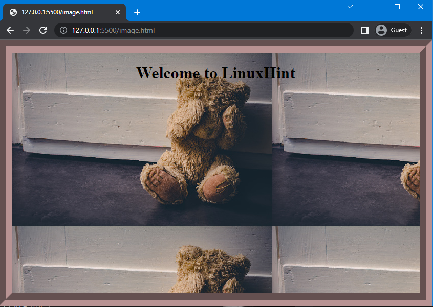
To avoid the repetition of the image, the “background-repeat” property is utilized. Here, we will set the value of background-repeat as “no-repeat”:
background-image: url("image.jpg");
background-repeat:no-repeat;
}
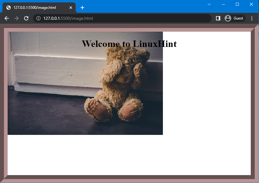
In the below-provided output, you can see that the repetition of the image is stopped; however, the image is not displayed on the screen:
To display the image on full-screen, we will utilize the “background-size” property. And set its value as “cover”, which means the image will cover the whole area of the created container:
background-image: url("image.jpg");
background-repeat:no-repeat;
background-size:cover;
}
The below image indicates that the image is displayed on the full screen and is cut off. This is because the size of the image is greater than the div size:
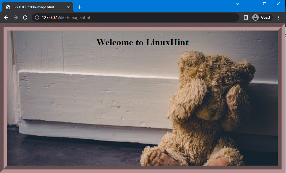
To fix this problem, use the “background-position” property and set the position of the image as “center”:
background-image: url("image.jpg");
background-repeat:no-repeat;
background-size:cover;
background-position:center;
}
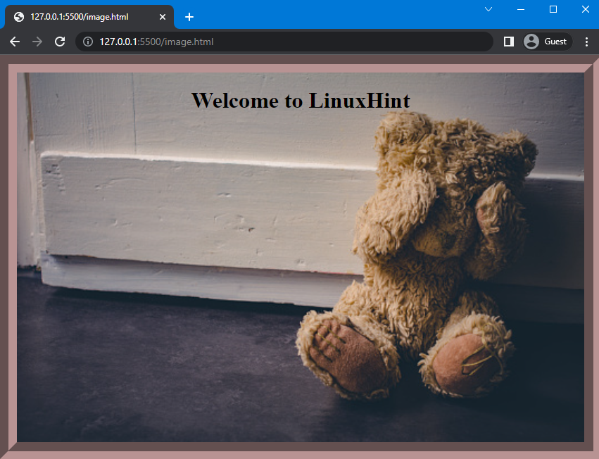
As a result, the selected image will be displayed in full-screen mode:
That’s it! We have explained the method to make a full-screen background image using CSS.
Conclusion
To create a full-screen background image using CSS, first, create a div and set the width, height, and margins to fill the screen. After that, create a border around the div, then add an image to it using the “background-image” property. To adjust the image according to the full screen, use the “background-repeat”, “background-size”, and “background-position” properties. This article has explained the complete method to make the full-screen background image using CSS.