While designing websites, developers are always searching for ways to adjust the web page so that the images or other components display perfectly in every screen size. More specifically, the Cascading Style Sheet or CSS helps to make a proper look for the web pages. It provides styling properties and properties that help maintain the layout, size, and aspect ratio of the images.
This write-up will demonstrate three following three methods:
- Method 1: Force Image Resize and Keep Aspect Ratio Using “width” and “height” CSS Properties
- Method 2: Force Image Resize and Keep Aspect Ratio Using “object-fit” CSS Property
- Method 3: Force Image Resize and Keep Aspect Ratio Using “display: flex” CSS Property
Prerequisite: Add Image to HTML File
Before, moving ahead, specify the “<img>” element in the HTML file for adding an image to the document:
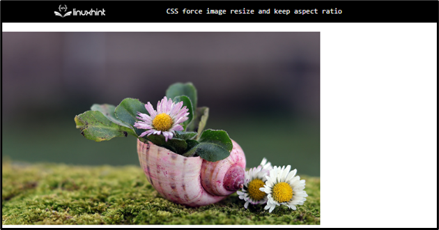
Method 1: Force Image Resize and Keep Aspect Ratio Using “width” and “height” CSS Properties
The “width” and “height” properties can be utilized to adjust the image. Moreover, the width property with a specified value and the height property with auto or vice versa could help in resizing the image and keeping the aspect ratio.
Style “img” Element
The “<img>” element is specified with the following properties:
width: 400px;
height: auto;
}
Here:
- “width” determines the image’s width.
- “height” sets the image height.
Output

Let’s now set the width as auto and see the results.
In CSS, set the “height” property with some value and “width” as “auto”:
width: auto;
The given output signifies that the image has been resized and the aspect ratio is also maintained:
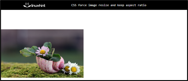
Method 2: Force Image Resize and Keep Aspect Ratio Using “object-fit” CSS Property
The CSS “object-fit” property with the value “contain” can be utilized to adjust the image without affecting its aspect ratio.
To do so, apply the following CSS properties to the added HTML “<img>” Element:
height: 400px;
object-fit: contain;
The “object-fit” property with the value “contain” specifies how an image or video should be resized to fit within its container.
Output
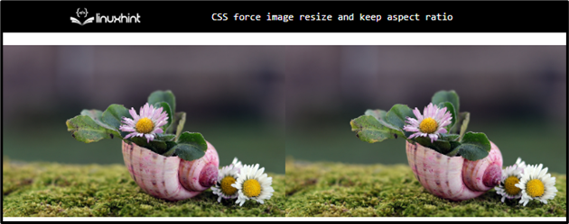
Method 3: Force Image Resize and Keep Aspect Ratio Using “display: flex” CSS Property
The “display” property with the value “flex” places the items of the flexible container in a row (by default).
Example
Firstly, add a “<div>” with the class “main”. Then:
- Add two images by using the “<img>” tags.
- The “src” and the “alt” attributes are mentioned for the image URL and the alternate text of the image if in any case image could not display:
<img src="/images/daisy-g99c1c1691_1920.jpg" alt="flowers in shell">
<img src="/images/daisy-g99c1c1691_1920.jpg" alt="flowers in shell">
</div>
Style “main” Class
The “.main” is used to access the “<div>” element with the specified class name. The following properties are applied to it:
display: flex;
width: 100%;
}
Here:
- “display” property with the value “flex” places the images in a row.
- “width” property determines the flexible container’s width.
Style “img” Element of “main” Class
width: 50%;
height: auto;
}
The “img” element holds the “50%” width and the “height” is set as “auto” and adjusts the height of the container automatically.
Output
You have learned how to force images to resize and keep the aspect ratio in CSS.
Conclusion
There are alternate ways to resize the image and keep its aspect ratio in CSS, like setting a specific value of the “width” property and the “auto” value for the “height” property of the image or vice versa. The CSS “object-fit” property with the value “contain” is the best method. Moreover, the “display: flex” property can also be used to maintain the aspect ratio of the image. This write-up has explained the methods to demonstrate how to resize an image and maintain its aspect ratio in CSS.