What is Flexbox
CSS Flexbox is a layout model that allows an efficient and dynamic arrangement of elements. This layout is one-dimensional and permits the placement of elements inside a container with equally distributed space.
This layout makes elements responsive which means that the elements change their behavior according to the kind of device displaying them. It makes elements flexible and provides them with appropriate position, and symmetry.
Flexbox was introduced in CSS version 3 to arrange items in a container more efficiently and dynamically. Before flexbox, there were initially four layout methods which we have listed below.
- Block
For the purpose of creating sections in a web page, the block layout is used. - Inline
It is a layout method that is used for text. - Table
This is used for a table with two-dimensional data. - Positioned
This is used for a definite position of an element.
Now we will discuss various components of a flexbox.
Flexbox Components
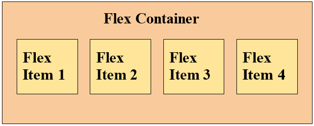
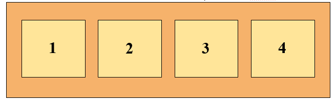
A flexbox consists of two components which we have explained below.
- flex-container
This component of a flexbox defines the properties of the ancestor element by setting its display to flex, or inline-flex. - flex-items
It describes the properties of the successor elements, moreover, there can be numerous elements present inside a flex-container.
Here is a visual representation of a flexbox.
Flexbox Axis
When dealing with the flexbox layout, there are two axes that should be taken care of. These axes have been listed below.
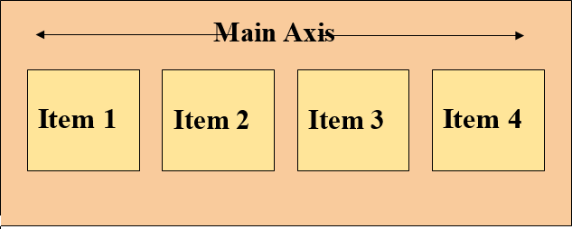
- Main Axis
- Cross Axis
Both of the axes are explained in detail below.
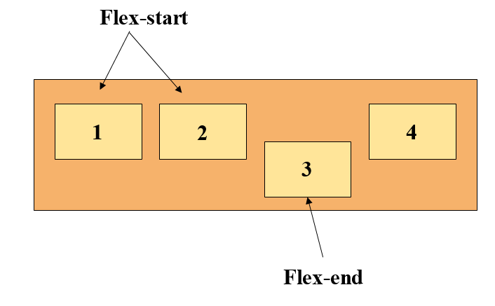
Main Axis
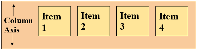
The main axis (from left to right) is set by the flex-direction property. This axis can render four values which are; row, row-reverse, column, and column-reverse.
In the case of the first two values which are row, and row-reverse, the flexbox exhibits an inline direction, which means, the flex container and items will be aligned horizontally. Whereas, for the column, and column-reverse values the direction of the flexbox will be block, or in simpler words, the container and items will be arranged vertically.
Cross Axis
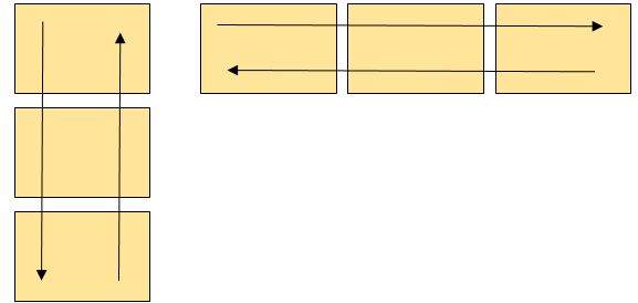
The direction of this axis is perpendicular to the main axis. If the direction of the main axis is adjusted to row or row-reverse then the cross axis will move along the columns downward, whereas, in the case of the column, and column-reverse the axis will move along the rows.
Both of the axes have a starting, an ending point, and a certain length between these points.
Flexbox Properties
The properties of a flexbox have been provided below.
1. display
It displays an element as a flexbox.
2. flex-direction
This property defines the direction of the items in a flex container.
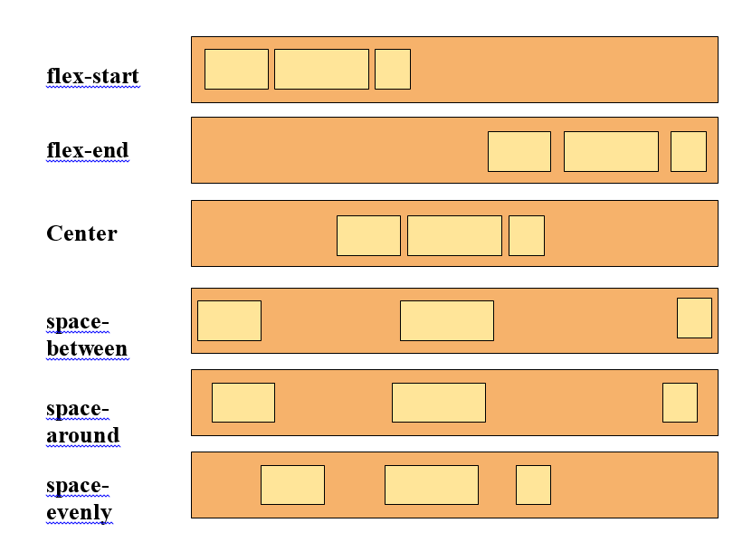
3. justify-content
If the items in a flexbox do not consume the horizontal space entirely, then this property aligns them across the main-axis.
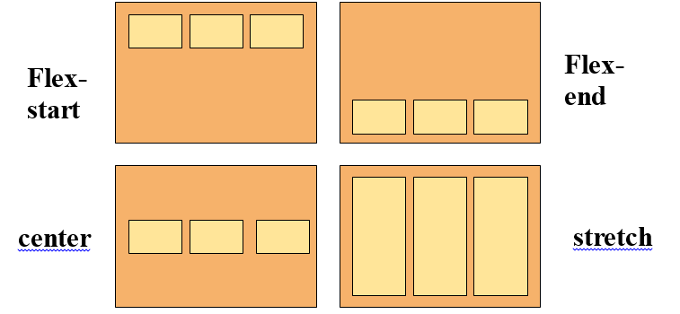
4. align-items
If the items in a flexbox do not consume the vertical space entirely then this property aligns them across the cross-axis.
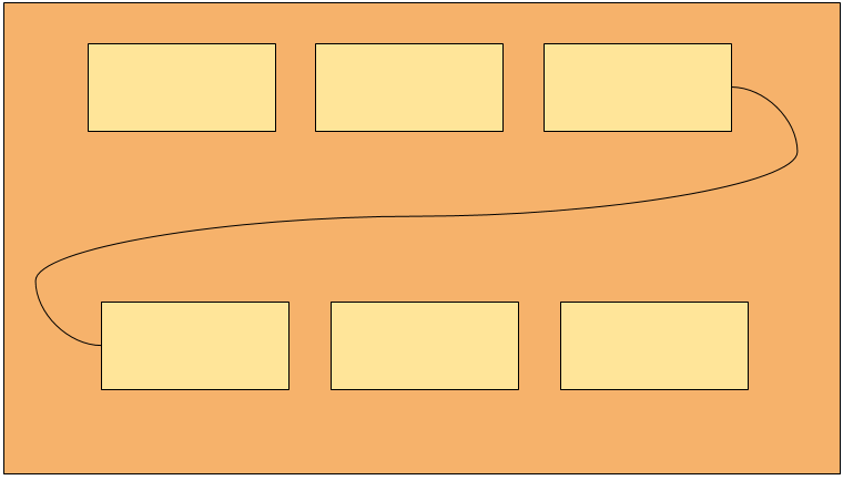
5. flex-wrap
If there is not much space on a single flex line then this property decides whether to wrap elements or not.
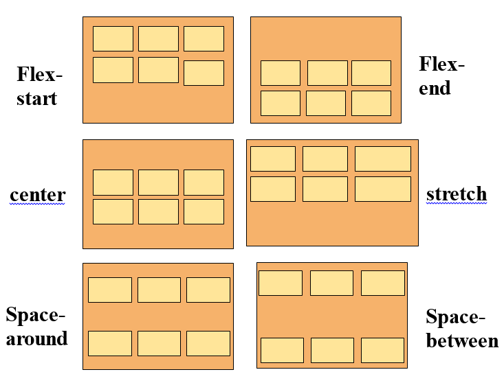
6. align-content
It alters the behavior of the flex-wrap property and is pretty much similar to the align-items property with the only difference being that it aligns the flex lines rather than the flex elements.
7. flex-flow
A shorthand property for flex-direction and flex-wrap.
8. order
It defines the order of a flex element relative to other elements present in a flexbox.
9. align-self
This property overrides the align-items property and is used on flex elements.
10. flex
It states the length of flex items relative to other items present in a flexbox.
Let’s see an example.
Example
Below we have shown you an example of how to create a flexbox.
HTML
Here we have created a div container having class “flexbox” and nesting four more div containers inside it.
CSS
display: flex;
background-color: aquamarine;
}
First of all we are assigning the main div container a flex display to make it a flexbox, and then we are giving it some background color.
CSS
background-color: lightgrey;
margin: 15px;
padding: 20px;
font-size: 35px;
}
Lastly, we are styling the flex items present in the flexbox using various CSS properties.
Output
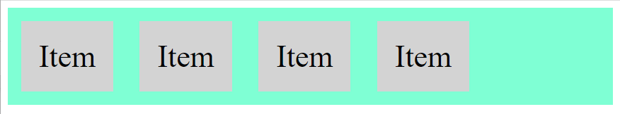
A flexbox was generated successfully.
Conclusion
A flexbox is a layout model that arranges elements in an efficient and dynamic manner while giving them equal distributed spaces inside a container. This layout makes elements responsive which means that the elements change their behavior according to the kind of device displaying them. It consists of a flex container and items which are regarded as its components. Moreover, it has axes which are main, and cross and it exhibits multiple properties. This write-up covers all the necessary details about a flexbox along with a suitable example.