This post demonstrates the difference between px, em, and %(percentage). Moreover, you would also get to know about realtive and absolute unit lengths and their differences.
What is the difference between px, em, and percent(%) in CSS?
In CSS, the sizing units are classified into two categories, the absolute and the relative measure.
Absolute units
The absolute units have fixed values, thus do not change their values until the user changes them manually. The px unit falls under the absolute category of sizing units in CSS. Although px is not good for responsiveness, it is still practiced where the elements do require fixed sizes on the screen. Moreover, the new user tends to use the px as the sizing unit as it is easy to handle and does not depend upon any other size unit or element.
Relative units
The other two em and percentage belong to the relative category of elements as they both change their behavior to manage responsiveness.
em: This unit refers to the font size of the parent/root element. It can also be used for width/height adjustment but the value of 1em would be 16px.
percentage(%): The percentage unit shows the relevancy with the parent element.
For instance, if a parent element defines the width = “10px“. Now, this value would be taken as a reference to associate the width in percentage.
Note: CSS does offer various other relative units that include rem, VW(view port’s width ), and VWH(view port’s height) also belong to the relative category.
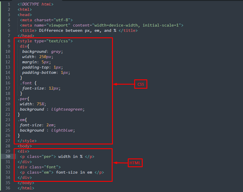
Example: Using px, em, and percentage values
The following HTML code is practiced getting to the difference between px, em, and percentage values.
HTML
In the above code, there are two-parent elements (div tags) and each parent has one child. The first parent div contains a paragraph that would exercise the width in percentage and the second parent div considers the font size of the element.
CSS
div{
background: gray;
width: 250px;
margin: 5px;
padding-top: 1px;
padding-bottom: 1px;
}
.font {
font-size: 12px;
}
.per{
width: 75%;
background : lightseagreen;
}
.em{
font-size: 2em;
background : lightblue;
}
</style>
The above CSS would be the main stakeholder in demonstrating the difference between px, em, and percentage. The width of the div tags is set to 250px which means it would be equal to 100%. For instance, in the above code the .per class takes 75% of the total width(250px).
Similarly, the font size of the second div elements is set to 12px which means 1em would be equal to 12px. If the value of em is changed, it would change relative to the 12px (as of the parent element).
Output
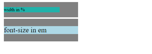
From the output, it is observed that the width of the child element(paragraph) has been adjusted to 75% of its parent element(div). Moreover, the font size is set to 2em which means it would be twice as compared to the font size of its parent element (12px=1em).
Conclusion
The px belongs to the absolute category of length units whereas the em and %(percentage) refers to the relative class of sizing units. The value of px is fixed over the HTML document but the em and %(percentage) depends on the unit used by the parent element. The em majorly manipulates the font size of the HTML elements and the (%)percentage unit primarily refers to changing the height/width of an HTML element(according to the parent element). In this article, you would have learned the basics of various units such as px, em, and percentage. For better understanding, we have demonstrated an example that better clarifies the difference between all these units.