This manual will demonstrate the difference between “justify-content” and “align-items” of the flexible container.
Difference Between “justify-content” and “align-item” in CSS
The CSS “justify-content” property specifies how the browser allocates space between and around content elements along a flex container’s main axis and a grid container’s inline axis. However, The “align-items” property sets the items on the y-axis in the flexbox. In grid layout, it sets the alignment of contents on the block axis.
Values for “justify-content” Property
The “justify-content” property can have values that are listed below:
- center
- space-between
- space-evenly
- space-around
- flex-start
- flex-end
- initial
- Inherit
Values for “align-items” Property
The “align-items” property can have values that are listed below:
- center
- stretch
- baseline
- flex-start
- flex-end
- initial
- Inherit
How to Justify Contents With CSS?
To justify the contents in HTML by utilizing CSS, the “justify-content” and “align-items” properties are used. For the demonstration, we have provided the example in which the main “div” is applied with the property “display” value as “flex”. This property will make the “div” flexible to its items. The other box inside the main “div” box will be justified and aligned according to the values.
Follow up on the stated steps for better understanding.
Step 1: Create HTML Page
First, create an HTML page and add the following elements:
- Add a “<div>” element with the class name “box”.
- Inside this “<div>” container, add another “<div>” and assign it a class “box-1”:
Step 2: Style First “div” Element
For the styling of the first “div” element, access it in CSS with the help of assigned class “.box”. Then, apply the below-coded properties:
border: 2px solid blueviolet;
width: 500px;
height: 250px;
margin: 40px auto;
display: flex;
}
Here is the elaboration of the above-code snippet:
- “border” property is utilized to adjust the border around div.
- “width” property with a value of “500px” sets the width of the box div.
- “height” property sets the height of the “div” to “250px”.
- “margin” specifies a space of “40px” at the top and bottom.
- “display” property sets the behavior of the display. The value “flex” makes this div flexible to its items.
Step 3: Style Second “div” Element
Access a second “div” through the assigned class “.box-1” and apply the following CSS on it:
width: 100px;
height: 100px;
background-color: chocolate;
}
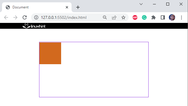
The “width” and “height” properties are applied. Then, the “background-color” property applies to set the color in the element’s background:
Step 4: Apply “justify-content” Property
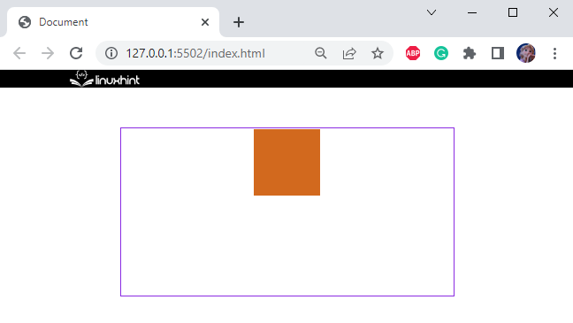
To justify the content, we have applied the “justify-content” property as “center” on the main “div”. This property aligns its contents according to the value given to it:
border: 2px solid blueviolet;
width: 500px;
height: 250px;
margin: 40px auto;
display: flex;
justify-content: center;
}
From the below image, it can observe that the main “div” aligns its content “box-1” div in the center on x-axis:
Step 5: Apply “align-items” Property
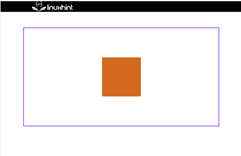
The “align-items” property sets the items on the y-axis in the flexbox. In the CSS, we have added the “align-items” property as “center” to align the content in the center along y-axis:
border: 2px solid blueviolet;
width: 500px;
height: 250px;
margin: 40px auto;
display: flex;
justify-content: center;
align-items: center;
}
You can see that, we have successfully justified the content with CSS:
We have demonstrated the difference between justify-content and align-item and how to use them to justify the content.
Conclusion
The properties “justify-content” and “align-items” are used to specify how the browser displays the contents. The justify-content property adds the margins around and between items along the flex container’s x-axis and the grid container’s inline axis. However, The “align-items” property sets the items on the y-axis in the flexbox. This post has elaborated on the difference between justify-content and align-item and how to use them to justify the content.