After the deployment of a website, there are certain moments when the developer needs to make updates from time to time or include some announcements. In such a scenario, the responsive banners come into effect and aid the developer in notifying the end-user of maintenance procedures or vital information conveniently.
How to Design Responsive Banners?
A banner refers to an appealing extension of the site’s header that comprises an image, often shown in combination with a text heading and a call-to-action button. It can be designed using HTML and CSS styling.
This write-up includes the following aspects:
Example 1: Designing a Responsive Banner
In this demonstration, a responsive banner will be designed that incorporates the banner title, description, and image.
HTML Code
Overview the following HTML code lines:
<html>
<head>
<meta charset="utf-8">
<meta name="viewport" content="width=device-width, initial-scale=1">
<title></title>
</head>
<body>
<div class="respbann">
<div class="page banner1">
<div class="banner2">
<div class="bannerarea">
<h2 class="heading">Home Page</h2>
<p class="subheading">All the Basic Information will be shown here</p>
</div>
<div class="banner_section">
<p class="banner_button">
<img src="F:\JOB TECHNICAL ARTICLES\imgbanner5.png">
</p>
</div>
</div>
</div>
</div>
</body>
</html>
In this snippet of code, perform the below-specified actions:
-
- Include multiple “<div>” elements to contain the banner appropriately.
- Also, specify the heading and a description to be included in a banner.
- Lastly, include an image as well in the banner using the “src” attribute.
CSS Code
Now, proceed to the CSS code:
* {
box-sizing: border-box;
margin: 0;
border: 0;
padding: 0;
}
.page {
max-width: 640px;
margin: 0 auto;
}
@media (min-width: 960px) {
.page {max-width: 960px;}
}
.banner1 {
display: flex;
flex-flow: column nowrap;
justify-content: center;
height: 100vh;
padding: 16px;
}
.banner2 {
border-radius: 8px;
padding: 16px 0;
background: rgba(0, 0, 0, 0.75);
box-shadow: 0 4px 8px rgba(0, 0, 0, 0.25);
}
.bannerarea {padding: 8px;}
.heading {
padding: 8px;
font: bold 32px / 1.5 sans-serif;
text-align: center;
color: #FFFFFF;
}
.subheading {
padding: 8px;
font: italic 16px / 1.5 sans-serif;
text-align: center;
color: #FFFFFF;
}
.banner_button {
margin: 0 auto;
padding: 8px;
}
.image {
display: block;
border-radius: 28px;
padding: 16px;
font: 16px / 1.5 sans-serif;
text-decoration: none;
text-align: center;
color: #000000;
background: #FFBF00;
}
@media (min-width: 480px) {
.heading {font-size: 48px;}
.banner_button {width: 50%;}
}
</style>
In this code, apply the following methodologies:
-
- Create a page CSS to control the layout of the page area such that the maximum width is “640” pixels on small and medium screens and “960” pixels on large screens.
- After that, include the display: flex; flex-flow: column nowrap; justify-content: center; properties to vertically center the banner’s content.
- Likewise, the “height: 100vh;” property specifies that the banner container is the entire screen’s height.
- The “text-shadow” property is used to implement a text shadow to the banner’s subheading.
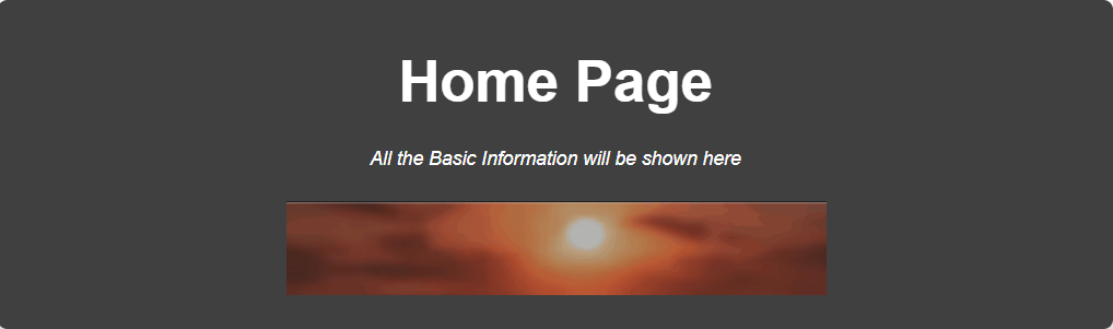
Output
Example 2: Designing a Responsive Call-to-Action Banner
In this example, a responsive CTA banner will be designed that also enables the reader to redirect to any other site’s functionality.
HTML Code
First, follow the below-given HTML code:
<html>
<head>
<meta charset="utf-8">
<meta name="viewport" content="width=device-width, initial-scale=1">
<title></title>
</head>
<body>
<div class="resp">
<img src="F:\JOB TECHNICAL ARTICLES\logo.png" class="img-responsive" />
</div>
<div class="ban">
<div class="container">
<div class="row">
<div class="col-xs-12 banner-text text-center">
<h2><a href="#">Start the Free Trial!</a></h2>
</div>
</div>
</div>
</div>
</body>
</html>
In this code:
-
- Include an image via the “src” attribute.
- This image serves as a responsive banner via the “class” attribute specified as “img-responsive”.
- After that, a link is included via the “href” attribute as a heading for redirection.
CSS Code
Now, proceed to the below-provided CSS code snippet:
@import url('https://fonts.googleapis.com/css?family=Montserrat|Open+Sans');
body {
font-family: 'Open Sans', sans-serif;
font-family: 'Montserrat', sans-serif;
}
.resp img {
width: 100%;
}
.ban {
background-color: #808080;
width: 100%;
float: left;
}
.ban .banner-text {
padding: 0;
}
.ban .banner-text h2 {
font-size: 25px;
font-size: 2.5rem;
font-weight: 900;
color: #fff;
margin-top: 39px;
margin-bottom: 41px;
display: inline-block;
position: relative;
}
.ban .banner-text h2 a {
color: #0000FF;
}
</style>
In this code block, style the incorporated banner and the included heading in the link via various attributes, such as “font-family”, “width”, “background-color”.
Output

This outcome signifies that a responsive call-to-action banner is designed appropriately.
Conclusion
A banner refers to an eye-catching extension of the site’s header that comprises a large, prominent image and can be designed using HTML and CSS styling. Also, a “Call-to-Action” responsive banner can be designed that includes a redirection option. This write-up illustrated designing responsive banners.