Properties for Darken Background Image in CSS:
We will use the following three properties which the CSS provides to darken the background image. These properties are:
- Using filter property.
- Using background-image property and set its value in linear gradient.
- Using background-blend-mode property.
Now, we are going to utilize all these properties in our codes below and you will learn from these examples how to use these properties and how to set the value of these properties because we will also explain all codes.
Example # 1:
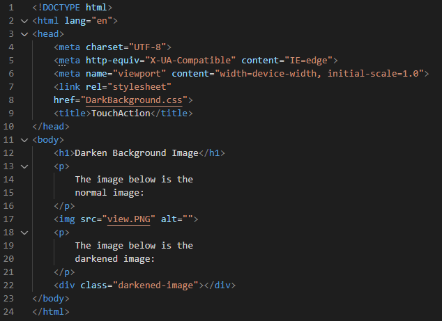
We’re utilizing Visual Studio Code to show the examples provided. So, we’ll open the new file and select the “HTML” language, which will result in the production of an HTML file. Then, in the newly generated file, we start writing the code. The “.html” file extension is automatically appended to the file name when we save the completed code. Now, we get basic tags by putting “!” marks and pressing “Enter”. When the basic HTML tags have appeared in this file created, we’ll begin by adding a heading.
Then, we also put a paragraph below this heading and insert the image after this paragraph. If the image is inserted, we have another paragraph and also a div class with the name “darkened-image”. Here, the HTML code is completed. Now, save it and let’s move to the CSS file where we will add the “filter” property for darkening the background image.
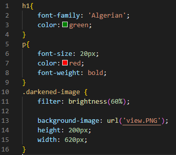
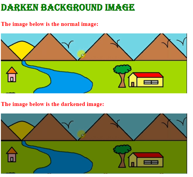
For “h1”, we set the “font-family” value to “Algerian” and also apply “color” to this heading as “green”. The “font-size” of the paragraph text is “20px” and its “color” is “red”, “bold” in its “font-weight”. Then, we are going to utilize the “filter” property for the div class “darkened-image”. This property helps in making the image darker. We used this property here so the image will appear darker in the output. We set its value using the “brightness” value and select “60%” brightness for this image.
In the “background-image”, we put the same path of the image which we have given in the HTML file. So, we apply this darkened property to the image which we have inserted above and we will see that original image as well as the darkened image on the output screen. We also set the “width” and “height” of the div as “200px” and “620px” respectively. This “height” property will set the height of the div and the “width” property will set the width of the div.
We make this image a darker image with the help of the CSS “filter” property and setting the “brightness” as the value of this property. We have applied “60%” brightness to this image to make it darker than the original image.
Example # 2:
We have a heading here and then add the image. After this image, we again place a heading and then we have a div container. We will utilize the second property for making this image a darker.
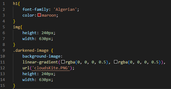
We apply “color” to this heading as “maroon” and set the “font-family” value for “h1” to “Algerian”. The “height” of the image is set to “240px” and its “width” is “630px”. Then, we mention the div container “darkened-image” and put the “background-image” property in which we utilize the “linear-gradient” and set its value in “rgba” form. Here, we use two “rgba” values and set them to “rgba(0, 0, 0, 0.5)” where “0.5” is the alpha value. We also insert the image in the “url ()”. We insert the path of the image in this “url ()”. The “height” of this div is “240px” and also, we define its “width” to “630px”.
In the output, both the original and the darkened versions of the image can be seen. The original image and the darkened image may clearly be distinguished from one another in the screenshot below. The darkened image is rendered because we have utilized the “background-image” property and set its value in the “linear-gradient” type.
Example # 3:
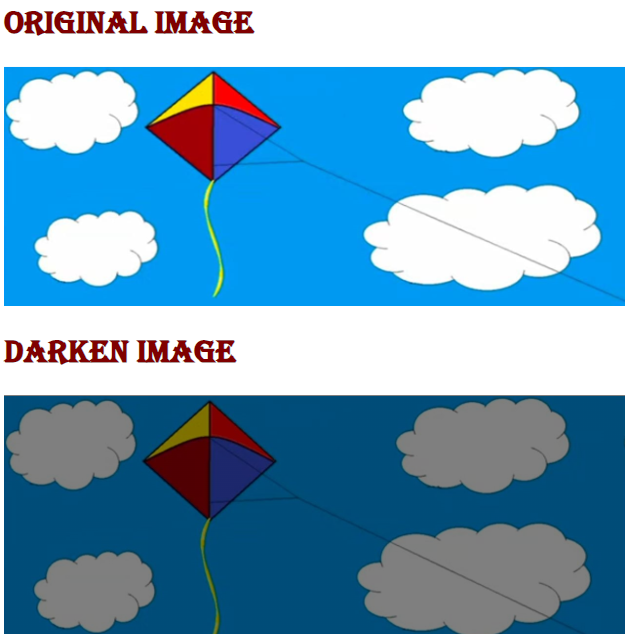
We have used the above HTML code and we insert another image in this code. We will use the “background-blend-mode” for creating the darkened image effect on the image.
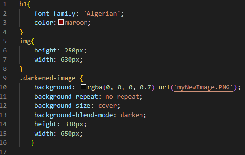
We set the “font-family” value for “h1” to “Algerian” and apply “color” to this heading to “maroon”. The image’s “width” is “630px” and its “height” is “250px”. We utilize the div class name as “darkened-image” and are going to apply some properties to it. We utilize the “background” property and place the “rgba” value here. The “rgba” value we are utilizing is “(0, 0, 0, 0.7)” and then we have the “url” property which we utilize for giving the path of the image. We give the image’s path as “myNewImage.PNG”.
After this, we have the “background-repeat” property and utilize the “no-repeat” keyword as the value of this property. Now, we also set the “background-size” and place “cover” so the image covers all the background. The “background-blend-mode” property is for applying the darkening effect to the image. We set it as the “darken” keyword. So, when this image renders on the output screen, it will appear as a darkened image because of this property. The “height” of the div named “darkened-image” is adjusted to “330px” and we also set its “width” which is “650px”. Now, look at the output of how these images will appear.
Both the original and the darker forms of the image are visible in the result. Here in the snapshot below, it is possible to easily tell the difference between the original image and the darkened image. We used the “background-blend-mode” attribute and placed the “darker” keyword as the value of this attribute to render the darkened picture.
Conclusion
We have thoroughly covered this concept and looked at numerous instances of how to darken the background image in CSS. As was previously mentioned, we have used three different properties for darkening the background image. We have utilized all three properties in our codes. We also covered how to use these properties and how to set their value. We have discussed that we have the “filter” property, “background-image” property, and also the “background-blend-mode” property for making the background image darker. We also provided the outcomes of all these codes in which we have rendered both the darken as well as the original image on the output screen. For your benefit, we have created a comprehensive tutorial in which the code is both provided and thoroughly explained, along with the results.

