Methods for Placing Two Divs Side By Side
There are five different methods available in CSS for placing the two divs side by side:
- display:inline-block method
- display:table method
- CSS float method
- CSS flexbox method
- CSS grid method
Example #1: Using the Display:Inline-Block Method
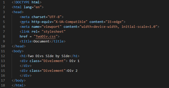
We start our HTML code by opening a new file in the Visual Studio Code and then selecting the HTML language. The file is created here. We put the “!” mark to get the basic tags. So, when we press “Enter”, all the basic tags of HTML will appear on the file.
We start our coding from the body part. We place one heading and two different divs here. We place these two divs side by side using the “display:inline-block” property in CSS. In this HTML file, we also link the CSS file before the body and inside the “head”. Now, move to the CSS file and look at how we use this property for placing these two divs side by side.
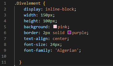
Here, after mentioning the div name, we open the curly braces. Inside these curly braces, we use the “display” property of CSS. We must place the “inline-block” as the value of this “display” property. This “display:inline-block” property helps us for placing two divs, one after the other. This “display:inline-block” property does not provide the “height” and “width” so, we have to mention the separate properties for setting the “height” and “width”. We set the width of both divs using the “width” property and set it to “150px”. We set the height of both divs to “100px”. The “background” of these two divs is “pink”. The “border” we create here for both divs is “2px” in width, “purple” in color, and in “solid” type. As we write some text inside these divs, we set the text at the “center” of the div using the “text-align” property. We also set the “font-size” to “24px” and the “font-family” to “Algerian”.
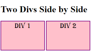
In the output, both divs are placed side by side because we used the “display:inline-block” method on these divs. Both divs are rendered here one after the other.
Example #2: Using the Display:Table Method
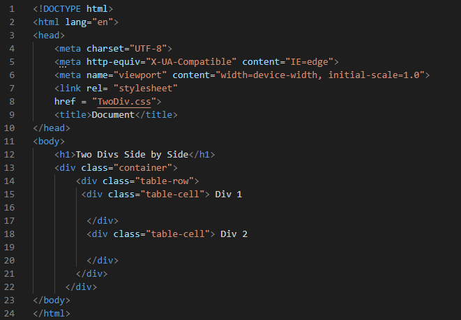
In this example, we have a heading, and we create two divs with the name “table-cell” inside the main divs which are the “container” and “table-row” divs. We use the display:table property in CSS for rendering both divs side by side.
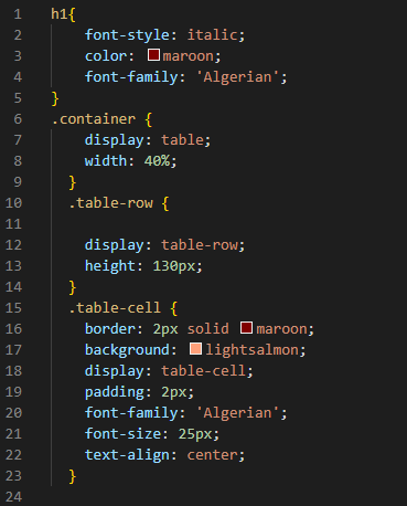
We start with the styling of the heading. The “font-style” that we use here for the heading is “italic”. The “color” that we utilize here for the heading is “maroon”. And the “font-family” that we use is “Algerian”. Then, we have the “container” class of div. We use the “display:table” property here, so it will display both divs side by side. We set the “width” to “40%”. Then, for the “table-row”, we utilize the “display” property again but here, we put the “table-row” as its value and its “height” is set to “130px”.
Then, we move to the “table-cell” div and set some properties here for these two divs. We create a border for both divs by utilizing the “border” property. This border is set to “2px” for its width, “solid” for its type, and “maroon” for its color. After this, we set its “background” to make those divs attractive and use a “light salmon” color for this property. We also set the “display” here as the “table-cell”. The “padding” that we use here is “2px”. Also, we have some text in the divs. We apply some styling to the text here. The “font-family” of the text is “Algerian” and their “font-size” is “25px”. We align these texts to the “center”.
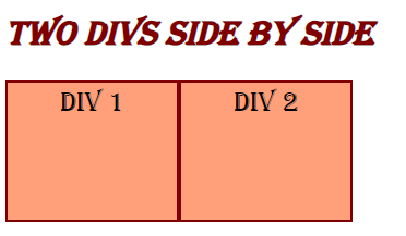
As we applied the “display:table” method on these divs, they appear side by side in the output. Both divs are rendered next to each other.
Example #3: Using the Float Method
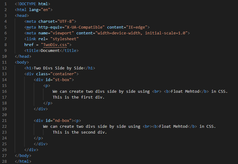
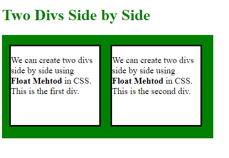
Here, after the heading, we have one main div named “container” and we put the two different divs inside this div. We create one div with the name “st-box” and the other div named “nd-box”. We also put the paragraphs inside each div except the main div. We will use the CSS float property for setting both divs side by side.
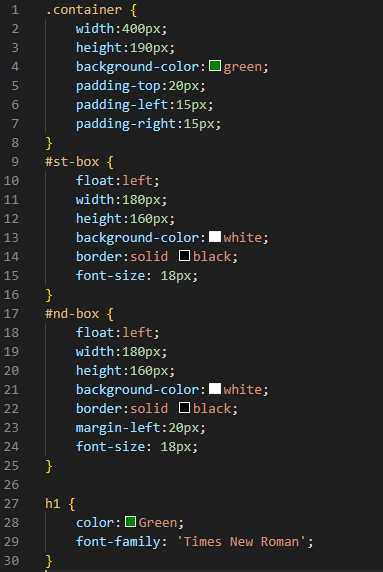
We set the “container” div’s “width” and “height” by placing the values “400px” and “190px”, respectively. The “background-color” of the container is “green”. The “padding-top” is “20px” and the “padding-left” and “padding-right” are both set to “15px” each. Now, we set the “st-box” div and use the “float” property. Here, we set it to “left”.
The “width” and “height” are “180px” and “160px”, respectively. The “background-color” of this “st-box” div is “white” with a border of “black” color in “solid” type. The “font-size” for the paragraph which we have written in this div is “18px”. The “nd-box” div properties are the same as the “st-box” div which we already explained here. The only new property we add here is the “margin-left” property and we set it to “20px”. We also style the heading a little bit by changing its “color” to “green”. The “Times New Roman” is selected here as the “font-family”.
You can see in this screenshot that the two divs appear here side by side inside the main div. We used the “float” property in this example for placing both divs one after the other.
Example #4: Using the Flexbox Method
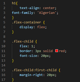
We have one main div called “flex-container” that contains two separate divs. Except for the main div, we inserted some paragraphs inside each div. Both divs will be placed side by side using the CSS flexbox method in this example.
We align the heading in the “center” and set the “font-family” to “Algerian”. We mention the “flex-container” and put the “display:flex” property inside. We put this property in the container so that the “flex” property puts the child element in a flex context and aligns the divs next to each other. For the “flex-child”, we put “flex” and give “1” as its value. We create the border around each div by utilizing the “border” property and setting it to “red” solid type. We set the paragraph’s “font-size” which is written inside the divs to “20px”. The “margin-right” of the “flex-child:first-child” is set here to “20px”.
These divs appear side by side in the output because we used the “flexbox” property in this example. Both divs are shown side by side.
Conclusion
We created this guide to help you understand the CSS properties which helps to put two divs side by side. This guide has gone through this topic in depth. We have gone through the methods which are used for placing two divs side by side in CSS. We explained that there are five properties for placing two divs side by side. We went over four different instances in which we used the four properties of the CSS for setting the two divs side by side and provided the outputs so you could see how these properties work. I hope you’ll be able to figure out which CSS properties are used for placing the divs side by side in CSS and how to use them on your own.

