The Cascading Style Sheet provides many styling properties for the HTML elements. These properties include simple styling to animation. Moreover, the fade-in and fade-out effects are among the common ones. The CSS “transition” property and “animation” with the @keyframe rules help to apply animation to the HTML elements.
This article will illustrate the method for adding fade out effects on different HTML elements.
How to Add a Fade-out Effect to Text?
The “animation” property can be used to add a fade-out effect to the text. To do so, first, in the HTML file, add a “<div>” element and assign it the “fadeout-text” id:
Style “#fadeout-text” Id
The “#fadeout-text” is used to access the created id having id “fadeout-text” and apply the following properties:
width: 100%;
color: darkred;
font-size: 6em;
text-align: center;
font-family: fantasy;
letter-spacing: .2em;
animation: fadeout 5s;
}
Here:
- “width” determines the div element’s width.
- “color” defines the element’s text or font color.
- “font-size” specifies the size of the font.
- “text-align” determines the text alignment.
- “font-family” determines the font style.
- “letter-spacing” sets the spacing between the characters.
- “animation” property sets the animation name “fadeout” and the duration “5s” as five seconds.
Define “@keyframes” Rule to animation Property
To apply the animation behavior on the element, mention the “animation” name after the “@keyframe” keyword as follows:
0% {
opacity: 1;
}
100% {
opacity: 0;
}
}
Following is the explanation of the above code snippet:
- “0%” defines the start of an animation.
- “100%” defines the end of an animation.
- “opacity” property is utilized to adjust the transparency level of an element.
Output
How to Add a Fade-out Effect on Hover?
In HTML, it is also possible to apply the fade-out effect when the user hovers the mouse over the element.
Example
The example below instructs how to apply a fade-out effect on hover.
Style “fadeout-text” id
Firstly, specify the “opacity” as “100%” in addition to the other styled properties:
Add “:hover” Pseudo-selector
opacity: 10%;
transition: 3s;
}
The “#fadeout-text:hover” is used to apply the specified properties on the element on hover. Here, the “transition” property changes the element’s movement within the duration.
Output
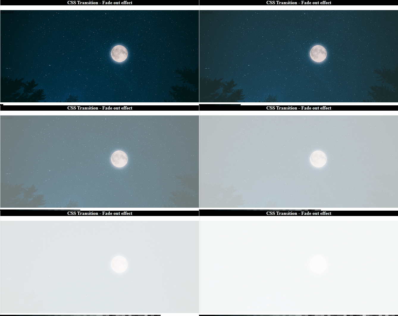
How to Add a Fade-out Effect to Images?
Adding animation effects on images is one of the most entertaining features of the web application. With the help of the previously discussed concept, you can also fade-out the image on a web page.
Example
Add a “<div>” element and assign it the id “fadeout-image”:
Style “fadeout-image” Id
The “#fadeout-image” is used to access the id “fadeout-image” of HTML and apply the following properties:
width: 100%;
height: 50%;
background-image: url(/images/night-.jpg);
background-repeat: no-repeat;
background-size: cover;
position: absolute;
animation: fadeout 5s;
}
In the above code:
- “background-image” defines the image’s URL.
- “background-repeat” defines not to repeat the image.
- “background-size” specifies the background image size.
- “position” property as “absolute” sets the image position relevant to the closest positioned ancestor.
Add “@keyframe” Rules to “animation” Property
Similarly, we will utilize the “@keyframes” rules to apply the fade-out effect to create an animation effect:
0% {
opacity: 1;
}
100% {
opacity: 0;
}
Output
That was all about adding a fade-out effect on HTML elements using CSS.
Conclusion
CSS properties such as “opacity”, “animation”, “transition”, and “@keyframe” rules are significant to add a fade-out effect on HTML elements. The “opacity” sets the transparency level, the “transition” property adjusts the gradual movement of the animation, and the “animation” property, along with the “@keyframes” rule, helps in adding animation to the elements. This post has explained the procedure on how to add a fade-out effect on elements using CSS.


