Example # 01:
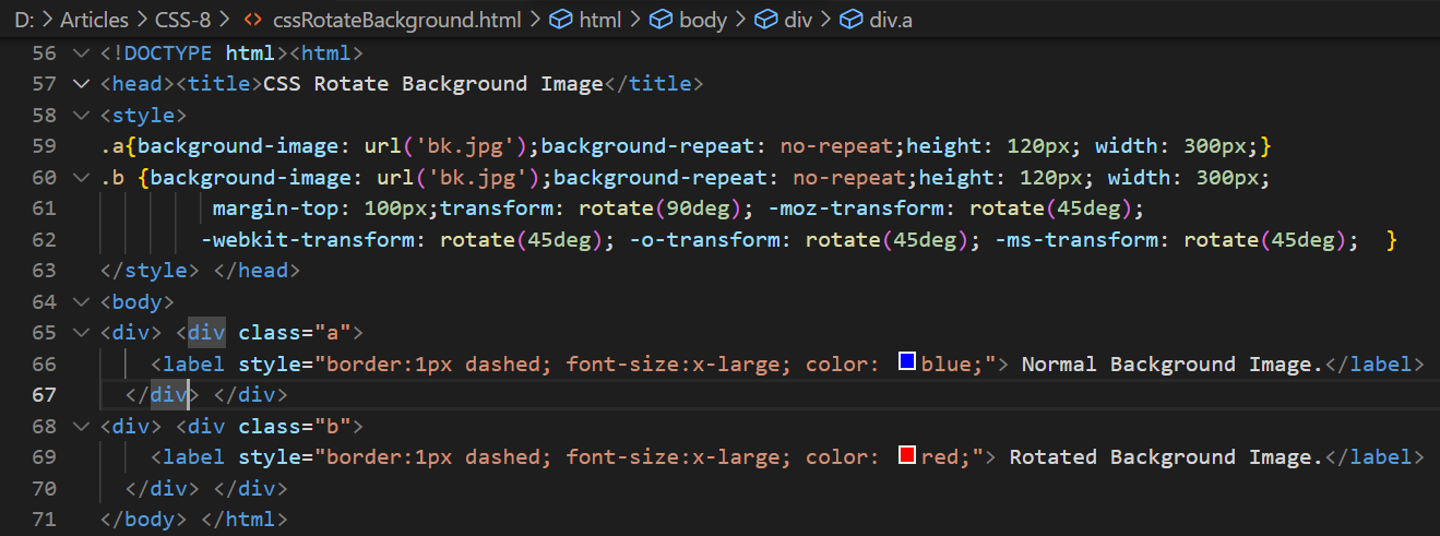
Let’s get started with this HTML script with the simple html basic tag followed by the head tag used to title the webpage via its “title” tag. The body of the HTML tag has been covered with different elements like div and labels. We have two main div elements in this HTML script. Within both the main div elements, we have two children “div” tags as well which are specified by two different classes a, and b. Both inner div tags are using the “label” element to label some text within the “div” and specify the div as normal or rotated. Both labels got the border of 1px in dashed style while the first div label would be blue and the second one would be red.
When we take a look at the style tag, we came to know that both the inner “div” sections are styled separately using their respective classes: a and b. Both div elements are using the same background image from the system with no background repetition, same height, and same width: 120px and 30px. While the second inner div would be containing some extra styling as well. We have used the margin-top property to place this div section 100px far from the top of the HTML page and rotated it 90 degrees right using the transform property.
After that, we rotated it 45 degrees in the opposite direction from where it started. Let’s save and run this script now.
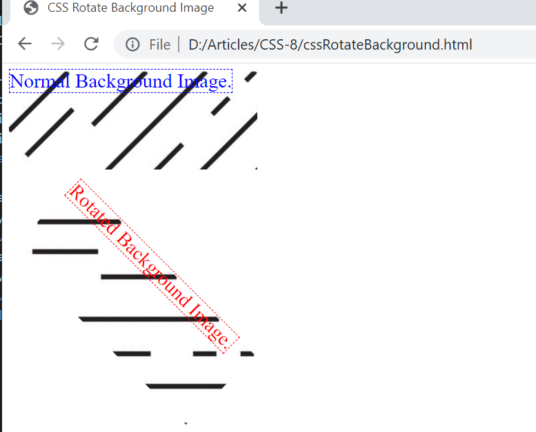
The output below is showing a clear representation of the above HTML code. The first div section contains an image with a label without any rotation and no background has been repeated. The other div section has been containing an image and the label while it has been rotated 90 degrees first and then skewed, translating, and scaling it 45 degrees towards its original position.
Example # 02:
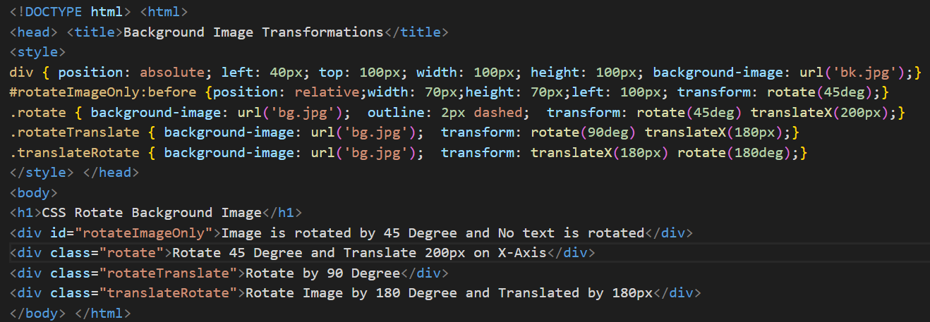
Within the above example, we have rotated the div sections along with their background images and the labels they contain. Now, we will be looking at the use of different properties to rotate the background image with and without its text on the HTML page. The body of this HTML page has been filled with a heading of size 1 and 4 different div sections with some texts. All these 4 divs have been specified with different IDs and classes to style them separately: “rotateImageOnly” ID for the first div, “rotate” class for the second div, “rotateTranslate” class for the third div section, and “translateRotate” class for the fourth div section. Within the style tag element, we have been using the div element in the same style for all the 4 elements for some properties. So, we have been specifying the position absolute, 40px left padding, 100px top padding, 100px width and height for all, and the background image would be the same for all.
While we have been using the ID of the first div in this style tag to change its position to relative, changing the width and height, and left margins. The background image for the first div would not be overridden and the older one would be used. The background image for this div section would be rotated 45 degrees without translating or rotating its text. After this, all the three div sections would be overriding the new background image.
The second div section has been outlined 2px dashed, rotated 45 degrees its text will also be translated by 200 pixels. The third div section background image has been rotated 90 degrees along with its text while the 4th div section has been rotated 180px along with its text.
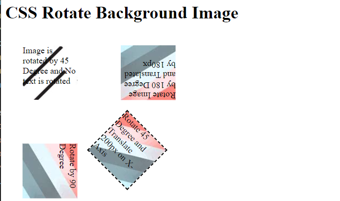
The output for this HTML script has been showing a total of 4 divs with background images. The first div has been using the different background images while the others are overriding the new images. The background image of the first div section has been rotated to 45 degrees while its text has not been rotated.
The background image for the second div rotated to 45 degrees while its text has been translated to 200 pixels. The background image for the third div section has been rotated to 90 degrees along with its text. Just like that, the background image for the fourth section has been rotated to 180 degrees and its text has been translated to 180 pixels.
Example # 03:
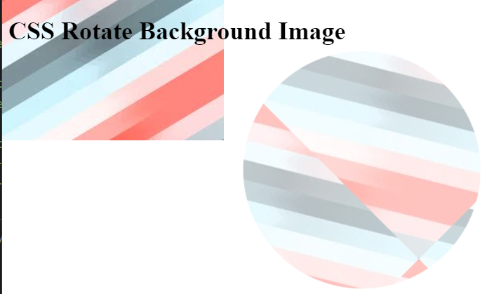
Let’s start with the last example of this article to use some properties of CSS on the background images of some elements of the HTML web page. We will take a look at the body of the HTML page first. Within the body tag for this HTML page, we have been using the only heading of size 1. There is nothing left to be done on the body tag, so we will be taking a look at the style tag of the HTML page. Within the head tag of HTML code, there is a title tag that has been used to title this as “Background image transformation”.
This style tag has been started with the use of body elements. For styling we have been using the property background-image to add the image as a background. We have been setting the background to no-repeat so that the background image cannot be repeated on the HTML webpage. Also, the background-attachment property is used to fix the background image and the text-overflow has been used to inherit the overall content properties throughout the page. Another body element has been used with the after attribute to create another background image with absolute position: top margins of 10%, left margin of 30%, width, and height of 300 pixels along with the same background image containing the opacity of 0.5.
The radius for the border of this image has been set to 50%. This means that this image will be shown in a circle. Also, its background image will be rotated 45 degrees and no background repeat property has been applied so the image can be repeated many times.
The output has been showing the first background image being displayed simply without any rotation, without any translation, and without repeating. While the second background image has been rotated 45 degrees with a 50% radius and the background image is repeated many times as shown in the image below.
Conclusion
This article constitutes the use of different CSS properties for rotating the background images of any HTML page to certain degrees. HTML examples have been tried to utilize these interesting properties of CSS in a very simple and unique way. For these examples, we have utilized the background-image property, background-repeat property, background-attachment property, text-overflow property, content, position, border-radius property, transform, opacity, and different width/height properties to achieve the required output for rotating the background.

