Example 01
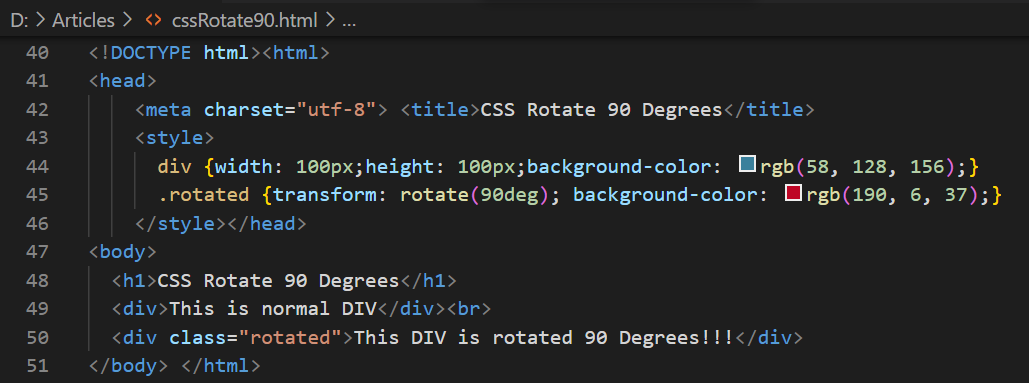
Let’s get started by demonstrating how an element of HTML can be rotated 90 degrees. This example has been initialized with the main “html” tag followed by the “head” tag titling our HTML webpage with the “CSS Rotate 90 Degrees” in the “title” tag. The body element of this HTML code has been initialized with the heading of size 1, i.e., the largest heading of HTML. It’s just a simple heading with no rotation at all. Then, we have a “div” section that will also be placed normally at the HTML web page screen without any rotation.
Another “div” section has been used here with the specified class “rotated”. Both the div sections contain some text within them, but the second “div” section will be rotated on the screen while the first one will stay normal. The “body” element is now closed, and we are here at the “style” tag to style this HTML page. Both the “div” sections have been styled with 100-pixel width and height, with some background sky color. After that, the class “rotated” was used to style the second div to 90 degrees using the “transform” property of CSS with the red background color. Due to the use of background color on the second “div” with its class, the second color will override the first color on this specific div section. Let’s save this code and run it using the Visual Studio code “Run” menu.
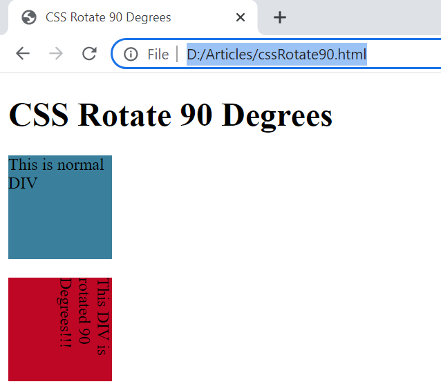
We have got the below-shown output for this HTML script. The first div is placed normally at our browser screen without any rotation. While the other “div” is rotated 90 degrees as per the direction and placement of its text using the “transform” attribute of CSS, i.e., top to bottom.
Example 02
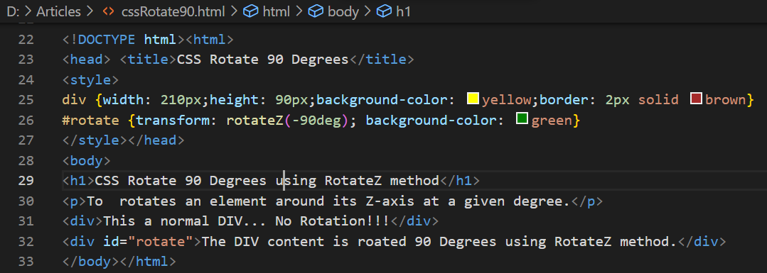
Within this example, we will be using the “rotate” method of transform attribute instead of the simple “rotate” method to rotate a specific element of the HTML script. This time, we have been again using the same html and “head” tags following the same “title”. The body area has been initialized with the simple heading of size 1 following a simple paragraph tag containing a text line in it. There has been initialized a normal div section on the HTML page, showing that there will be no rotation applied to it.
Another “div” section has been initialized with its ID “rotate,” and it will contain a long sentence explaining that the rotate function has been applied to this div for rotation of 90 degrees. The body and html tags are closed so far. The style tag contains the styling for both “div” tags, i.e., the width of both div tags would be 210 pixels, the height would be 90 pixels, yellow background color with a 2-pixel solid brown border for both.
After this, we have been applying the “rotateZ” attribute of the transform property on the second div section using the ID of this section, i.e., “rotate”. It has been used to rotate the particular div to -9- degrees, i.e., in the opposite direction (z) of the above example output. The background color property has been used again to override the last styled background color for this specific div section, i.e., it will be green, not yellow, due to overriding. This example has been completed here and is ready for execution in the Chrome browser.
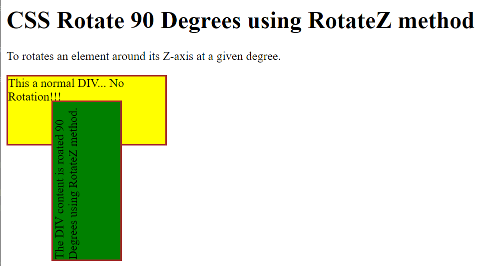
The output of this HTML code example has been showing 1 heading, 1 paragraph, and 2 div sections on the Chrome browser screen. At the same time, the first div section of yellow background color has been placed in the left to right direction without a 1-degree rotation. On the other hand, the green div section has been rotated -90 degrees to the left, opposite to the output of simple 90 degrees that would be placed in the right direction of an HTML page.
Example 03
Let’s have our last example of this article to demonstrate the use of a simple transform property to rotate some HTML Elements to 90 degrees with a little change. For this, we have started this HTML script with the html main tag followed by the head tag. This head tag contains a title tag to title the HTML webpage as “CSS Rotate 90 Degrees” so far once again.
After this, we have a style tag to style the webpage using different CSS style properties. For the time being, we need to skip its explanation because we have to take a look at the body section of this HTML webpage before jumping at the styling. So, the body section contains a simple heading of size 1, i.e., the largest heading of HTML. After this heading, we have a normal div section to be created at our HTML webpage, and it will not be rotated.
After that, we have another div section to be used in the HTML webpage that will be rotated 90 degrees concerning the page’s original direction. It has been assigned with the class “rotate” for use in the styling. After this, we have been moving towards the explanation of the style tag to add some styling to our HTML page. The “div” element has been used here for styling. We have been setting left-alignment or padding for both the tags to 50px and top-alignment or padding to 150px. The position for both the div sections has been set to absolute. The width and height of both div sections is also the same i.e. 200px and 100px respectively.
After this, we have been utilizing the class “rotate” of the second div section to style it separately as well. We have been setting the background color for this div section to transparent, i.e., overriding the above background-color property. We have been using the outline property instead of the border, i.e., a 5 px dashed outline. Also, the transform property is here to rotate this particular section to 90 degrees. Let’s run this code now.
The output for this HTML script has shown us two div elements on this page; one of yellow color, and the other is transparent. The yellow div section is normal in its position and not rotated at all. The transparent div section with a dashed outline is rotated 90 degrees.
Conclusion
This article demonstrated the use of the transform property of CSS with different methods to rotate any HTML element of any webpage to 90 degrees. For this, we have tried a simple rotate attribute to rotate an element to 90 degrees and the rotateZ attribute to rotate an element to “-90” degrees, i.e., opposite of the 90 degrees.


