A Cascading Style Sheet is used to add special features to the content that is created through the HTML tags. CSS is also written in the form of tags and can be declared in three ways. We apply the internal style approach. The HTML tags are quite easy to implement along with CSS. The user must be aware of the basics of both languages.
Implementation of Disable Button
First, we use the HTML tags only to create buttons. Once the HTML tags for the button creation are understood, then it will be easy for us to add the CSS to the button.
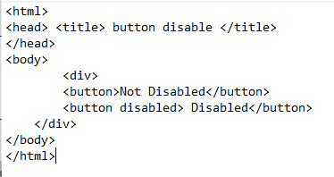
Starting with the HTML tags, we declare the head section. Inside the head section, we declare the title of the page, which appears in the tab of the browser. Then, we close the title and the head tag. Then, we declare the body tag. Inside the body, we use the div tag. A container that is used to contain and aligns its content in a specified shape is known as a div container. In the HTML, there are built-in tags for several features that are utilized by using their opening and closing tags. Similarly, the <button> tag creates a button. We create two buttons. We enable one button and disable the other one. This is done simply by adding the keyword “disabled” to the button. In this way, we can enable or disable the working of a button in the webpage by using the simple HTML tags.
Since we have to create only two buttons, close all the tags, and then save the file. To run the webpage you created, open the file in the browser.
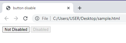
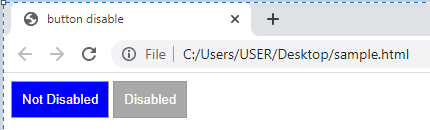
When we execute the code, we will see that two buttons are created. One is enabled, while the other one is disabled. The button and the text on the disabled button are in a lighter color tone and appears to be blur, making the button looks like a text in a block. This means that the button will not work.
Disable The Button in CSS
Now, we use both the HTML and CSS to disable the specific button. The part of the div creation is almost the same, but the CSS tags will be added to the head section, making an internal styling. Below the title tags, inside the head section, open the style tag.
We use classes and ids to specify the effects to be applied to the specified items in CSS. By using these classes and ids, there is no need to apply the effects separately for each content. We simply mention these effects in the head section and use the name of the class or the id at the place where we want the features to be applied. Let us see how this class feature will work with the button in this case. The class name in this example is taken the same way as the button. First, declare the class for the disabled button.
The first effect that is applied to the styling of a disabled button is the border feature. The size of the border is given, that is 1 pixel. The solid border color is applied, not the gradient. Also, the color code is applied to the border. This code is for the dark grey color. Similarly, the background color to the button is also applied, which is also dark grey. We can mention the color code or the name directly as well; they both work the same.
Background-color: dark grey;
Moving towards the other features, the color of the font is also styled by giving it the white color through a color code. The next feature is padding. It is the distance of the content from the margin of the container. Since we used the div as a container, we add the text inside the container button. This text is aligned in the center of the button through this padding feature.
We used the value of the padding as 10 pixels. Each measuring effect is written with a suitable unit like pixels, %, etc.
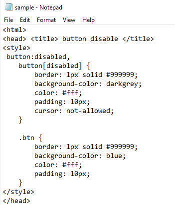
The cursor effect is the main property in disabling the button. As we know, whenever we need to use any feature on the website, we navigate towards that point through the cursor. So, to disable any feature, like in this example, we disable a button. We need to disable the cursor effect on that specified button. We use a “not-allowed” term to the cursor in the class of that button while the declaration of CSS features.
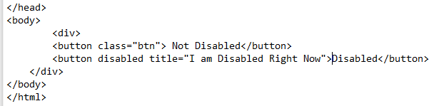
Now, we close the class for the disable button. Another class for the simple enable button is created. To discriminate from the disable button properties, we use another name for the class. Almost all the features inside the class are the same—the border color, size, font color, and padding. Only the background color for the enable button is set as blue to discriminate it from the disabled one. We will not add the cursor property inside the class as we do not want this button to be disabled. Close the style tag and the head tag. Inside the body, a div is created as we did before. The name of the class is mentioned respectively for all the effects.
An additional feature that we added to the disable button is the label. Whenever the cursor is moved toward the disabled button, a message is displayed. This will show that this button is disabled. The entire syntax for the button remains the same.
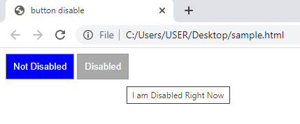
Now, save the code and we will run it in the browser. The webpage looks like the snap attached in the folllowing:
When we move the cursor towards it, the “mouse” icon is changed into a “not-allowed” symbol. At the same time, a label will appear with the button.
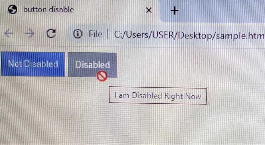
Without the cursor appearing, a label is shown that helps the user to identify the disabled button.
Conclusion
CSS Disable Button is an article written to assist the user in disabling a button simply through the HTML and with both HTML and CSS as well. We aimed to highlight the most basic features and effects necessary in designing any button on the webpage by using the style sheet. An example is quoted in which a simple button and a disabled button are created and designed through both languages. The cursor property is the main feature that is added to the CSS property to style the button. Moreover, the user can add other features to discriminate between the simple and the disabled buttons.