Example 01: Using CSS Style Tag in an HTML File to Create a Rounded Corner Button
In this example, we will use the CSS Style Tag approach to create a rounded corner button in an HTML file. The default button element of the Hypertext Markup Language will be remodeled into a button with color and round borders in this example. Let us take a look at the script that we will create to complete this task:
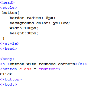
In the given script, we open our file header. In the file header, we define the styling of the button element. For this, we open a Style Tag and call the button class where we define the several styling properties. The first property would be the border radius of the button which creates a border for the button with round corners. Then, we add the color to the background of the button by using the background-color property. After this, we define the width and height of the button in pixels and then close the style and head tags. Now, we open the body tag and give a heading to the page with the help of the h1 tag. Then, we open the button tag and call the button class inside the tag. This will inherit all the styling properties that are defined in the Style Tag. After this, we close all the tags and save the file to open it on our browser.
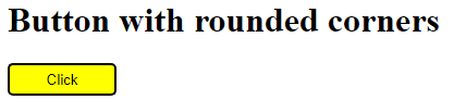
In the previous output, we can see that the button has rounded corners due to the CSS styling we specified in the button class. Now, we alter the border-radius property and observe the change in the button’s border.
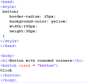
Now, we increase the pixel length of the border’s radius in the previous script and not make any more changes other than that. After saving and opening this file, we will get the following output:
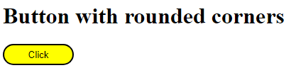
We can see that the button in the given output has completely round ends and is different from the previous version when the border’s radius was increased in the script.
Example 02: Using Inline CSS to Make a Button with Rounded Corners
In this example, the Inline CSS approach will be adopted to transform the default button by giving it with round borders and adding a color to the background. We will add the styling inside the button’s tag in this example, as shown in the following snippet:
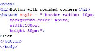
In the given script, we start our code from the body tag as there is no use of the file header in this scenario. In the body tag, we add a heading first to the page by opening the h1 tag and then move on to the button tag. In this tag, we write the styling properties using the CSS keyword “style”. In between the inverted commas, the properties are assigned, separated by semicolons. The first property is the border-radius and its value is “10px”. Then, we assign the color of the background, and assign the height and width of the button. After this, we close the button and the body tags to end the file. And then save it in the “.html” file format so we can open it on our browser.
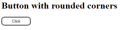
The output shows that we transformed the default button by giving it a round border and white background using the Inline CSS inside the button’s tag.
Example 03: Using the Different Properties Related to the Border Radius in CSS on a Button
In this example, we will use the different properties related to the border radius that the CSS provides regarding the positioning perspective. We will discuss these different properties and implement them in the following script for an HTML file:
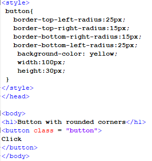
In the previous script, we add four different properties regarding the border’s radius which are the top left, top right, bottom left, and bottom right. All these properties represent the four sides of the button’s border and CSS allows us to edit every side of the border, separately. So, we assign the left side of the button’s border with similar radius values and the right side of the button’s border with similar radius values. This will create two different border shapes on both sides of the button’s border. Then, we also add a color to the background of the button and assign a fixed width and height for the button element. After this, we give the page a heading in the body tag and create a button in the body tag as well. The button tag will inherit the Style Tag class that has all the different styling properties for creating a unique shape for the button’s border.
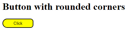
After opening the previous script file on our browser, we will get the given result. As we can see, the button has two different styles of the border on both sides. This happened because we assigned the different values of the border’s radius for both sides of the button.
Example 04: Using CSS to Change the Border Corners of a Button When It Will Be Hovered
In this example, we will change the border of the button when it will be hovered over. The Style Tag CSS approach will follow to create a hover effect on the button. In this example, we will create a separate class and a specific function to be inherited as well for this class.
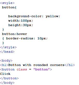
In this script, we create a styling class in the file header for the button element. Then, we create a new property function for this class called “hover”. In this function, we set the border’s radius to “10px,” which results to an animation of the border’s transition to a round edged border. Now, we close the header of the tag after completing all the styling related properties. In the body tag, we create a heading by using the h1 tag and open a button tag as well. In this button tag, we use the button class from the file’s header to inherit all of the formatting properties. After saving the file, we open it on our browser.
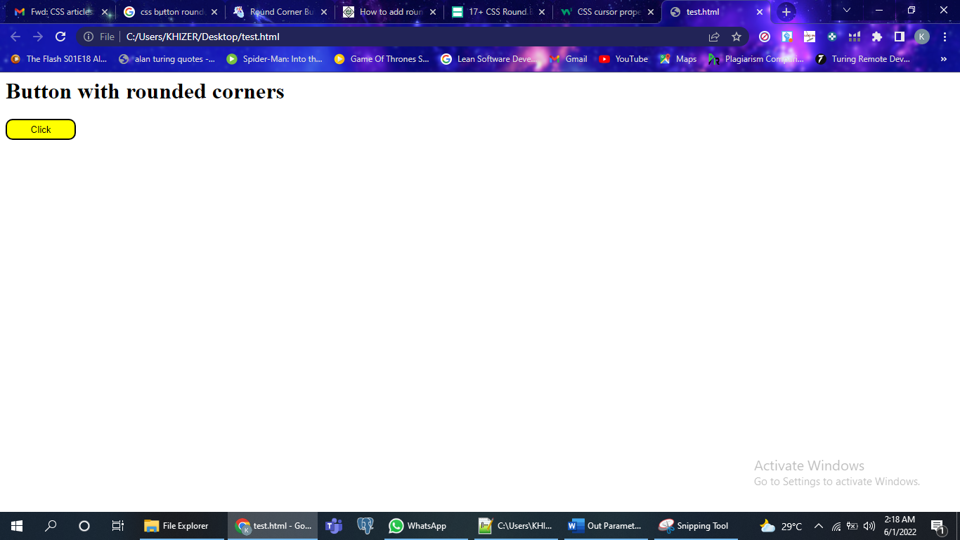
The output shows the after-hovered effect on the button as it was defined in the styling class and its function.
Conclusion
In this article, we discussed the several approaches to create a button with rounded corners using the different CSS styles which are the Inline CSS and the Style Tag CSS. We observed the different properties related to this phenomenon in this article. And implemented these variations in the Notepad++ to grasp a better understanding of this concept.