This blog will specifically discuss the procedure to create a vertical navigation menu with CSS.
How to Create a Vertical Navigation Menu With CSS?
As we know, the navigation menu is a list of links for which the <ul> and <li> elements are utilized. To create a vertical navigation bar, add a <nav> tag with the class name “vertical-nav” in the HTML elements. Then, add the <h1> element for the heading. After that, the <ul> element which includes several <li> elements and the related link will be specified in the <a> tag.
HTML
<h1>Vertical Navigation</h1>
<ul>
<li><a href="#">Home</a></li>
<li><a href="#">About Us</a></li>
<li><a href="#">Contact</a></li>
<li><a href="#">Features</a></li>
<li><a href="#">Our Services</a></li>
<li><a href="#">Testimonials</a></li>
<li><a href="#">Faqs</a></li>
</ul>
</nav>
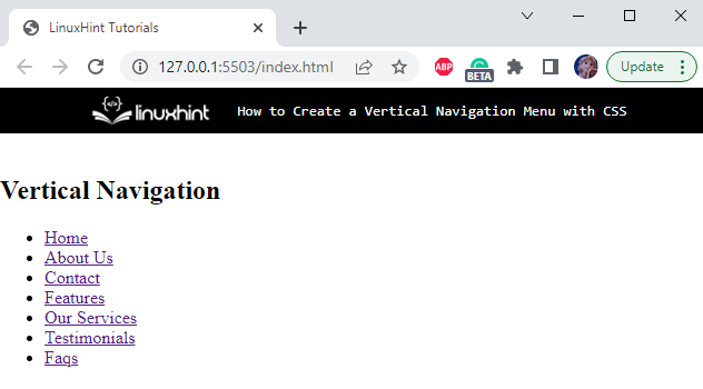
As a result, the structure of the navigation menu will look like this:
The CSS can be used to transform plain HTML menus into visually appealing navigation bars. So, let’s apply CSS properties to the added HTML elements.
Style All Elements
margin: 0;
padding: 0;
}
All elements of the HTML file are provided with the margin and padding properties with the value set as 0px.
Style vertical-nav div
background-color: aliceblue;
width: 145vh;
height: 95vh;
padding-left: 25px;
padding-top: 20px;
font-family: Verdana, Geneva, Tahoma, sans-serif;
}
The “.vertical-nav” is used to access the div class vertical-nav. The following are the properties applied to it:
- “background-color” specifies the color of the element’s background.
- “width” property adjusts the element’s width.
- “height” property adjusts the element’s height.
- “padding-left” property sets space on the left of the element’s content.
- “padding-top” property sets space on the top of the element’s content.
- “font-family” property applies font style to the element’s text. The list is provided to make sure if the browser does not support the first style, the other will be applied to the font.
Style h1 Element of vertical-nav div
margin-bottom: 20px;
color: blue;
}
The following properties are applied to the heading h1 element:
- “margin-bottom” property sets the space at the bottom of the heading.
- “color” property sets the specified font color.
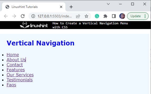
So far, the applied properties will display the navigation menu as shown in the below image:
Now, let’s remove the bullets from the list.
Style “ul” Element of vertical-nav div
list-style: none;
}
The “list-style” property with the value set as “none” will remove the bullets from the list.
Style “a” Element of li Element
text-decoration: none;
display: block;
width: 250px;
background: white;
color: black;
box-shadow: 2px 2px 2px cadetblue;
border-radius: 8px;
margin: 5px;
padding: 10px;
}
The “.vertical-nav ul li a” defines the path of <a> tag. The following properties are applied to it:
- “text-decoration” with the value “none” removes the underline decoration from the list.
- “display” property with the value set as “block” will set each list item in one line.
- “width” property is utilized for the setting of the element’s width.
- “background” property is utilized to add effects to the element’s background.
- “color” property specifies the font color.
- “box-shadow” property specifies the x and y offsets, blur and spread radius, and color of the shadow.
- “border-radius” property makes the element’s edges round.
- “margin” property sets the space around the element.
- “padding” property specifies space around the element’s content.
As a result, the navigation bar will look as follows:
Let’s apply some transition effects to the navigation menus created above.
Bonus Tip: Apply Transition to the Vertical Navigation Menu
Now, we will apply the transition to the “a” Element:
Here is the description of the above-given code block:
- transition-property is specified as “all” which means the transition applied to all the properties.
- transition-duration is specified as “0.3s”.
- transition-timing-function is specified as “ease”, which results in an increase in velocity to the middle of the transition and then slows back down at the end.
Style “a” Element on hover
background-color: rgb(142, 175, 237);
color: white;
transform: scale(1.1, 1.5);
}
The above properties applied to the “a” element of the vertical nav are described below:
- “background-color” property specifies the color of the element’s background.
- “color” property specifies the color of the element’s font.
- “transform” property is applied with the value as scale(1.1, 1.5). This scale() function defines a 2D plane transformation.
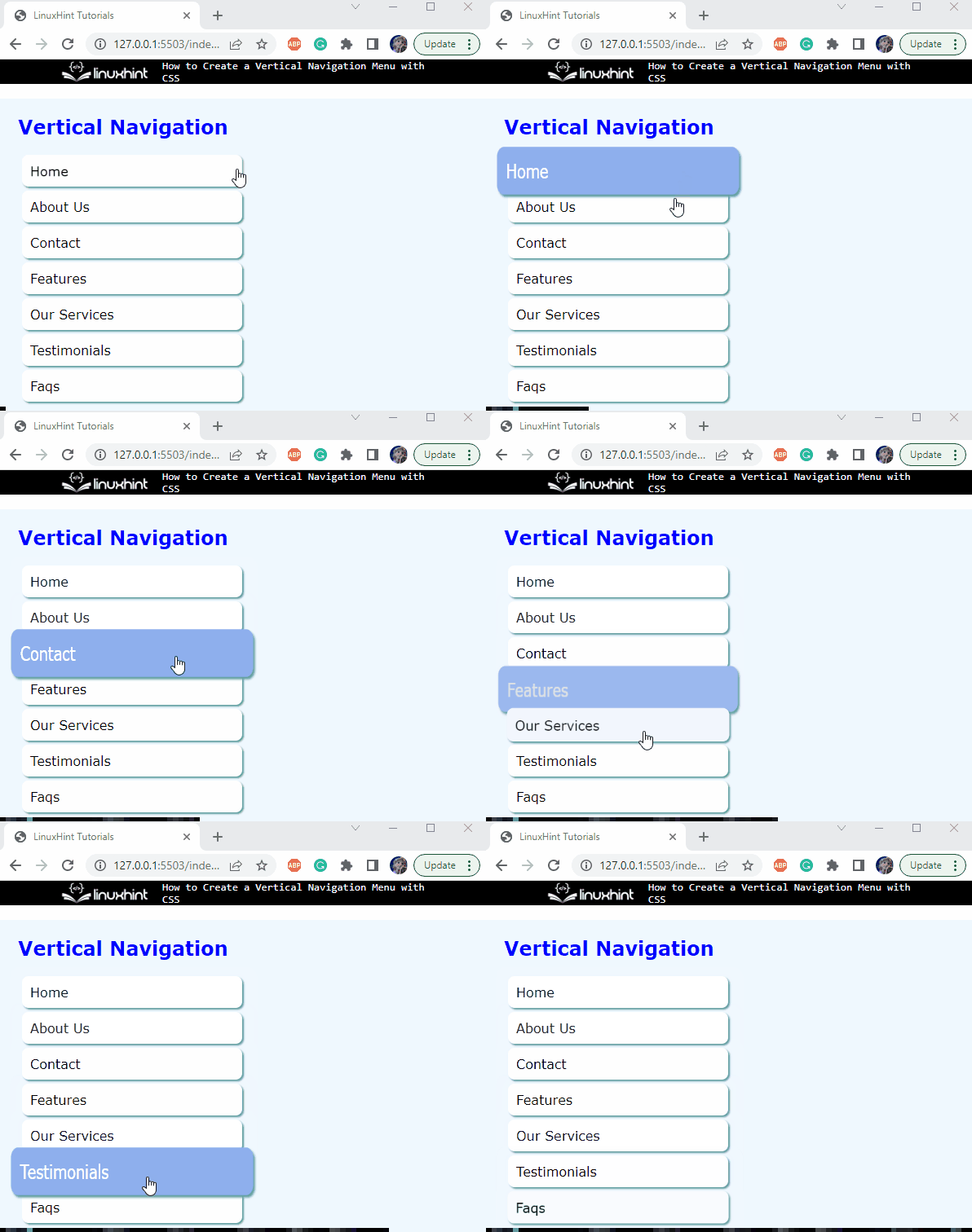
Save the above-mentioned code and open it in the browser. The navigation menu bar will look like this:
We have successfully learned to create a vertical navigation menu with CSS.
Conclusion
The navigation bar plays a vital role in making any website user-friendly. It consists of a list of links to different sections of the application. In HTML, the <ul> and <li> elements are utilized to make the list of links, specifically in the navigation bar. To make them interactive, different styling properties are applied to them using CSS. This study has explained the procedure to create and animate a vertical navigation menu with CSS.


