Example # 1:
We will create the HTML file to design our close button. The CSS file will be created in which we will style our close button. We use the visual studio code for all these. When we create the HTML file, in visual studio code, then we write the code in this file. We have to save the HTML file with the file extension of “.html” and the CSS file with the extension of “.css”. Let’s try the given code:
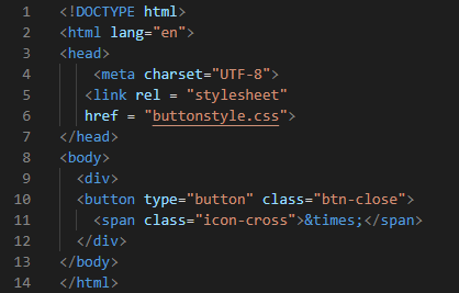
The code above is the HTML code so here is the type of this document mentioned as “html”. We use tags in HTML, so we have to open tags of “<html>” and “<head>”. The meta is defined in the “<head>” tag and it sets as “charset= UTF-8”. By using this, we can use many characters. For linking to the CSS file, we use the “<link>” here and the “rel” describes the relationship. The “href” is for giving the name of the CSS file which we have to join with this HTML file. We link the “buttonstyle.css” file by using “<link>”.
Now, close the “</head>” and open the “<body>” tag. The “<div>” class is here for the separation of data from the web. We have to design the button in this HTML file. The type of button is “button” and the class is named “btn-close”. Then, open “<span>” and this span class is defined with the name “icon-cross”. The “&time” will display the “x” for the close button. Close “</span>”, “</div>”, “</body>
and “</html>” tags.
CSS Code:
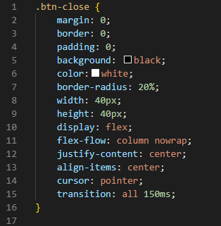
In CSS coding, we give style to our close button which we have created in the HTML file. First, mention the button class which is “btn-close”. Place a dot before this “btn-close” and open bracket. Set “margin”, “border” and “padding” to “0”. As the margin is for creating the space, the border is for creating the border around the button. Padding is for creating spaces between elements so we set all these as “0”.
We want to apply “black” as the background color so we place “background: black” here. The “color” describes the color of the font or cross. The “border radius” has adjusted to “20%”. The width describes the width of the close button which is “40px” and the height is also “40px”. The “display” is “flex” so it will set the flexible length to the display. The “flex-flow” property is applied here to the “column nowrap”. We have to justify the content to the center. So, the line “justify-content: center” will justify it to the center. Also, align the items to the center. Select the “cursor” as “pointer”. The transition is applied as it will control the speed when the CSS property changes. It is set as “all 150ms”.
For the output, we have to use the browser. We may use any browser. We have installed a browser by pressing “Ctrl+Shift+X” and installing “open in browser”. Then, for rendering the output, we press “ALT+B” and the output will be displayed and the button appears on the screen which is shown below.

Here, you can see that we create a simple close button. In the upcoming examples, we will create more than one close button and design them by using different colors and shapes in CSS.
Example # 2:
In this example, we are going to create more than one close button and apply different colors to these close buttons. Create the close buttons in the HTML file.
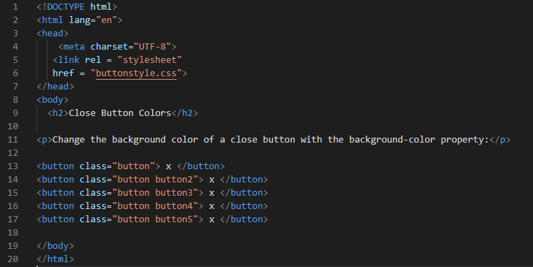
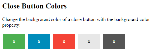
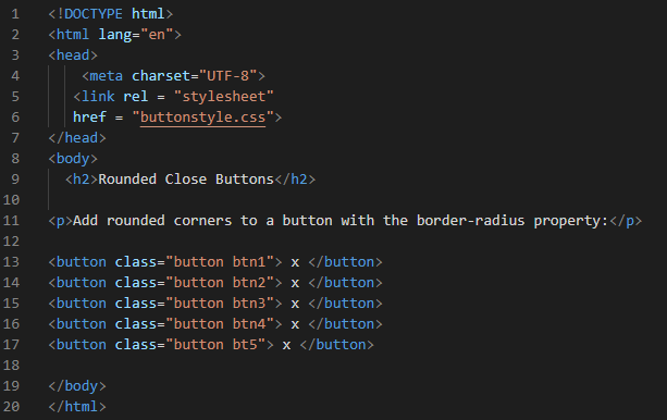
In this HTML file, we create multiple close buttons using the “<button>” tag. We named the class of the button as “button” for creating the first button. Then, put an “x” symbol which is displayed as the close “x” character. We named the second button class “button button2”. The third button class name is “button button3”. And the fourth and fifth buttons are named “button button4” and “button button5”, respectively. We must close the button tag at each line.
CSS Code:
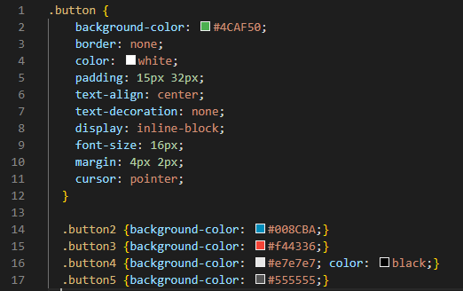
In the first line, place a dot and then type the name of the first button which is “button” here and start designing the button. The color of the “background” of the first close button is “#4CAF50” which is the code of green color, so the first close button will appear green. The next “color” is for setting the color of the “x” to “white”.
Now, “padding” is “15px” vertical, and “32px” vertical is applied. The “text-align” is set to the “center”. We don’t have any text written in the close button, so we set the “text-decoration” property to “none”. The “display” as “inline-block” is for displaying an inline-block container. Fix the “font-size” to “16px”. And vertical margins are “4px” and horizontal margin is “2px”. “Pointer” is used as a “cursor”.
Now, we want to change the background colors of the remaining button so we just add background color to the remaining buttons. Close the bracket of the first button. Put a dot and the name of the second button, and set the background color. The code of the background color is “#008CBA” which displays as “blue”. Change the color of all buttons with the same property and save it. See the output, all close buttons are of different colors.
Example # 3:
We use our previous HTML file which we have created in example 2 and just change the CSS code. Then, apply different shapes to the close button here in this example.
CSS Code:

We have set the background color for the first button as “green”. Padding is “20px” and this will apply to all the four sides. The “font-size” is changed to “16px”. Margin is “4px” vertical and “2px” horizontal. The new property we added in the remaining buttons is the “border-radius” property. This will change the corners of the button into a round shape. And also apply different colors to all buttons.
The “border-radius” for the first button is set as “2px” and the color of its “background” is “red”. The second button “border-radius” is “4px” and the “background-color” is “blue”. The third, fourth, and fifth buttons “border-radius” are “8px”, “12px” and “50%” respectively. Also, the colors of the background for these buttons are “yellow”, “purple”, and “orange”, respectively. Check the output and see how these close buttons appear on the browser.
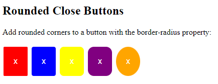
In the above output, you can notice that the corners of the close buttons are rounded. All close buttons are of different shapes. The last close button is a circle shaped close button. We apply all these stylings in our CSS file.
Conclusion:
This guide is provided for you to know how to create the close button in HTML and CSS. Here, we have designed and styled different close buttons. We also have provided the HTML and CSS code and the output of all codes as well. You have learned the use of HTML and CSS in this guide and will be able to create the close buttons whenever you need them in your projects or websites. We have also explained the codes here and have demonstrated three different examples for you.