This tutorial will demonstrate:
How to Make/Create a Button in HTML?
If the user wants to make a button in HTML, try out the given instructions.
Step 1: Create a div Container
First, use the “<div>” element to create a “div” container. Also, add an “id” attribute with a specific value according to your preferences.
Step 2: Insert Heading
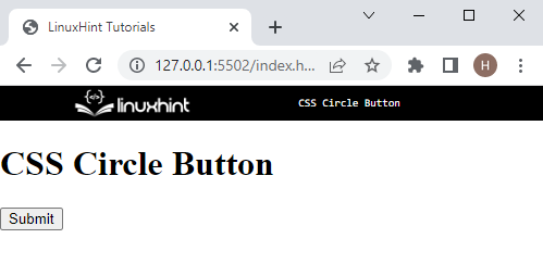
Next, insert a heading of level one using the “<h1>” element. Then, embed the heading text between the “<h1>” tags.
Step 3: Create Button
Create a button in HTML by utilizing the “<button>” tag along with the “type” attribute as “submit”:
It can be observed that the button has been created successfully:
Now, move toward the next section for making the button circular.
How to Make/Create a Circle Button Using CSS Properties?
The “border-radius” property is utilized for making the button in the form of a circle. This property sets the element corners round from each side.
To do so, look at the given step-by-step procedure.
Step 1: Style “div” Container
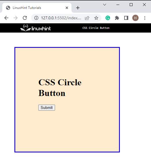
First, access the “div” container by using the class name “#circle-btn” and apply the following CSS properties for styling:
height: 200px;
width: 200px;
margin: 50px;
padding: 80px;
border: 3px solid rgb(23, 8, 228);
background-color: blanchedalmond;
}
Here:
- The “height” property is utilized for specifying the height of the element.
- “width” defines the element size horizontally.
- “margin” is used for allocating the space outside the defined border.
- “padding” specifies the space inside the boundary.
- “border” allocates a boundary around the element.
- “background-color” property is used for specifying the color at the backside of the element.
Output
Step 2: Make the Circle button
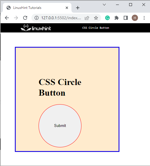
Now, access the button by tag name and apply the given properties on the button to make it circular:
display:block;
height: 150px;
width: 150px;
border-radius: 50%;
border: 1px solid red;
}
The description of the above code is as follows:
- The “display” CSS property is used to specify the display behavior of the element, such as whether the element is a block or inline.
- “border-radius” property is utilized for setting the edges of elements round from all sides. In our scenario, the value of this property is set as “50%” to make the button round from all sides.
It can be noticed that the circle button has been created successfully:
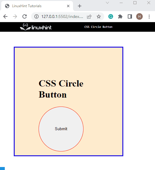
Step 3: Apply “hover” Effect on the Button
Apply the “hover” pseudo class to add the hover effect on the button:
color: rgb(247, 274, 248);
background-color: cadetblue;
}
On the “button:hover”, the CSS property “background-color” is utilized for setting the color of the background, and “color” is used to specify the text color.
Output
You have learned the method for creating a circle button in CSS.
Conclusion
To create a circle button in CSS, first, create a simple button by utilizing the “<button>” tag in HTML. Then, apply the “border-radius” property that sets the element’s edges round from all sides. The value of the “border-radius” is specified as “50%” to make the circular button. This post has explained the procedure for making the circle button in CSS.