In this article, we will learn the method to center the social media icons using:
In order to align the social media icons in the center of the HTML element, first, it is important for to learn the method add social media icons in HTML. To do so, follow the given steps.
Step 1: Add Social Media Icons in HTML
To add the social media icons in the HTML, first add the given below link in the header of the HTML. This is a link to the online library named “font-awesome” used to fetch icons. There are more than 1600 vector icons you can freely use on your website and customize it easily by using CSS.
HTML
After adding the link in the header of HTML, we will create a container with the class named as “div” and add heading <h1> inside the <center> tag. Here, we will create a sub-div and assign the class name as “icons”.
Inside the sub-div, we will add four icons using the <a> tag. In “href”, we will give the links of the icons and define the class name of the icon from where the icons are fetched. Here, we will use two classes, “fa” and the related icons such as “fa-twitter”. The “fa” stands for “font-awesome” and “fa-twitter” is the name of the icon. Using the same method, we will other three icons in the sub-div:
<div class="div">
<center>
<h1>Center Social Media Icons</h1>
</center>
<div class="icons">
<a href="https://twitter.com/" class="fa fa-twitter"></a>
<a href="https://www.whatsapp.com/" class="fa fa-whatsapp"></a>
<a href="https://www.instagram.com/" class="fa fa-instagram"></a>
<a href="https://www.snapchat.com/" class="fa fa-snapchat"></a>
</div>
</body>
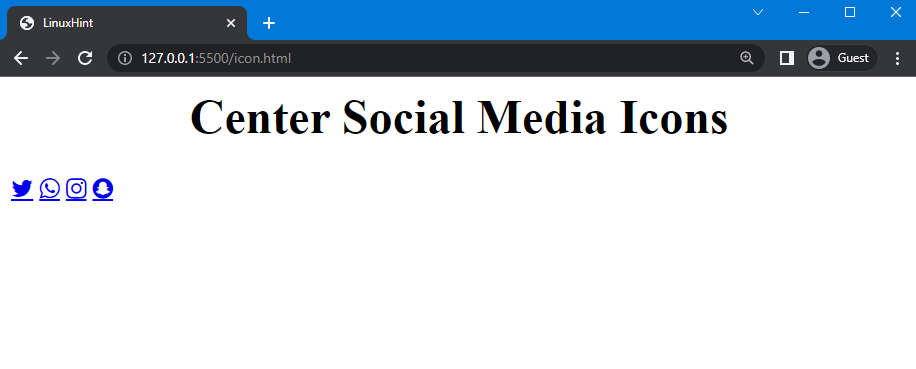
You can see that the social media icons are added in the div:
Now, we will move to the next step to style the div and social media icons.
Step 2: Style Div & Social Media Icons Using CSS
In the CSS file, use “.div” to access the created container in HTML. Here, set the height of the div as “250px”. To style the div, add a background color as “rgb(0, 0, 0)” and set the border width as “7px”, style as “double”, and color as “rgb(2, 217, 255)”. We will also set the color of the heading as “rgb(2, 217, 255)”.
CSS
height: 250px;
background: rgb(0, 0, 0);
border: 7px double rgb(0, 217, 255);
color: rgb(0, 217, 255);
}
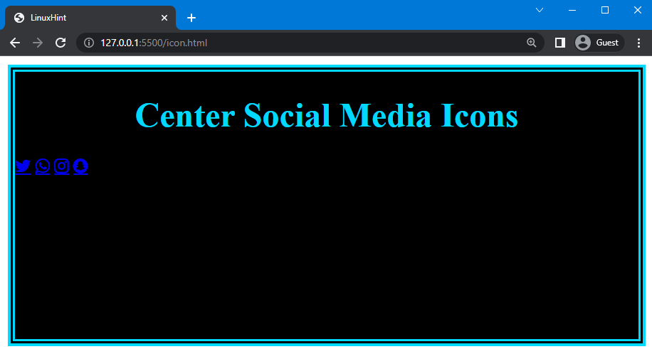
Here, you can see that the div is styled but the icons still have the same style:
Now, we will style the icons using CSS.
To do so, we will use “.fa” to access all four icons and style them accordingly. We will set the font size of the icons as “30px” width as “30px” to create space between icons and the “text-decoration” property as “none” to remove the underline from the links.
After that, we will use the second class of the icons “.fa-twitter”, “.fa-whatsapp”, “.fa-snapchat” and “.fa-instagram” to set the color of these icons differently. Here, we will set the color of the Twitter icon as “rgb(28, 150, 232)”, WhatsApp as “rgb(69, 198, 85)”, Snapchat as “rgb(247, 247, 0)”, and Instagram as “rgb(246, 1, 140)”:
font-size: 30px;
width: 30px;
text-decoration: none;
}
.fa-twitter{
color: rgb(28, 150, 232);
}
.fa-whatsapp{
color: rgb(69, 198, 85);
}
.fa-snapchat{
color: rgb(247, 247, 0);
}
.fa-instagram{
color: rgb(246, 1, 140);
}
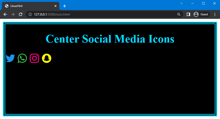
The following image shows that the both div and icons are styled:
Step 3: Center Social Media Icons Using CSS
Now, we will move to the next step in which we have to center align the social media icons by using four different methods. So. let’s start with the first one.
Method 1: Center Social Media Icons Using “text-align”
To center the social media icons, we will use the “text-align” property of CSS. It specifies the horizontal alignment of text in the HTML elements, such as aligning left, right, center, and justify.
Syntax
The syntax of the text-align property is:
The description of the above-provided values is given below:
- left: It is the default value of the text-align property used to adjust the text on the left side of the HTML element.
- right: It is utilized to align the text on the right side of the element.
- center: It specifies the center alignment of the text.
- justify: By using it, the words are spread out into a full line.
As a continuation of the previous example, let’s align social media icons in the center of the div.
Example
In CSS, we will use the “.icon” to access the created container in which we have added social media icons and then set the value of the text-align property as “center”:
text-align: center;
}
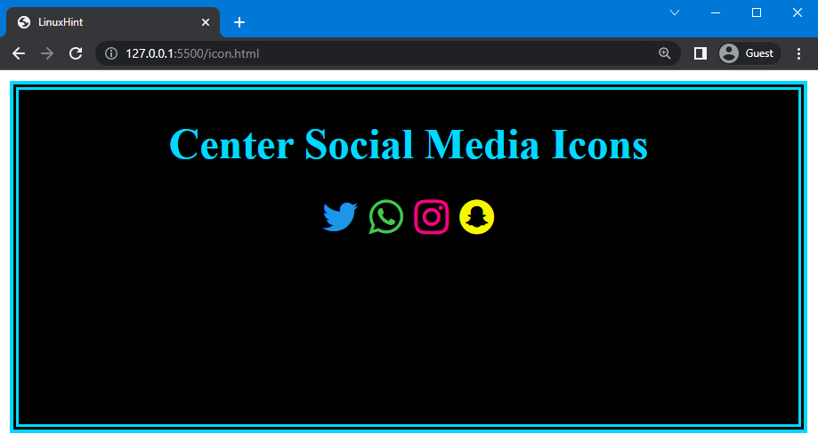
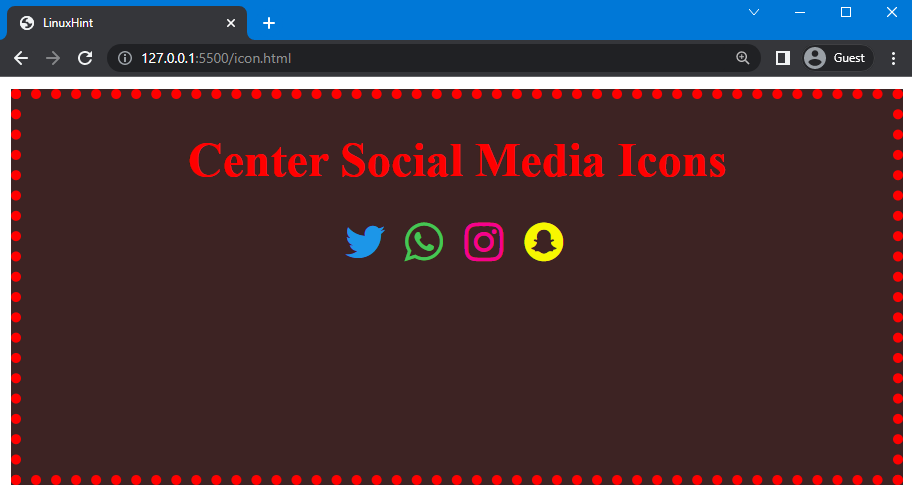
The below-provided image indicates that the social media icons align in the center of the div:
Method 2: Center Social Media Icons Using “grid”
“grid” is used to adjust the element in a grid container. You can use the “display” property and set its values as the grid to center align the added social media icons.
Syntax
The syntax of the display property is:
Let’s continue the example and align the social media icons.
Example
Here, we will set the value of the display property as “grid” to display icons in a grid form. Then, create four columns by using the “grid-template-columns” property and set its value as “auto” to allow the browser to calculate the width by itself. We will utilize the “column-gap” property to create a gap between columns and set its value as “10px”. After that, set the value of the justify-content property as “center” to display the grid container in the center of the div:
display: grid;
grid-template-columns: auto auto auto auto;
column-gap: 10px;
justify-content: center;
}
Note: The “display”, “grid-template-columns” and “column-gap” have been used to set the icons in a grid container and the “justify-content” is utilized to display the grid container in the center of the div.
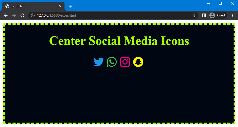
You can see that the social media icons are displayed in the center of the div:
Method 3: Center Social Media Icons Using “margin”
To center the social media icons, the “margin” property of CSS can be utilized. This property is used to create a transparent area around an element. It allows you to set the margin of an element from the left, right, top, and bottom sides. It is a shorthand property of “margin-left”, “margin-right”, “margin-top”, and “margin-bottom” properties. You can set all four values in a single line using the “margin” property.
Syntax
The syntax of the margin property is given below:
The description of the above-provided syntax of the margin property is given below:
- length: It is used to set the margin manually from the left, right, top, and bottom side of the element.
- auto: It allows the browser to set the margin around an element by itself.
Example
We will continue the previous examples and change the values of the border property to give the div a different look. To do so, set the value of the margin property as “auto” and width as “fit-content” to align the icons exactly in the center of the div:
margin: auto;
width: fit-content;
}
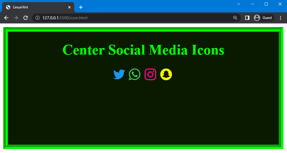
The provided code showed that the social media icons aligned at the center of the div:
Method 4: Center Social Media Icons Using “flex”
In CSS, “flex” is the value set for the display property. It allows the content or elements to be flexible and adjustable. CSS’s flex value ensures elements are arranged efficiently by creating equal space between them.
Syntax
In the above-given syntax, “flex” will be specified as the value of the “display” property.
Example
We will utilize the display property as “flex” and set the gap between icons as “5px” using the “gap” property. After that, use justify-content and set its value as “center”:
display: flex;
gap: 5px;
justify-content: center;
}
Using the code above, the following output is obtained:
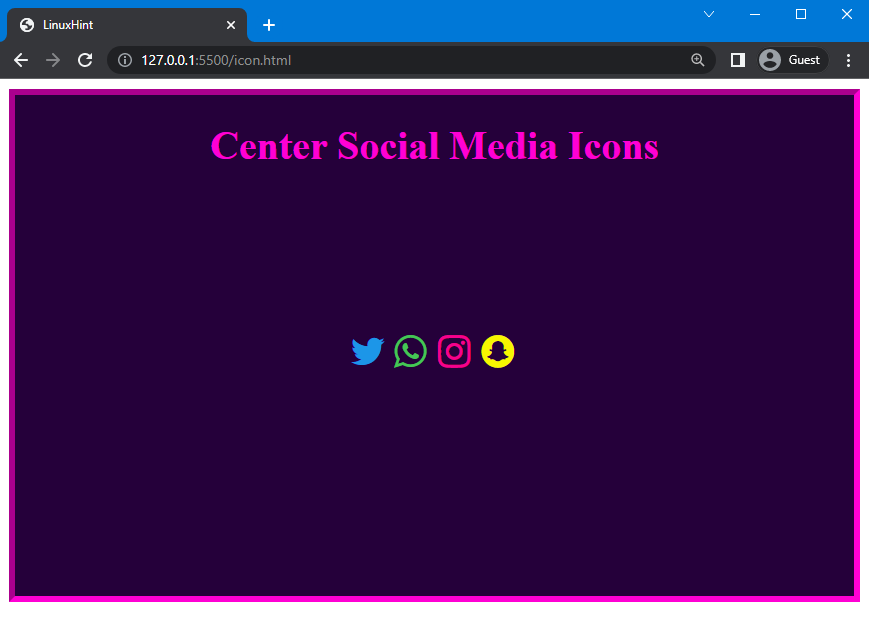
You can also set the social media icons in the center of the div both vertically or horizontally by using the “flex” value for the display property. To do so, use the “align-item” property as “center” and set the height as “250px” to display the icon vertically center in the div:
...
align-items: center;
height: 250px;
}
Here is the result that demonstrates that the social media icons are in the center of the div both vertically and horizontally:
That’s it! We explained the method to center the social media icons using four different methods.
Conclusion
Social media icons are aligned in the center of the div by using four different methods of CSS, which are the “grid” and “flex” values of the display property, the “text-align” and “margin” properties. You can also set the social media icon center vertically by using the “flex” value of the display property. In this guide, we have explained these four methods in detail and provided examples of each method to center the social media icons using CSS.
[/cc]

