HTML buttons are like any other button on the screen and can perform various functions. The HTML buttons can be used to submit or reset form data, to show any success or danger sign, to create a link button, and so on.
In HTML, the buttons can be created using the <button> and <input> elements. However, the button created with <input> element deals with only textual data whereas the button created with <button> element does support image uploading, an extensive list of attributes styling, and much more. This article provides a detailed guide to HTML buttons with the following learning outcomes.
How to create an HTML button
As discussed earlier, an HTML button can be created using the <button> element. The button tag supports numerous attributes that can be used to avail various functionality of the button tag. Such as, it can pass a function or script on its on-click event. Moreover, the type attribute specifies the functionality of the button that either it would be a submit button or a reset button. Let’s have a look at the attributes that are supported by the HTML button element.
The following table lists down the attributes supported by the button tag.
| Attribute | Value | Description |
|---|---|---|
| autofocus | true, false | The button would be focused upon loading the page |
| disabled | true, false | The specific button would be disabled |
| form | form_id | This attribute shows that the button is associated with one of more forms |
| formaction | URL | This attribute specifies where the data of the form will be sent. |
| formmethod | GET, POST | Specifies the HTTP method for that specific form |
| formnovalidate | formnovalidate | The form data will not be validated upon submission |
| formtarget | _blank, _self, _parent, _top, framename | Specifies the location where the response would be displayed |
| name | name | This attribute specifies the name of the button |
| type | reset, submit, button | The button type is specified |
| value | text | The initial value of the button is set |
| onclick | script | Executes a script on clicking the button |
Let’s practice these attributes with the help of the following examples.
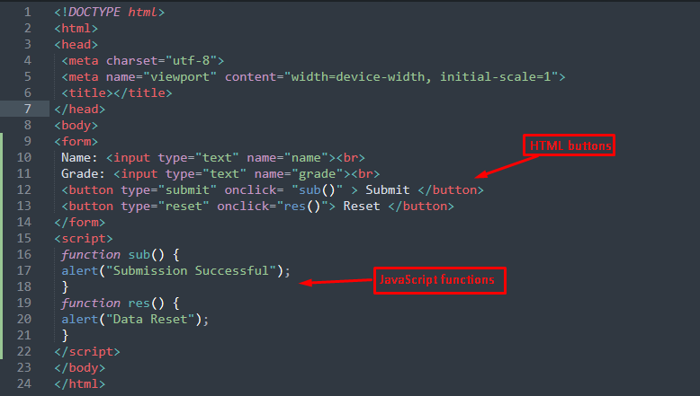
Example 1: Submit and Reset buttons
This example shows the creation of HTML buttons with type=”submit” and type=”reset” attributes of <button> tag. The values of the type attribute show that the data will be submitted/rest upon clicking the button.
The code provided below creates submit and reset buttons on the form tag.
HTML
The above code creates a form that contains two buttons with type=”submit” and type=”reset”. The onclick event of both buttons is exercised and a JavaScript function will be executed on each button.
JavaScript
alert("Submission Successful");
}
function res() {
alert("Data Reset");
}
Two JS functions are created that are supposed to be called upon clicking the buttons.
Output
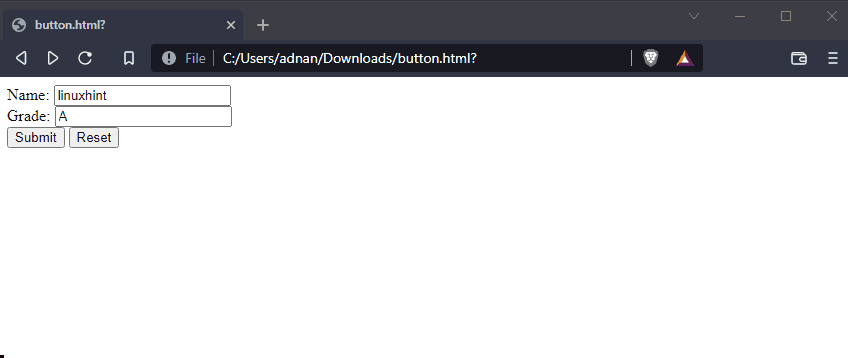
From the output, it is observed that upon the submit and reset buttons, an alert is initiated on each click. Moreover, the data is submitted and reset successfully as well.
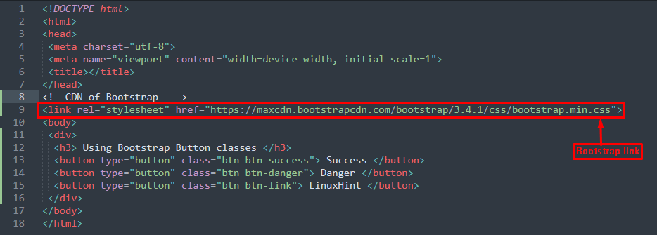
Example 2: HTML buttons with Bootstrap
The HTML buttons can be associated with CSS properties to style them for a better presentation. Bootstrap is a widely used CSS framework that has a built-in class for buttons. The following HTML code practices the success, danger, and link class of Bootstrap to add some effects to the buttons.
To add Bootstrap classes, you have to add the following CDN link into your HTML document.
Output
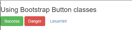
The output shows that the “btn-success” class has a green color whereas the “btn-danger” class turned the color of the button into red. On the other hand, the “btn-link” class has created a link button.
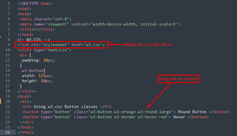
Example 3: HTML Buttons with w3.css framework
The w3.css framework has been widely used because of its built-in classes. The following code creates buttons with w3.css classes.
The above code practices the w3-orange, w3-round-large, w3-border, and w3-hover-red classes of the w3.css framework. These classes change the color, shape, border, and add hovering effects to buttons.
Output
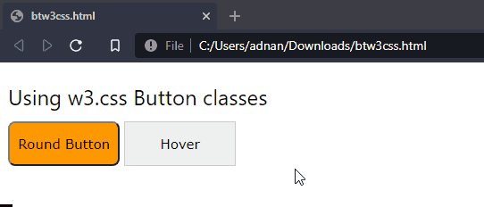
From the output, it is observed that the first button is rounded and in orange color. While the second button has a hover effect on it and moving the cursor to it would make the button red-colored.
Conclusion
HTML buttons can be created using the <button> element and the <input> element using the type=”submit” attribute. However, a button created with the <button> element offers more functionality and styling as compared to the button created by <input> tag. This article provides a descriptive guide for HTML buttons. Additionally, this post also serves the styling of HTML buttons using two widely used CSS frameworks, that include W3.CSS and Bootstrap.